Turn on suggestions
Auto-suggest helps you quickly narrow down your search results by suggesting possible matches as you type.
- Home
- Microsoft 365
- Excel
- Pivot Chart to Line Chart Formatting
Pivot Chart to Line Chart Formatting
Discussion Options
- Subscribe to RSS Feed
- Mark Discussion as New
- Mark Discussion as Read
- Pin this Discussion for Current User
- Bookmark
- Subscribe
- Printer Friendly Page
- Mark as New
- Bookmark
- Subscribe
- Mute
- Subscribe to RSS Feed
- Permalink
- Report Inappropriate Content
Feb 24 2022 12:18 PM
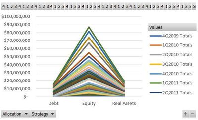
I have been trying to get data that I incorporated into a Pivot Chart to translate into a line/mountain graph. Unfortunately, the graph seems to auto-generate the y-axis as being monetary value automatically every time, so that I see the results as a V shape (see image) rather than over time (what I'd like to do, so I can see changes over time).
I've included a picture of the pivot chart (with data whited out) as well so you can see what I'm looking for/hoping to use.
Is there a way to re-format or organize the chart so that I can get this chart to show over time rather than auto-setting to monetary value?
Labels:
- Labels:
-
Excel
0 Replies

