- Subscribe to RSS Feed
- Mark Discussion as New
- Mark Discussion as Read
- Pin this Discussion for Current User
- Bookmark
- Subscribe
- Printer Friendly Page
- Mark as New
- Bookmark
- Subscribe
- Mute
- Subscribe to RSS Feed
- Permalink
- Report Inappropriate Content
Nov 01 2022 10:28 AM
Hello,
I am struggle and my brain isn't processing what I'm doing wrong. I'm working on making a "dashboard" to visual a series of reports that have been accepted, returned or not received.
So the breakdown is X amount of "ORG's" that is rolled up into a senior org. I would like to be able to sort by both ORG and Accepted, returned and not received. I've attached an excel sheet with a sample of the daya I'm working with.
- Mark as New
- Bookmark
- Subscribe
- Mute
- Subscribe to RSS Feed
- Permalink
- Report Inappropriate Content
Nov 01 2022 10:21 PM - edited Nov 01 2022 10:22 PM
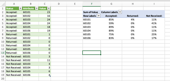
Solution@zackwilson11 You need to "flatten" (a.k.a. unpivot) the data table first and filter out the unwanted status types. Then create a pivot table on that transformed table. See picture.
I used PowerQuery to create the green table!
File attached.
- Mark as New
- Bookmark
- Subscribe
- Mute
- Subscribe to RSS Feed
- Permalink
- Report Inappropriate Content
Nov 02 2022 08:21 AM
@Riny_van_EekelenGreat! One more follow up, my ultimate goal is to use a pie chart for a visual. Is there a way to have to Chart update for all 6 "orgs"? Right now, its not matching the data, or should I just create a new chart?
- Mark as New
- Bookmark
- Subscribe
- Mute
- Subscribe to RSS Feed
- Permalink
- Report Inappropriate Content
Nov 02 2022 08:42 AM
@zackwilson11 Not sure what you mean, but I added a slicer for the Org number, and moved the chart on top of the pivot table. Looked better, I thought.
- Mark as New
- Bookmark
- Subscribe
- Mute
- Subscribe to RSS Feed
- Permalink
- Report Inappropriate Content
Accepted Solutions
- Mark as New
- Bookmark
- Subscribe
- Mute
- Subscribe to RSS Feed
- Permalink
- Report Inappropriate Content
Nov 01 2022 10:21 PM - edited Nov 01 2022 10:22 PM
Solution@zackwilson11 You need to "flatten" (a.k.a. unpivot) the data table first and filter out the unwanted status types. Then create a pivot table on that transformed table. See picture.
I used PowerQuery to create the green table!
File attached.
