- Home
- Microsoft 365
- Excel
- Re: Multiple scenarios in one graph
Multiple scenarios in one graph (using Scenario Manager)
- Subscribe to RSS Feed
- Mark Discussion as New
- Mark Discussion as Read
- Pin this Discussion for Current User
- Bookmark
- Subscribe
- Printer Friendly Page
- Mark as New
- Bookmark
- Subscribe
- Mute
- Subscribe to RSS Feed
- Permalink
- Report Inappropriate Content
Nov 20 2020 08:10 AM - edited Dec 24 2020 11:31 PM
I have a simple question but cannot seem to find the answer (unless it is "no").
How can I show multiple scenarios (what-if, using the Scenario Manager) in one and the same graph?
I know how to show scenario 1, and then scenario 2 (using the scenario manager), but how can I show both scenarios at the same time in one graph? Impossible?
- Labels:
-
Excel
-
Formulas and Functions
- Mark as New
- Bookmark
- Subscribe
- Mute
- Subscribe to RSS Feed
- Permalink
- Report Inappropriate Content
Nov 20 2020 09:04 AM
I'm sure it's possible. Just have both sets of data included in the dataset that is graphed.
How to do THAT depends a lot on how your spreadsheet is organized. Could you post a copy, so long as it includes no confidential information?
- Mark as New
- Bookmark
- Subscribe
- Mute
- Subscribe to RSS Feed
- Permalink
- Report Inappropriate Content
Dec 23 2020 11:42 PM
Hi, sorry for the delay (I got sidetracked) and thanks for looking into my question!
Attached a workbook with a simple example explaining what I want.
Below a screenshot.
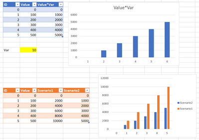
In the upper part, I have a simple table, where one column depends on the variable Var. I have two scenarios, and the graph changes when I display another scenario, but I can't show the two scenarios at once.
In the lower part, I copied the values from scenario 1 and 2 into a new table, and I can of course show these 2 results in one graph. But these are unlinked from my scenario.
So what I would like is to have the lower double bar chart, but still dynamically linked to my scenarios.
- Mark as New
- Bookmark
- Subscribe
- Mute
- Subscribe to RSS Feed
- Permalink
- Report Inappropriate Content
Dec 24 2020 07:00 AM
Well, your example does make clear what you want. Unfortunately, that was never my question.
The question was how to get there from whatever it is that produces those two scenarios in the first place. Where are your scenarios calculated in the first place.
THAT's what we need to see. You have some data, somewhere, that shows conditions X, Y and Z, modified by percentage P over time T. Scenario one uses certain assumptions for P and T; Scenario 2, other assumptions for P and T. What I was asking was to see that arrangement of the "raw data" that underlies the graph(s)
How do you get two "What-ifs" into one graph. To answer that involves some kind of modification to the way you've set up the scenario in the first place. So we need to go back to that request, to see how your actual data are arrayed.
Short of seeing your original sheet, I can only offer general ideas, like having a separate column for Scenario 2 that bases its numbers on the same conditions as in Scenario 1, but changes one (or more) of the variables. That seems, in some ways, so obvious that I have to assume your situation has something in it that makes it more complicated......
- Mark as New
- Bookmark
- Subscribe
- Mute
- Subscribe to RSS Feed
- Permalink
- Report Inappropriate Content
Dec 24 2020 10:22 AM
@mathetes OK, I attached a new workbook which maybe makes it clearer? It's fictional again, but let's say I have 5 variables that all play a role in the end result of a complicated table.
I can change the values of the 5 variables with one click of the button (using scenarios) and get the new results and graph instantly. Which is great.
But I want to compare, in one glance, the result of 7 scenarios, all in one graph, without copying and pasting 7 times the original table and variables. Can that be done, and if so, how?
Is this any clearer?
- Mark as New
- Bookmark
- Subscribe
- Mute
- Subscribe to RSS Feed
- Permalink
- Report Inappropriate Content
Dec 24 2020 01:12 PM
Ah, it finally sank in that your question really had to do with using Excel's Scenario Manager Tool and graphing the results of multiple scenarios from that. I was reading your use of the word as more generic, using the word scenario to mean, just, different scenarios; no fancy tool.
And I'll acknowledge, I don't know of a way to do it using the scenario tool.
Depending on how you're actually using it, however, I don't even see an advantage to that tool. It would come in handy, I suppose, if the only way you're going to present the data is in print form.
Here I did what you don't want to do (copied and pasted the datatable three times, not seven), placed three sets of variables in one area, and the graph off to the side. With this, in a live presentation, you can change any one or more variables "real time" and immediately see the comparison and the effect of the change. To my way of thinking, that would be more powerful anyway.
I like the scenario manager for some purposes, and it may be that another Excel guru knows of a way to do exactly what you've asked. I see this as not only a way to accomplish the same goal, but maybe even a way that has benefits. It also didn't take much time, frankly.
I suspect as well that there may be a different way to arrange the basic table and the formulas contained therein, perhaps even eliminating the copy/paste routine. Need to give it some more thought.
- Mark as New
- Bookmark
- Subscribe
- Mute
- Subscribe to RSS Feed
- Permalink
- Report Inappropriate Content
Dec 24 2020 11:36 PM
@mathetes I edited the title and original question to make it clearer.
Yes, your proposal works, but as you say, it's not exactly what I'm after. I think that what I asked for specifically cannot be done, but wanted to make sure.
The closest would probably be to add a set of columns (1 set for each scenario) in the original table, but 1) that would make the table extremely large horizontally and 2) if I'd want to change a formula in a column, I'd have to repeat that change manually for each scenario. Still not ideal.
- Mark as New
- Bookmark
- Subscribe
- Mute
- Subscribe to RSS Feed
- Permalink
- Report Inappropriate Content
Dec 25 2020 12:17 PM
just looking at it briefly (it IS Christmas, after all) I wonder if you could make Qantity1 another of the variables that changes (as it does), and then, given that all the rest is formulas, I wonder if those columns could be reduced (by nesting formulae) to two or three, maybe even one. You could then have the variables appear above the results, for fine-tuning whatever it is that the real-world data represents.
I do apologize for the amount of time we spent speaking (writing) past each other. You obviously were aware of what I was proposing; and no doubt couldn't understand why I kept asking such stupid questions.
Have a good Christmas day, and (hoping this for all of us) a better 2021!
- Mark as New
- Bookmark
- Subscribe
- Mute
- Subscribe to RSS Feed
- Permalink
- Report Inappropriate Content
Dec 26 2020 12:51 AM
@mathetes No problem, thanks for thinking with me :)
Nesting formulas would help, but would make the calculations a lot harder to understand later on. (I like to add columns for intermediate steps, so I can follow what's being calculated more easily, and also detect and correct mistakes more easily afterwards.)
I'm thinking that instead of the Scenario Manager, something could be done with Power Queries instead, but haven't worked it out in detail yet.
Eg.
1) put the basic data in a table on a worksheet (no formulas)
2) put the variables and their different values for each scenario in a second table
3) create a Power Query that does the calculations. This query fetches the variable values from the second table.
4) duplicate the Power Query for each scenario, and have each duplicate fetch a different column (scenario) of variable values. The column number could in turn be a variable defined in the Power Query itself. This way, the Power Queries could be simply duplicated, and one could just change one value (column number of the scenario) to have it fetch the correct scenario.
I think something similar would work, but I'm still not very happy with it, in the sense that when one formula changes, you'd have to delete the duplicates and start duplicating all over again.
- Mark as New
- Bookmark
- Subscribe
- Mute
- Subscribe to RSS Feed
- Permalink
- Report Inappropriate Content
Dec 26 2020 03:15 AM - edited Dec 26 2020 03:19 AM
To answer my own question, I got something working using Power Query. For my own reference and for others with the same problem, below is how I did it. (See also the workbook attached for the complete result).
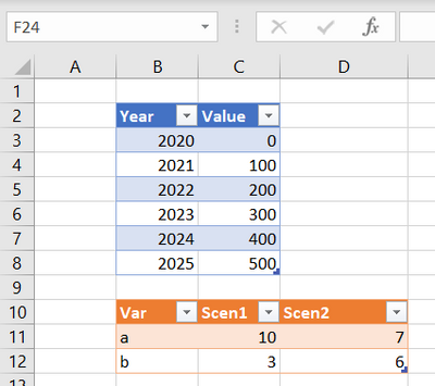
On Sheet1, put a table with the basic data (no formulas), and a table with the variables for each scenario.
What I want to do, is create a chart showing Value*a/b for each scenario, showing both scenarios at the same time.
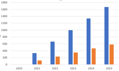
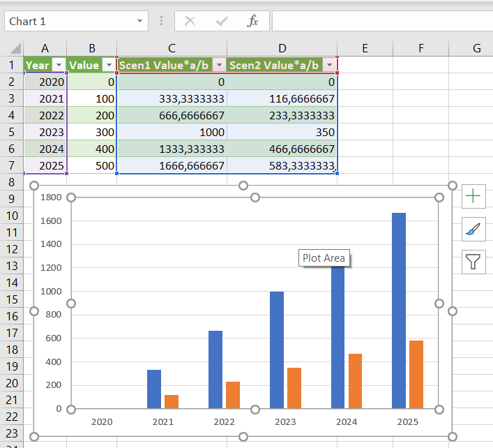
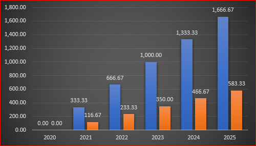
Below the intended end result, blue is scenario 1, orange is scenario 2:
I want the chart to update when I change the values for a and b in the variable table.
And I don't want to copy/paste values, or add columns per scenario to my data table (think of a case with not 1 but many columns per scenario, and this for 10 scenarios, the table would become huge).
Here are the steps I followed:
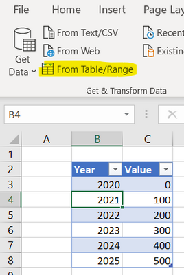
Step 1: a query for the data table
Create a new query (using "from Table/Range" in the Data section of the ribbon):
Press "Close & Load To", and select "Connection only".
Step 2: a query for the variables table
Do the same for tVar.
Step 3: a query to fetch the value of variable "a" for Scenario1
Now right click the tVar query in the Power Query Editor and select "Reference".
In the resulting query, right click on the value for variable a, Scenario 1, and select "Drill down"
The result is no longer a table, but the value itself (10):
Rename this query to "a1".
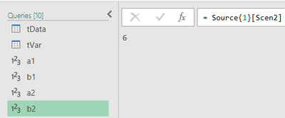
Steps 4-6: do the same for b1, a2 and b2
The result is this:
Step 7: make a table with Value*a/b for scenario 1
The same way I referenced tVar, I now referenced tData.
In the new query that is created this way, add a Custom Column, with formula
= [Value]*a1/b1
Rename this new query to tScen1.
Step 8: duplicate the previous query and change it to display Scenario2
Right click on query tScen1 and select duplicate.
The only thing to change in the duplicate is a1 -> a2 and b1 -> b2 in the formula
Rename this query to tScen2.
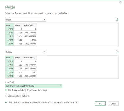
Step 9: Merge the last two queries into a new query representing both scenarios
Merge Queries as new:
This results in a new query "Merge1"
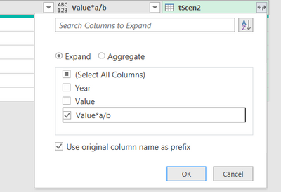
Rename "Merge1" to "tResult", and expand "tScen2"
only expand the calculated column:
The result is almost what we want:
Rename the two columns to the right for clarity:
Close and load creates a table in a new worksheet, based on which we can create the chart showing the two scenarios at once:
Conclusion
If I now want to change the variables, I just have to change them in my worksheet Sheet1 and Refresh All.
If I want to change the formula, I'll have to either adapt queries tScen1 and tScen2, or adapt tScen1, delete tScen1 and repeat step 8.
I still would prefer an easier way, eg. Scenario Reports that automatically update when the data is changed, but apparently that isn't possible at the moment.
- Mark as New
- Bookmark
- Subscribe
- Mute
- Subscribe to RSS Feed
- Permalink
- Report Inappropriate Content
Dec 26 2020 06:40 AM
I found an even better solution for displaying multiple scenarios simultaneously in one chart, without Power Query, based on these two articles: "How to Build Drop-Down Scenarios in Your Financial Model" and "Conveying Your Message by Charting Scenarios in Your Financial Model", apparently from the book "Financial Modeling in Excel For Dummies".
(I had to reverse engineer the second article, because it's incomplete and has an error in it, "Highlight cells A24:F2" should be "A24:F27").
The workbook attached contains a step-by-step explanation.
In short, it looks like this:
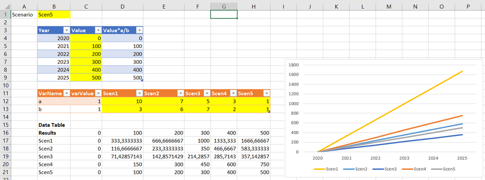
- The blue table is where the calculation is done (for one scenario at a time), fetching values from the orange table (C12 and C13), where the variables live.
- In B1, there's a "scenario switcher" (a simple data validation list), to choose the active scenario
- the values in C12 (variable a) are fetched from D12:H12 using an XLOOKUP with lookup value B1 (active scenario). Similar for C13 (variable b). This makes the worksheet and the calculated values respond to the drop-down in B1, and lets you change scenarios easily. But it still doesn't allow for simultaneous showing of all scenarios in one graph.
- the really smart part is the data table in B16:H21 (What-if Analysis > Data Table). It looks like a two-variable Data Table, but it's not. Instead, it's a one-variable Data Table with as "Column input cell" B1 (and no row input cell).
The data table then allows for the simultaneous showing of all scenarios in one graph.
What's great about this solution is that you can change the formula in the blue table, and all scenarios follow. And instead of copy-pasting the results for each scenario in a separate (static) table, the data table follows dynamically. And you can of course easily see, and display, the variable values for each scenario.
- Mark as New
- Bookmark
- Subscribe
- Mute
- Subscribe to RSS Feed
- Permalink
- Report Inappropriate Content
Dec 26 2020 06:42 AM
As variant:
tVar:
let
    Source = Excel.CurrentWorkbook(){[Name="tVar"]}[Content],
    #"Unpivoted Other Columns" = Table.UnpivotOtherColumns(
        Source, {"Var"},
        "Attribute", "Value"
    ),
    #"Grouped Rows" = Table.Group(
        #"Unpivoted Other Columns",
        {"Attribute"},
        {{"Var", each _[Value]{0}/_[Value]{1}}}
    ),
    #"Pivoted Column" = Table.Pivot(
        #"Grouped Rows",
        List.Distinct(#"Grouped Rows"[Attribute]),
        "Attribute", "Var", List.Sum
    )
in
    #"Pivoted Column"
tData:
let
    Source = Excel.CurrentWorkbook(){[Name="tData"]}[Content],
    #"Added Custom" = Table.AddColumn(Source, "Custom", each tVar),
    #"Expanded Custom" = Table.ExpandTableColumn(
        #"Added Custom",
        "Custom",
        {"Scen1", "Scen2"},
        {"Scen1", "Scen2"}
    ),
    #"Inserted Multiplication" = Table.AddColumn(
        #"Expanded Custom",
        "Scen1 Value*a/b",
        each [Value] * [Scen1],
        type number
    ),
    #"Inserted Multiplication1" = Table.AddColumn(
        #"Inserted Multiplication",
        "Scen2 Value*a/b",
        each [Value] * [Scen2],
        type number
    ),
    #"Removed Other Columns" = Table.SelectColumns(
        #"Inserted Multiplication1",
        {"Year", "Value", "Scen1 Value*a/b", "Scen2 Value*a/b"}
    )
in
    #"Removed Other Columns"
Load tData to data model only and build PivotChart
- Mark as New
- Bookmark
- Subscribe
- Mute
- Subscribe to RSS Feed
- Permalink
- Report Inappropriate Content
Dec 26 2020 07:08 AM
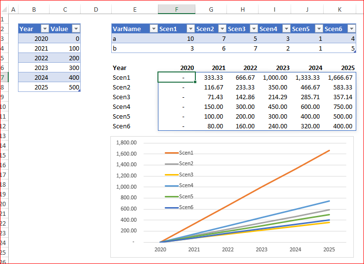
@bartvana Followed this tread the last couple of days. Was wondering why you need such a complicated approach at all. A simple structured table with the calculations, linked to the variables for each scenario (your orange table) achieved all in one go. And it expands automatically. Add an extra year end the graph will expand with it. See attached.
But perhaps I'm missing the point all together.
- Mark as New
- Bookmark
- Subscribe
- Mute
- Subscribe to RSS Feed
- Permalink
- Report Inappropriate Content
Dec 26 2020 07:36 AM
SolutionOne more scenario is with dynamic arrays
where
years:
=TRANSPOSE(tData[[#All],[Year]])

scens:
=TRANSPOSE(INDEX(tVar[#Headers],1,SEQUENCE(,COLUMNS(tVar)-1,2)))

data:
=TRANSPOSE(tData[Value])*
 TRANSPOSE(INDEX(tVar,1,SEQUENCE(,COLUMNS(tVar)-1,2))/
           INDEX(tVar,2,SEQUENCE(,COLUMNS(tVar)-1,2)
 )
)- Mark as New
- Bookmark
- Subscribe
- Mute
- Subscribe to RSS Feed
- Permalink
- Report Inappropriate Content
Dec 26 2020 09:05 AM
No problem, thanks for thinking with me :)
It was a pleasure.
And now that you've gotten some solutions, beginning with your own via Power Query [which isn't available to my Mac world yet], and then solutions from true MVPs @Sergei Baklan and @Riny_van_Eekelen -- solutions that go way beyond my abilities -- you can end 2020 on an Excel high!
It's fun to be part of this creative, and learning, community!
- Mark as New
- Bookmark
- Subscribe
- Mute
- Subscribe to RSS Feed
- Permalink
- Report Inappropriate Content
Dec 26 2020 09:25 AM
@mathetes , don't simplify, with your great experience your input is always valuable. Each of us has strong and wear points. That's advantage of this resource we may discuss concrete task from different points of view.
- Mark as New
- Bookmark
- Subscribe
- Mute
- Subscribe to RSS Feed
- Permalink
- Report Inappropriate Content
Dec 26 2020 02:12 PM
There are times though when I'm very aware of how much there is for me to learn. Fortunately, I enjoy learning.
- Mark as New
- Bookmark
- Subscribe
- Mute
- Subscribe to RSS Feed
- Permalink
- Report Inappropriate Content
Dec 28 2020 03:19 AM
@Riny_van_Eekelen wrote:@bartvana Followed this tread the last couple of days. Was wondering why you need such a complicated approach at all. A simple structured table with the calculations, linked to the variables for each scenario (your orange table) achieved all in one go. And it expands automatically. Add an extra year end the graph will expand with it. See attached.
But perhaps I'm missing the point all together.
Thanks for answering!
My example is indeed extremely simplified in an attempt to make my point clear, and in its simplified form, it does allow for a solution like yours (which is also interesting of course).
But imagine you don't have one column with a formula, but 7, each with a different formula, and you want these 7 columns to adapt to 5 scenarios. You'd have 7*5 = 35 columns in the table. Plus, if you'd want to adapt one formula, you'd have to repeat this adaptation 7 times, which is monkey work I always try to avoid.
- Mark as New
- Bookmark
- Subscribe
- Mute
- Subscribe to RSS Feed
- Permalink
- Report Inappropriate Content
Dec 28 2020 04:18 AM
@Sergei Baklan Those are really fabulous and very smart and elegant solutions (both the dynamic array and the queries with pivoting). Learned a lot by trying to follow the logic, thanks!
One thing that does bother me a bit in these solutions, is that the formulas are kind of "hidden away" (in the query, and to a lesser degree also in the dynamic array). I know from experience that when I open a workbook that I made a few months earlier, I sometimes have to scratch my head and spend time trying to understand my own prior logic :) Which is another waste of time in a sense.
In this respect, I finally prefer the setup where the basic data and calculations are in one, easy to understand table, that one can follow from left to right, with references to the table headers etc. (In my example the blue table). Then a second table with the variables per scenario. And then "something" (a third table, or query, or ...) that takes care of mashing up the first and second table to display the different scenarios.
This wasn't of course clarified in my original question (I'm discovering what I really want along the way, I'm afraid), so your solutions definitely win the prize for most elegant solutions for the question as it was stated. I apologize for not being very clear in my initial question also.
If you feel like thinking further about this, I was wondering how you would solve the problem having the formula within the blue table? (If different from already posted answers).
Accepted Solutions
- Mark as New
- Bookmark
- Subscribe
- Mute
- Subscribe to RSS Feed
- Permalink
- Report Inappropriate Content
Dec 26 2020 07:36 AM
SolutionOne more scenario is with dynamic arrays
where
years:
=TRANSPOSE(tData[[#All],[Year]])

scens:
=TRANSPOSE(INDEX(tVar[#Headers],1,SEQUENCE(,COLUMNS(tVar)-1,2)))

data:
=TRANSPOSE(tData[Value])*
 TRANSPOSE(INDEX(tVar,1,SEQUENCE(,COLUMNS(tVar)-1,2))/
           INDEX(tVar,2,SEQUENCE(,COLUMNS(tVar)-1,2)
 )
)