- Subscribe to RSS Feed
- Mark Discussion as New
- Mark Discussion as Read
- Pin this Discussion for Current User
- Bookmark
- Subscribe
- Printer Friendly Page
- Mark as New
- Bookmark
- Subscribe
- Mute
- Subscribe to RSS Feed
- Permalink
- Report Inappropriate Content
Jul 15 2021 04:22 AM - edited Jul 15 2021 04:23 AM
Hi,
I'm using MS Office 365 on PC/Windows 10 version 21H1.
I've been trying to create a map chart both in PowerPoint and Excel but have been unsuccessful.
Whichever way I do it, I cannot make the chart display correctly. First of all a message pops up and secondly, the adjusted data (by country) makes the whole map disappear, regardless of which display selection I choose (Automatic, country/region; multiple countries/regions; only regions with data; or World). Nothing I do makes the map display. I've attached screen shots for both pptx and xls which I hope are legible. Would anyone be able to tell me the reason why this happens, please? It's driving me nuts!
Thank you.
- Labels:
-
Charting
-
Excel
-
Office 365
- Mark as New
- Bookmark
- Subscribe
- Mute
- Subscribe to RSS Feed
- Permalink
- Report Inappropriate Content
Jul 15 2021 04:36 AM
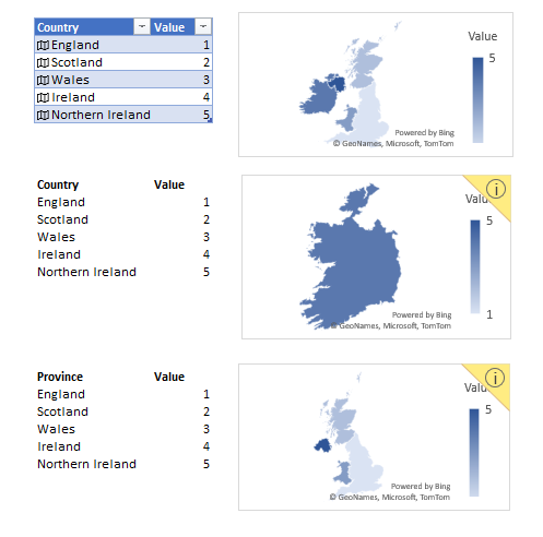
Map Charts is quite sensitive to column names and data layout, e.g.
If you use structured table and linked data types, it shows everything.
In the middle it shows only Ireland as Country.
If change Country on Province as in the latest sample, it shows all but Ireland.
I don't think it will properly work on generated by PivotTable data, at least you ay try with correct field names.
- Mark as New
- Bookmark
- Subscribe
- Mute
- Subscribe to RSS Feed
- Permalink
- Report Inappropriate Content
Jul 15 2021 08:11 AM
Hi @tribalartdesign63
I tried to create map chart in Office365 hope you will like it.
I used ChartExpo™ For Excel & Office365 to create these charts from few clicks.
There is no requirement of coding skills.
It is also available for Google Sheets.
Regards!
- Mark as New
- Bookmark
- Subscribe
- Mute
- Subscribe to RSS Feed
- Permalink
- Report Inappropriate Content
Jul 15 2021 09:53 AM
@Sergei Baklan Thank you, Sergei. Are you saying I need to add filters to the columns? When you insert a new map chart in PowerPoint it looks like the image below. There are no named columns. All I did was replace the existing labels/data - at which point everything disappeared, regardless of which map area I wanted to show.
After I added filters on the columns (2nd image below), I managed to show England and Scotland but as soon as I included the next Country and data into the selection, everything disappeared again and it didn't matter to what I changed the area selection. Once I included Ireland in the data set, it showed only Ireland and not the previous Countries in the data set. Again, no matter what area selection I chose.
I think I've worked out now that it's just not possible to show the UK only. I even rearranged the order of the Countries but it made no difference. I'm giving up on Map charts. They're a waste of time for my purposes and I won't be using them again until Microsoft have stabilised it and sorted out the Country shapes!
Thank you very much for your help :)


