- Subscribe to RSS Feed
- Mark Discussion as New
- Mark Discussion as Read
- Pin this Discussion for Current User
- Bookmark
- Subscribe
- Printer Friendly Page
- Mark as New
- Bookmark
- Subscribe
- Mute
- Subscribe to RSS Feed
- Permalink
- Report Inappropriate Content
Oct 29 2018 12:18 PM
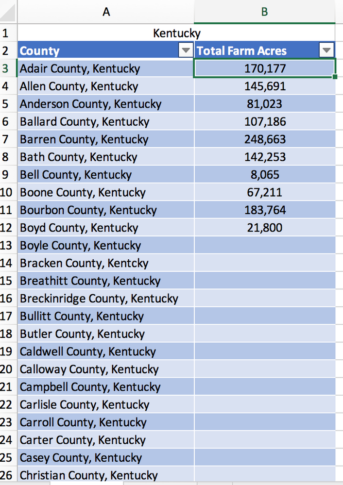
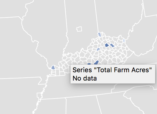
Okay, so I'm making a project to show data for each county in Kentucky. My table is formatted with Column A having the heading "County" and Column B having the heading "Acres Used for Farm Land"--the data. However, when I go to the recommended charts, It only gives me the option to use a United States map instead of a Kentucky state map. To make matters worse, it is showing two of the counties in different states (one in Arkansas and another in Indiana). I went through and added ", Kentucky" to the end of all the counties; however, this did not fix the problem. Any answers or possible troubleshooting I could do? Pictures are attached. Thanks
- Labels:
-
Charting
-
Excel
-
Excel on Mac
-
Map Chart
- Mark as New
- Bookmark
- Subscribe
- Mute
- Subscribe to RSS Feed
- Permalink
- Report Inappropriate Content
Oct 29 2018 01:25 PM
Hello,
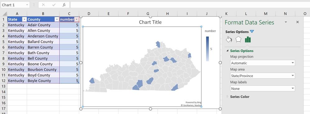
if you add a column for State and enter Kentucky in all cells, then the map can be configured to show Kentucky only and the counties will be plotted correctly.
- Mark as New
- Bookmark
- Subscribe
- Mute
- Subscribe to RSS Feed
- Permalink
- Report Inappropriate Content
Oct 29 2018 06:16 PM
Thank You so much!! Life Saver. I just have one more question. I want to change the legend for the map chart. It is auto set for the faded shades as the numbers fall; however, I would like to seperate the data into seperate categories. For example, I want 0-60,000 to be one color, 60,001-120,000 to be another, and so on. Is there a way to do this?
- Mark as New
- Bookmark
- Subscribe
- Mute
- Subscribe to RSS Feed
- Permalink
- Report Inappropriate Content
Oct 29 2018 09:23 PM - edited Oct 30 2018 02:53 AM
You can't have distinct colors for a range of numbers, but you can define up to three colors in a gradient.
In the Format Data Series panel click on Series Color and select Diverging (3-color). You can change the colors and you can change the minimum, midpoint and maximum to exact numbers. Set Minimum to 0, midpoint to 60000 and maximum to 120000.
If you don't like the gradients, then you need to add a column to your data table and use formulas to translate 0 - 60,000 to 1, 60,001 - 120,000 to 2, 120,001 to whatever to 3, etc. Then use the column with the values 1, 2, 3 to plot the chart and set the colors for these numbers as described above.
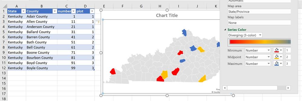
In the following screenshot I have added a formula to the data table to generate numbers from 1 to 3 for the number ranges in column C, using
=IFS([@number]<33,1,[@number]<66,2,TRUE,3)
Then I changed the chart series definition to plot the numbers from column D instead of C and gave each of the three number a distinct color.
If you want more than three distinct colors, use the "lowest value", "middle value", and "highest value" instead of numbers and set your thresholds. With "x" distinct number of values in column D, there will be "x" distinct colors in the map, but they will be a mix of the "start" and the "end" color. You won't be able to define "x" exact hues.
- Mark as New
- Bookmark
- Subscribe
- Mute
- Subscribe to RSS Feed
- Permalink
- Report Inappropriate Content
Nov 05 2018 01:10 PM
Virginia is composed of 133 Cities and Counties.
How do I plot Richmond City in Excel? 2016 3D Maps? 2019 Map Charts?
It seems to only know about Richmond County, which is entirely different than Richmond City.
- Mark as New
- Bookmark
- Subscribe
- Mute
- Subscribe to RSS Feed
- Permalink
- Report Inappropriate Content
Jun 02 2023 12:29 PM - edited Jun 02 2023 12:34 PM
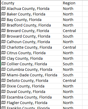
I am having the same issue with Counties in Florida, where some show in other states even though the series has a field with Florida listed and the county selection is via a drop box. And some counties don't even generate a map even though they are spelled correctly, like St. Johns and St. Lucie Counties.
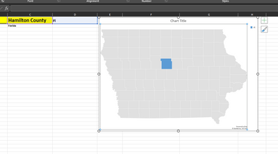
So if I select Hamilton County from the drop down list and in the very next cell it says FL or Florida, the map chart still shows Hamilton county Iowa and not Hamilton County Florida.
- Mark as New
- Bookmark
- Subscribe
- Mute
- Subscribe to RSS Feed
- Permalink
- Report Inappropriate Content
Jan 16 2024 04:14 PM
Ive been having the same issue for counties in PA. Ive tried 100 different ways. Ive made county maps for PA using excel in the past, but it no longer works.
- Mark as New
- Bookmark
- Subscribe
- Mute
- Subscribe to RSS Feed
- Permalink
- Report Inappropriate Content
- Mark as New
- Bookmark
- Subscribe
- Mute
- Subscribe to RSS Feed
- Permalink
- Report Inappropriate Content
Apr 10 2024 12:38 PM
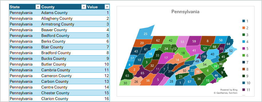
@Sergei Baklan I'm trying to replicate your map to show numbers of occurrences for each county. I can't get it to show the value in each county - it's only showing the color related to the number value. I compared my sheet to yours but can't seem to find what I've missed. Plus, it shows the data going over the Great Lakes....Any suggestions?
- Mark as New
- Bookmark
- Subscribe
- Mute
- Subscribe to RSS Feed
- Permalink
- Report Inappropriate Content
Apr 10 2024 12:47 PM
- Mark as New
- Bookmark
- Subscribe
- Mute
- Subscribe to RSS Feed
- Permalink
- Report Inappropriate Content
- Mark as New
- Bookmark
- Subscribe
- Mute
- Subscribe to RSS Feed
- Permalink
- Report Inappropriate Content
Apr 10 2024 12:52 PM
- Mark as New
- Bookmark
- Subscribe
- Mute
- Subscribe to RSS Feed
- Permalink
- Report Inappropriate Content
Apr 10 2024 12:53 PM
- Mark as New
- Bookmark
- Subscribe
- Mute
- Subscribe to RSS Feed
- Permalink
- Report Inappropriate Content
Apr 10 2024 12:55 PM
- Mark as New
- Bookmark
- Subscribe
- Mute
- Subscribe to RSS Feed
- Permalink
- Report Inappropriate Content
Apr 10 2024 12:56 PM
- Mark as New
- Bookmark
- Subscribe
- Mute
- Subscribe to RSS Feed
- Permalink
- Report Inappropriate Content
Apr 10 2024 12:59 PM
- Mark as New
- Bookmark
- Subscribe
- Mute
- Subscribe to RSS Feed
- Permalink
- Report Inappropriate Content
Apr 10 2024 01:03 PM
- Mark as New
- Bookmark
- Subscribe
- Mute
- Subscribe to RSS Feed
- Permalink
- Report Inappropriate Content
Apr 10 2024 01:09 PM
- Mark as New
- Bookmark
- Subscribe
- Mute
- Subscribe to RSS Feed
- Permalink
- Report Inappropriate Content
- Mark as New
- Bookmark
- Subscribe
- Mute
- Subscribe to RSS Feed
- Permalink
- Report Inappropriate Content
