- Home
- Microsoft 365
- Excel
- Map Charts - Impressive but needs better instructions
Map Charts - Impressive but needs better instructions
- Subscribe to RSS Feed
- Mark Discussion as New
- Mark Discussion as Read
- Pin this Discussion for Current User
- Bookmark
- Subscribe
- Printer Friendly Page
Dec 16 2016
03:19 PM
- last edited on
Jul 25 2018
09:36 AM
by
TechCommunityAP
- Mark as New
- Bookmark
- Subscribe
- Mute
- Subscribe to RSS Feed
- Permalink
- Report Inappropriate Content
Dec 16 2016
03:19 PM
- last edited on
Jul 25 2018
09:36 AM
by
TechCommunityAP
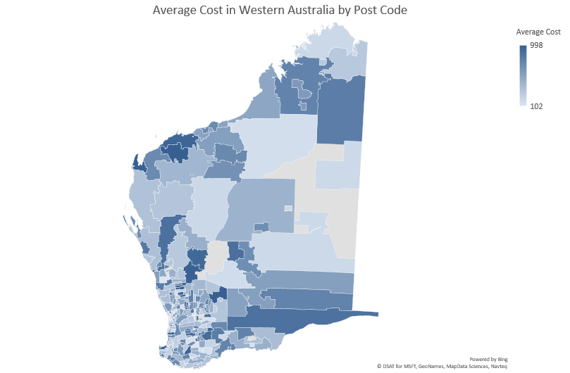
So I just installed the latest update to Excel 2016 and now have access to Map Charts.
This is not the same as 3D maps (Which are very cool, see video below then show this to the next person who tells you that Google sheets is as good as Excel...!)
So back to map charts...
First question: How on earth do I use them? Come on Excel Team, give a little more guidance!
So after doing a bit of searching in the Excel help menu I found a short video which looked great but was largely unhelpful in how I need to set up my data
My findings so far
Start with a 2 column table with unique values.

Then get a little more adventurous by using a 3 column table
The Table headings are important ! Zip Code works, Post Code does not

Also it appears that if you have a few values you will get unique entries in the legend but for bigger data sets it will give you a heat map type scale.
I eventuall found this more useful guide..
There's some great potential here but adoption will be very slow without better up front instructions.
- Labels:
-
Charts & Visualizing Data
-
Tutorial
