- Home
- Microsoft 365
- Excel
- Re: Map Chart Series Color Customization
Map Chart Series Color Customization
- Subscribe to RSS Feed
- Mark Discussion as New
- Mark Discussion as Read
- Pin this Discussion for Current User
- Bookmark
- Subscribe
- Printer Friendly Page
- Mark as New
- Bookmark
- Subscribe
- Mute
- Subscribe to RSS Feed
- Permalink
- Report Inappropriate Content
Mar 07 2023 05:28 AM
Dear all,
I've been trying to create this map chart for a while and I came across a problem. I'll try to explain what I've been trying to do step by step:
- I have a list of cities that are in the same country and a column of data according to these cities,
- I can insert a map chart without any problem,
- What I want to do is basically coloring each city with a solid color according to the interval of their respective data,
- I conditional formatted the data to be highlighted in a certain color (for example if data of city A is between x and y, highlight it in green) and I have 5 different intervals (which also means 5 different colors to be projected on the map chart),
- I want each city to be colored as the conditional formatting's rules color. But not like a gradient coloring, need them to be solid colors.
- I also want this to be automatic since the data has about 80 cities.
Is there any way that I can do this? I'm open to any solution.
Thanks for your help!
- Labels:
-
Excel
-
Office 365
- Mark as New
- Bookmark
- Subscribe
- Mute
- Subscribe to RSS Feed
- Permalink
- Report Inappropriate Content
Mar 13 2023 08:38 AM
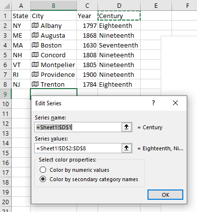
SolutionTo use colored categories (instead of gradients for numeric values), first add a column that contains identifiers for your categories. In my example below, it is the Century column. Edit your data series (right-click any city on your map; click "Select Data…"; select your desired - probably the only - series in the Legend Entries (Series) box; press the Edit button). Change the "Series values" to a range in the category column (and, if appropriate, change also the "Series name"). Click the "Color by secondary category names" radio button, then the OK button.
And of course, click the OK button to close the Select Data Source dialog, saving your changes.
The (gradient and non-gradient) colors for your categories are selectable from the usual chart-coloring tool.
Excel creates only choropleth maps, for which regions of the map area are colored. For mapping data for cities, it might be more user friendly to use a symbol map. Microsoft's old MapPoint software was good at this; presumably Bing Maps can do the same. Other alternatives are Google Maps (although I don't recall if you can map categories to custom icons automatically) or the website Datawrapper.de.
- Mark as New
- Bookmark
- Subscribe
- Mute
- Subscribe to RSS Feed
- Permalink
- Report Inappropriate Content
Mar 14 2023 12:28 PM
Accepted Solutions
- Mark as New
- Bookmark
- Subscribe
- Mute
- Subscribe to RSS Feed
- Permalink
- Report Inappropriate Content
Mar 13 2023 08:38 AM
SolutionTo use colored categories (instead of gradients for numeric values), first add a column that contains identifiers for your categories. In my example below, it is the Century column. Edit your data series (right-click any city on your map; click "Select Data…"; select your desired - probably the only - series in the Legend Entries (Series) box; press the Edit button). Change the "Series values" to a range in the category column (and, if appropriate, change also the "Series name"). Click the "Color by secondary category names" radio button, then the OK button.
And of course, click the OK button to close the Select Data Source dialog, saving your changes.
The (gradient and non-gradient) colors for your categories are selectable from the usual chart-coloring tool.
Excel creates only choropleth maps, for which regions of the map area are colored. For mapping data for cities, it might be more user friendly to use a symbol map. Microsoft's old MapPoint software was good at this; presumably Bing Maps can do the same. Other alternatives are Google Maps (although I don't recall if you can map categories to custom icons automatically) or the website Datawrapper.de.
