- Home
- Microsoft 365
- Excel
- Re: Making combo graph in Excel or PowerPoint for Mac
Making combo graph in Excel or PowerPoint for Mac
- Subscribe to RSS Feed
- Mark Discussion as New
- Mark Discussion as Read
- Pin this Discussion for Current User
- Bookmark
- Subscribe
- Printer Friendly Page
- Mark as New
- Bookmark
- Subscribe
- Mute
- Subscribe to RSS Feed
- Permalink
- Report Inappropriate Content
Jul 25 2022 05:57 PM
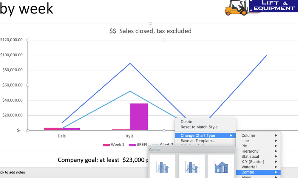
Hello. I have researched how to do this but I don't get the same command. I simply need to change the selection of which column of my data gets shown in the line, and which ones stay as columns in a combo graph. I really need this for PPT but the problem happens in Excel too: at the point right after I select "Chart type / Combo / Clustered Column - Line" there is SUPPOSED to be (according to all the videos and articles) a box that says "Choose the chart type and axis for your data series." This does not appear.
This image below is what I actually see - after I select Combo chart then I do not see "how choose the chart type and axis for my data series"

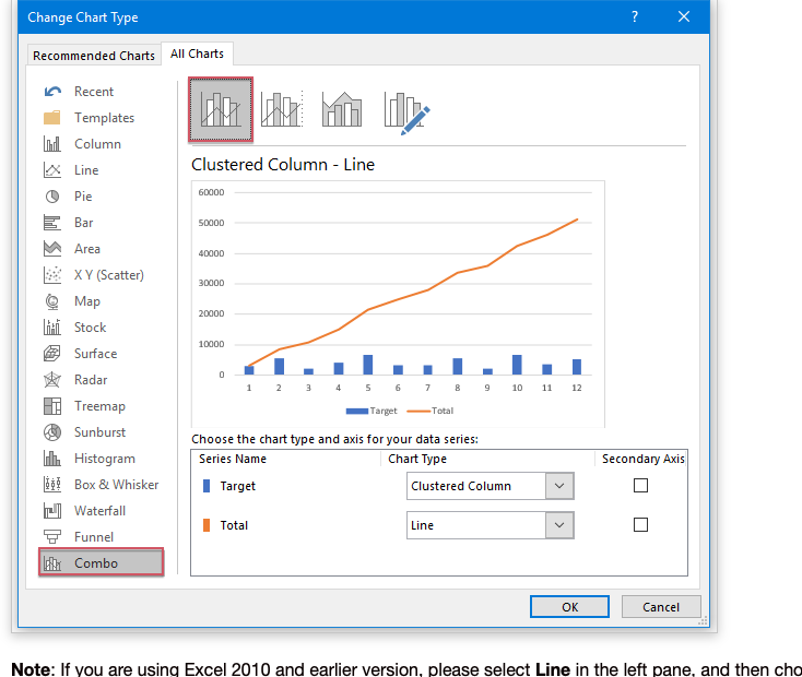
Here is the help article showing me what I should see: You see that box at the bottom of the screen "Choose the chart type and axis for your data series."? I can't find those commands. I don't get that option.
I have spent 4 hours online research and 2.5 hours with Office 365 help and still can't solve this.
- Labels:
-
Charting
-
Excel on Mac
-
Office 365
- Mark as New
- Bookmark
- Subscribe
- Mute
- Subscribe to RSS Feed
- Permalink
- Report Inappropriate Content
Jul 25 2022 10:11 PM - edited Jul 25 2022 11:20 PM
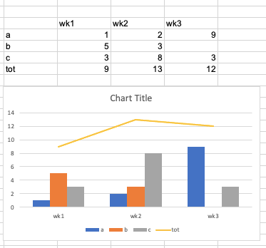
@NancyMCM The "Change Chart Type" window exists in the PC version only. In Excel for Mac, the easiest way is to create a regular column chart first. Note with the data structure like in your picture, you'd have to switch row/column to get the weeks on the horizontal axis with four columns, the fourth on being the Total.
Now, click on any of the Total columns (this will select all of them) and press change chart type, and choose the icon for a line chart. That's it.
Example:


