- Subscribe to RSS Feed
- Mark Discussion as New
- Mark Discussion as Read
- Pin this Discussion for Current User
- Bookmark
- Subscribe
- Printer Friendly Page
- Mark as New
- Bookmark
- Subscribe
- Mute
- Subscribe to RSS Feed
- Permalink
- Report Inappropriate Content
Jun 16 2021 12:40 PM
I am stuck with a graph that I am trying to create. I want to create a Profit and Loss line graph (with markers) of a stock that I have recently bought.
Y-axis: Profit and Loss amount
X-axis: Different Prices Range
Also, I would like to highlight the current market price of the stock with a horizontal line or some sort of marker. How do I do that? I have spent 3 hrs trying to do that, but no success. Please help. Best, Varun
If you refer to the attached file at the top, that is what I am trying to replicate in MSExcel. I just need help with marking the current price of the stock (refer to a red dot in above snippet) in excel. If I click on 'select data' I don't get any reference to axis.
- Labels:
-
Charting
- Mark as New
- Bookmark
- Subscribe
- Mute
- Subscribe to RSS Feed
- Permalink
- Report Inappropriate Content
Jun 16 2021 01:32 PM
Hi,
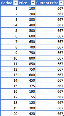
You need a table with 3 columns:
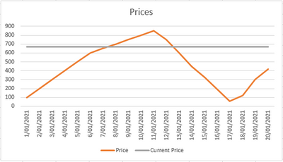
The 'Period' should be the date/time period, 'Price' is the price at that time period, 'Current Price' is a calculated column showing the current price. The current price column will add an additional line to the graph showing a current price line.
- Mark as New
- Bookmark
- Subscribe
- Mute
- Subscribe to RSS Feed
- Permalink
- Report Inappropriate Content
Jun 16 2021 07:41 PM
@StoneKiwi Thanks for your reply. Basically, as I have mentioned in my mail, this is a Profit and Loss (P&L) graph. I have attached the image that what I am looking at.
X-axis (horizontal) - Stock Price Range
Y-axis (vertical) - P&L amount
X-axis (horizontal) - Current market price of the stock (depicting with a line).
Thank you once again for your support.
- Mark as New
- Bookmark
- Subscribe
- Mute
- Subscribe to RSS Feed
- Permalink
- Report Inappropriate Content
Jun 16 2021 07:54 PM
- Mark as New
- Bookmark
- Subscribe
- Mute
- Subscribe to RSS Feed
- Permalink
- Report Inappropriate Content
Jun 17 2021 12:02 AM
Solution@Varun_Aggarwal The data in you picture doesn't seem to correspond with the graph, but perhaps the attached file has what you asked for.
First add a column with the P&L figure, only for the row with the current price. All others need to be #N/A.
Then create a scatter chart and add vertical error bars for the "current price" series as described in the article referred to by @StoneKiwi
Now select the P&L series and change the chart type to a line.
- Mark as New
- Bookmark
- Subscribe
- Mute
- Subscribe to RSS Feed
- Permalink
- Report Inappropriate Content
Accepted Solutions
- Mark as New
- Bookmark
- Subscribe
- Mute
- Subscribe to RSS Feed
- Permalink
- Report Inappropriate Content
Jun 17 2021 12:02 AM
Solution@Varun_Aggarwal The data in you picture doesn't seem to correspond with the graph, but perhaps the attached file has what you asked for.
First add a column with the P&L figure, only for the row with the current price. All others need to be #N/A.
Then create a scatter chart and add vertical error bars for the "current price" series as described in the article referred to by @StoneKiwi
Now select the P&L series and change the chart type to a line.

