- Subscribe to RSS Feed
- Mark Discussion as New
- Mark Discussion as Read
- Pin this Discussion for Current User
- Bookmark
- Subscribe
- Printer Friendly Page
- Mark as New
- Bookmark
- Subscribe
- Mute
- Subscribe to RSS Feed
- Permalink
- Report Inappropriate Content
Sep 29 2020 11:39 PM
I was wondering if the KPI Status can be included for slicer tool filtering in the pivot table.
Please help
- Labels:
-
Excel
- Mark as New
- Bookmark
- Subscribe
- Mute
- Subscribe to RSS Feed
- Permalink
- Report Inappropriate Content
Oct 04 2020 10:39 AM
- Mark as New
- Bookmark
- Subscribe
- Mute
- Subscribe to RSS Feed
- Permalink
- Report Inappropriate Content
Oct 04 2020 11:54 AM
I don't think so. KPI Status is actually the measure, you can't add slicer on measure.
- Mark as New
- Bookmark
- Subscribe
- Mute
- Subscribe to RSS Feed
- Permalink
- Report Inappropriate Content
Oct 04 2020 10:39 PM
I understood your request, you can work around it by 1st ranking the original data using if condition, then you can create your slicer.
In this example, I labeled the data I have based on ranking, 1st 400 cities got "Green" then "Yellow" then "Red"
Then just add the slicer.
- Mark as New
- Bookmark
- Subscribe
- Mute
- Subscribe to RSS Feed
- Permalink
- Report Inappropriate Content
Oct 05 2020 02:44 AM - edited Oct 06 2020 03:09 AM
@Excel ,,
Possibly this may help you.
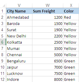
Source Tale:
N.B.
- Color is Helper Column, for neatness later on you may hide it.
- Formula in cell X2, fill it down.
=IF(W2>=6000,"Green",IF(W2>=1500,"Yellow",IF(W2<1500,"Red")))
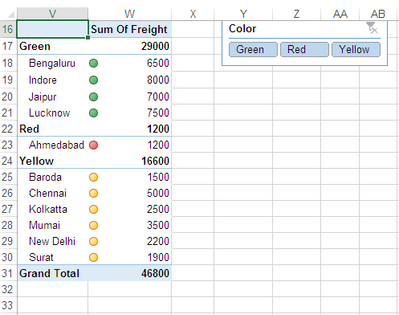
Pivot Table & Slicer:
How it works:
- Create PT, put City Name & Color in Row, and Sum Of Freight as Value.
- Select PT, Right click and from Pivot Tale Option dialogue, hit Display and un-check, Show Expand Collapse button.
3. In Data section, select Refresh Data When Open file.
4. Now create Slicer and from it's setting, set column to 3.
- You may keep as original also.
Now this is the tricky part.
- Apply Condition Formatting to each part separably.
- Select W18:W21 and apply ICON Set using following rules as show below.
3. Now copy Condition Formatting on W23 and W25:W30.
- Reason for doing this is to skip ROW Totals while Filter with Slicer.
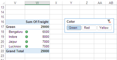
Now start clicking slicer buttons to filter data.
:Green:
:Yellow:
:Red:
- Mark as New
- Bookmark
- Subscribe
- Mute
- Subscribe to RSS Feed
- Permalink
- Report Inappropriate Content
Oct 05 2020 07:44 AM
@Ramiz_Assaf , @Rajesh_Sinha ,
IMHO, such workarounds are quite limited since they are based on source data, not on calculated values as data model KPI. For example, if we have yellow for +-20 of average, red for below and green for upper values, this status will be shown not on only on all cities, but on filtered context as well. If we filter by country, that will be the status for this country average. Or for any filter we will apply.
- Mark as New
- Bookmark
- Subscribe
- Mute
- Subscribe to RSS Feed
- Permalink
- Report Inappropriate Content
Oct 06 2020 03:15 AM - edited Oct 06 2020 03:16 AM
KPI should use basic as well calculated data,, and sometimes to fix the issue we have to follow non traditional methods, and that's what I did.
I've applied ICON sets on numeric column,, and while filter usually adjacent value appears, nothing new,, the method I've used address the core issue,, and it was only my intentions.


