- Home
- Microsoft 365
- Excel
- Is there a formula to aid in organizing the data by count (many) ranges to generate a chart?
Is there a formula to aid in organizing the data by count (many) ranges to generate a chart?
- Subscribe to RSS Feed
- Mark Discussion as New
- Mark Discussion as Read
- Pin this Discussion for Current User
- Bookmark
- Subscribe
- Printer Friendly Page
- Mark as New
- Bookmark
- Subscribe
- Mute
- Subscribe to RSS Feed
- Permalink
- Report Inappropriate Content
Apr 28 2023 06:43 AM - edited Apr 28 2023 06:46 AM
I have this (sample raw data) sheet here I need to achieve the following (make a chart) -
SAMPLE RAW DATA PREVIEW
| Insitution Name | State | Count |
| Legacy Bank | MA | 168 |
| PeoplesBank | MA | 657 |
| The Pittsfield Co-Operative Bank | MA | 326 |
- Group "Counts" into ranges of 1-200 and list the associated Institution names in the "name column"
Right now there are many "names" with associated values 1,1,1 2,2 .... and so on.
I need to group the ranges so I can see which range has most names.
How can I do this? What formula I can use to organize and generate a chart?
I've tried using Pivot but that doesnt do the job in excel, SO I'm a bit at a dead end now
- Labels:
-
Excel
-
Formulas and Functions
- Mark as New
- Bookmark
- Subscribe
- Mute
- Subscribe to RSS Feed
- Permalink
- Report Inappropriate Content
May 11 2023 02:04 PM
For clarity, I am going to use alphanumeric identifiers for the groups of counts – G01, G02, etc. – and I'll call those CountGroupIDs. To derive the CountGroupID values, add a helper column and put this formula into it (specifically for row 2; copy it down as needed):
="G" & TEXT( CEILING.MATH(C2/200), "00" )(Blank or somewhat-negative values for Count will be assigned G00. I'm also assuming that Count does not exceed 20,000; if it could, you can just add an extra zero in the last argument, making the IDs four characters in length.)
That might be enough of an answer to get you to a solution using a pivot table. If not, or if you don't want to use a pivot table…
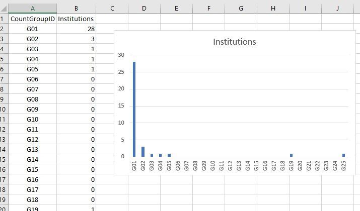
I would create an additional worksheet, and load up column A with the possible CountGroupID values. (If you want that list to contain only the groups that actually exist, you can use a formula like =UNIQUE(Sheet2!D2:D99999).) Use the following formula in column B (in row 2; copy it down as needed) to get data for the chart:
=COUNTIF( Sheet2!D:D, A2 )(Of course, replace the "D:D" if you used a different helper column on Sheet2.)
If you wish, sort that range on the second column (Largest to Smallest). Chart as desired.
