- Home
- Microsoft 365
- Excel
- Re: Interactive Dashboard chart from multiple splicers
Interactive Dashboard chart from multiple splicers
- Subscribe to RSS Feed
- Mark Discussion as New
- Mark Discussion as Read
- Pin this Discussion for Current User
- Bookmark
- Subscribe
- Printer Friendly Page
- Mark as New
- Bookmark
- Subscribe
- Mute
- Subscribe to RSS Feed
- Permalink
- Report Inappropriate Content
Feb 26 2022 12:43 AM
I have created 3 different charts of the same type from 3 different sets of data. I create them by using pivot table and splicer. How do I transform them into a single dashboard chart but able to show the different chart interactively one at a time. I also intend to add more data sets to this chart .Attached is my workbook .
- Mark as New
- Bookmark
- Subscribe
- Mute
- Subscribe to RSS Feed
- Permalink
- Report Inappropriate Content
Feb 26 2022 03:23 AM
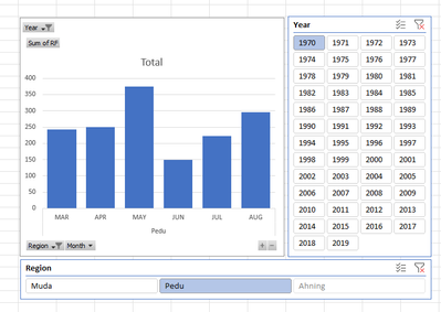
Solution@Liphor Something like in the attached file perhaps? It's just a very rough model, based on your data and done with Power Pivot and would require further refining though. Use the slicers to select the year and region.
- Mark as New
- Bookmark
- Subscribe
- Mute
- Subscribe to RSS Feed
- Permalink
- Report Inappropriate Content
Feb 26 2022 05:56 AM
- Mark as New
- Bookmark
- Subscribe
- Mute
- Subscribe to RSS Feed
- Permalink
- Report Inappropriate Content
Feb 26 2022 11:25 PM
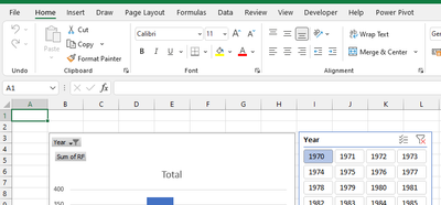
@Liphor Not sure about 2016, but in 2021 you should see Power Pivot in the top menu as shown in the top right-hand corner of the picture below.
- Mark as New
- Bookmark
- Subscribe
- Mute
- Subscribe to RSS Feed
- Permalink
- Report Inappropriate Content
Feb 27 2022 05:45 PM
- Mark as New
- Bookmark
- Subscribe
- Mute
- Subscribe to RSS Feed
- Permalink
- Report Inappropriate Content
Feb 27 2022 11:01 PM
@Liphor In this particular case I connected to each of the rainfall tables with Power Query, where I transformed them to a usable format and in one table. Then loaded the single table into the Data model (i.e. Power Pivot) from which the Pivot Chart was created.
All was intended to demonstrate what's possible, but as said it's very rough and if I would start from scratch I would probable do it differently. I.e. create a single (tabular) database from the start, use proper dates rather than year numbers and short codes for the months.
- Mark as New
- Bookmark
- Subscribe
- Mute
- Subscribe to RSS Feed
- Permalink
- Report Inappropriate Content
Mar 17 2022 11:09 PM
- Mark as New
- Bookmark
- Subscribe
- Mute
- Subscribe to RSS Feed
- Permalink
- Report Inappropriate Content
Mar 17 2022 11:29 PM
@Liphor That depends on where the data comes from. Is it an on-line source (a web page), a CSV file or do you get these tables ready made in Excel files? Can you show where it comes from and how the raw data looks like? Am assuming you don't type it all in manually.
- Mark as New
- Bookmark
- Subscribe
- Mute
- Subscribe to RSS Feed
- Permalink
- Report Inappropriate Content
Mar 18 2022 05:54 AM
- Mark as New
- Bookmark
- Subscribe
- Mute
- Subscribe to RSS Feed
- Permalink
- Report Inappropriate Content
Mar 18 2022 06:44 AM
@Liphor Well, you would need to clean-up the tables. Make sure the headers are exactly the same. In your original file they are not.
As I said earlier, I would create one table with all data. Done that in the Data sheet. Then, I also made sure that the we are working with real dates to begin with. It becomes easier that way to work with some data intelligence in PQ and PP. From that point, it's not very difficult to create a pivot chart with slicers. See attached file in the Chart tab. This version is more robust than the one I did in my previous file.
Accepted Solutions
- Mark as New
- Bookmark
- Subscribe
- Mute
- Subscribe to RSS Feed
- Permalink
- Report Inappropriate Content
Feb 26 2022 03:23 AM
Solution@Liphor Something like in the attached file perhaps? It's just a very rough model, based on your data and done with Power Pivot and would require further refining though. Use the slicers to select the year and region.

