- Home
- Microsoft 365
- Excel
- Re: Inconsistent format in LINE chart tooltip
Inconsistent format in LINE chart tooltip
- Subscribe to RSS Feed
- Mark Discussion as New
- Mark Discussion as Read
- Pin this Discussion for Current User
- Bookmark
- Subscribe
- Printer Friendly Page
- Mark as New
- Bookmark
- Subscribe
- Mute
- Subscribe to RSS Feed
- Permalink
- Report Inappropriate Content
Oct 06 2022 11:21 AM - edited Oct 06 2022 11:27 AM
Hi team,
We have created a LINE chart from the below data
| Periods | Products | $ value |
| week1 | COMPANY 1 | -$193M |
| week2 | COMPANY 2 | $31M |
| week3 | COMPANY 1 | $19K |
| week4 | COMPANY 2 | -$312M |
| week1 | COMPANY 1 | -$163M |
| week2 | COMPANY 2 | $265M |
| week3 | COMPANY 1 | $165M |
| week4 | COMPANY 2 | -$272M |
We have applied format in the $ value column
for positive number cells as -> [>999999]\$#,##0,,"M";[>999] \$#,##0,"K";\$#,##0
and for negative numbers as -> ##\$#,##0,,"M" based on the cell value.
data without formatting will look like
| Periods | Products | $ value |
| week1 | COMPANY 1 | -193305001.4 |
| week2 | COMPANY 2 | 30945602.86 |
| week3 | COMPANY 1 | 19104.845 |
| week4 | COMPANY 2 | -312312350.9 |
| week1 | COMPANY 1 | -162850584.3 |
| week2 | COMPANY 2 | 265085524.4 |
| week3 | COMPANY 1 | 165275457.6 |
| week4 | COMPANY 2 | -271548364 |
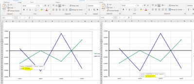
When we render the chart out of this data, we are seeing inconsistent formatting in the tooltip as below
Could you please help us understand the inconsistent tooltip behavior in Excel ?
Note : I am unable to attach the excel here. Please let me know if any other info is needed.
Thanks,
Thilak Babu
- Labels:
-
Excel
- Mark as New
- Bookmark
- Subscribe
- Mute
- Subscribe to RSS Feed
- Permalink
- Report Inappropriate Content
Oct 06 2022 12:24 PM
I can reproduce it. It looks like a bug. You can report it from within Excel by selecting File > Feedback and clicking Send a Frown.
By the way, Data Labels display correctly formatted values:
- Mark as New
- Bookmark
- Subscribe
- Mute
- Subscribe to RSS Feed
- Permalink
- Report Inappropriate Content
Oct 06 2022 12:36 PM
I provided the feedback with in the excel and attached this forum link.

