- Subscribe to RSS Feed
- Mark Discussion as New
- Mark Discussion as Read
- Pin this Discussion for Current User
- Bookmark
- Subscribe
- Printer Friendly Page
- Mark as New
- Bookmark
- Subscribe
- Mute
- Subscribe to RSS Feed
- Permalink
- Report Inappropriate Content
Apr 04 2023 03:54 AM
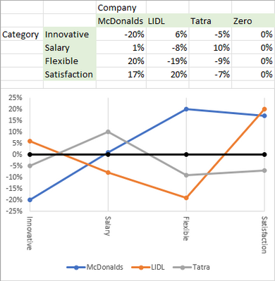
I am working on datasets from surveys. I would like to create is a value-map. Like the image below. I wonder which function in use to get the graphics like the image shows. It looks like an NPS. Any tips and advice whom to structure the data to the right function in Excel?
- Labels:
-
Charting
-
Excel on Mac
- Mark as New
- Bookmark
- Subscribe
- Mute
- Subscribe to RSS Feed
- Permalink
- Report Inappropriate Content
Apr 04 2023 08:09 AM
It can be approximated by creating a line chart. But it will be rotated 90 degrees, and coloring the area between min and max is not possible.
Here is a much simplified example with some totally made up, random data. No resemblance to real data is intended.
Sample workbook attached.
- Mark as New
- Bookmark
- Subscribe
- Mute
- Subscribe to RSS Feed
- Permalink
- Report Inappropriate Content
Apr 04 2023 02:09 PM
Thanks Hans, for your tip, I will start testing this tomorrow with your ideas. @Hans Vogelaar

