Turn on suggestions
Auto-suggest helps you quickly narrow down your search results by suggesting possible matches as you type.
- Home
- Microsoft 365
- Excel
- Re: How to overlay a line chart with secondary data
How to overlay a line chart with secondary data
Discussion Options
- Subscribe to RSS Feed
- Mark Discussion as New
- Mark Discussion as Read
- Pin this Discussion for Current User
- Bookmark
- Subscribe
- Printer Friendly Page
- Mark as New
- Bookmark
- Subscribe
- Mute
- Subscribe to RSS Feed
- Permalink
- Report Inappropriate Content
Oct 26 2020 01:50 AM
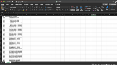
I've a set of data (simplified example below) that I'd like to graph by year and then have the different 'eras' shaded and labels. For example, I'd want to have the GDP 1929-'32 shaded one colour and labelled with 'Hoover', and the GDP data points for 1933-'44 shaded another and labelled with 'Roosevelt', etc.
Thanks for any help!
2 Replies
- Mark as New
- Bookmark
- Subscribe
- Mute
- Subscribe to RSS Feed
- Permalink
- Report Inappropriate Content
Oct 26 2020 03:58 AM
Insert a Pivot table from your data. Drag the president field to the row area and the year column as well. Then drag the GDP field to the sum area. Click Insert pivot chart.
- Mark as New
- Bookmark
- Subscribe
- Mute
- Subscribe to RSS Feed
- Permalink
- Report Inappropriate Content
Oct 26 2020 08:44 AM
@Jan Karel Pieterse Thanks a ton for your help! That worked perfectly and was a much simpler solution than I expected!
