- Home
- Microsoft 365
- Excel
- Re: How to make shading on Excel chart and move x axis labels to the bottom and rotate 45 degrees
How to make shading on Excel chart and move x axis labels to the bottom and rotate 45 degrees
- Subscribe to RSS Feed
- Mark Discussion as New
- Mark Discussion as Read
- Pin this Discussion for Current User
- Bookmark
- Subscribe
- Printer Friendly Page
- Mark as New
- Bookmark
- Subscribe
- Mute
- Subscribe to RSS Feed
- Permalink
- Report Inappropriate Content
Oct 24 2021 02:50 PM
I am using Excel 365 (I have a Windows 365 Family subscription) on Windows 10 Home. I have made an Excel workbook which has Wi-Fi signal strength measurements in several parts of my house for two locations of the Comcast Xfinity modem. I have attached the file and some screen shots showing how I want it to look.
1. I want the labels to be at the bottom of the chart instead of the top and I want them to be oriented at 45 or 60 degrees relative to horizontal. Now they are at the top and horizontal.
2. On my signal strength meter, values below -60 dBm are shown in yellow so I would like to shade the chart with yellow from -60 to the bottom.
Thanks,
Don
- Labels:
-
Charting
- Mark as New
- Bookmark
- Subscribe
- Mute
- Subscribe to RSS Feed
- Permalink
- Report Inappropriate Content
Oct 24 2021 03:05 PM
In the axis options for the vertical axis, specify that the horizontal axis crosses at -80:
Also specify -80 as minimum value.
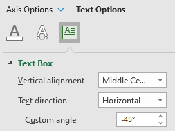
In the text options for the horizontal axis, specify a custom angle of -45 degress (or whichever value you prefer):
For the yellow shading, add a series with constant value -80, and a series with constant value -20.
In the Change Chart Type dialog, change the chart type for the new series to Stacked Area.
Change the color from whatever Excel decides to yellow.
Finally, remove the new series form the legend.
See the attached version.
- Mark as New
- Bookmark
- Subscribe
- Mute
- Subscribe to RSS Feed
- Permalink
- Report Inappropriate Content
Oct 24 2021 05:18 PM
- Mark as New
- Bookmark
- Subscribe
- Mute
- Subscribe to RSS Feed
- Permalink
- Report Inappropriate Content
Oct 25 2021 12:23 AM
SolutionSorry, I should have written -80 and 20, as it is in the workbook.
To add a new series, click anywhere on the chart, then click Select Data on the Chart Design tab of the ribbon.
Under Legend Entries (Series), click Add.
Accepted Solutions
- Mark as New
- Bookmark
- Subscribe
- Mute
- Subscribe to RSS Feed
- Permalink
- Report Inappropriate Content
Oct 25 2021 12:23 AM
SolutionSorry, I should have written -80 and 20, as it is in the workbook.
To add a new series, click anywhere on the chart, then click Select Data on the Chart Design tab of the ribbon.
Under Legend Entries (Series), click Add.

