- Home
- Microsoft 365
- Excel
- Re: How to adjust patterns (thickness) in an excel bar chart?
How to adjust patterns (thickness) in an excel bar chart?
- Subscribe to RSS Feed
- Mark Discussion as New
- Mark Discussion as Read
- Pin this Discussion for Current User
- Bookmark
- Subscribe
- Printer Friendly Page
- Mark as New
- Bookmark
- Subscribe
- Mute
- Subscribe to RSS Feed
- Permalink
- Report Inappropriate Content
Oct 23 2021 01:03 AM
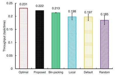
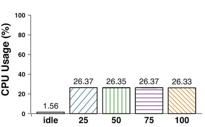
I am using Excel to plot a bar chart that has different patterns for each bar in both color and shape. For applying different shapes, I am using different patterns for each bar. But, patterns are so dense and the pattern lines are covering each other such that the shape of the bars look the same and filled by a solid color. I used to use Rstudio and it gave nicely thick and well-spaced patterns for a bar. I see Matlab also can do so. Is there any way I can get a less dense pattern for bars?
(Patterns density in ) Excel bar chart:
(Patterns density in ) Rstudio bar chart:
- Labels:
-
Charting
- Mark as New
- Bookmark
- Subscribe
- Mute
- Subscribe to RSS Feed
- Permalink
- Report Inappropriate Content
Oct 23 2021 02:22 AM
- Mark as New
- Bookmark
- Subscribe
- Mute
- Subscribe to RSS Feed
- Permalink
- Report Inappropriate Content
Oct 23 2021 03:54 PM
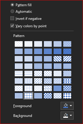
@Sergei Baklan Thank you for your reply. I did so, but still, it is too dense compared to that of Rstudio and Matlab. I for example used the pattern in the last column of the third row, but the same pattern in other software gives much less dense lines. Can we adjust this density in Excel?
- Mark as New
- Bookmark
- Subscribe
- Mute
- Subscribe to RSS Feed
- Permalink
- Report Inappropriate Content
Oct 24 2021 10:47 AM
Perhaps with VBA programming, but that's not my territory, not sure.


