- Home
- Microsoft 365
- Excel
- Re: How to Add Percentage Increase/Decrease Numbers to a Graph Trendline
How to Add Percentage Increase/Decrease Numbers to a Graph Trendline
- Subscribe to RSS Feed
- Mark Discussion as New
- Mark Discussion as Read
- Pin this Discussion for Current User
- Bookmark
- Subscribe
- Printer Friendly Page
- Mark as New
- Bookmark
- Subscribe
- Mute
- Subscribe to RSS Feed
- Permalink
- Report Inappropriate Content
May 23 2021 04:32 AM
Hi,
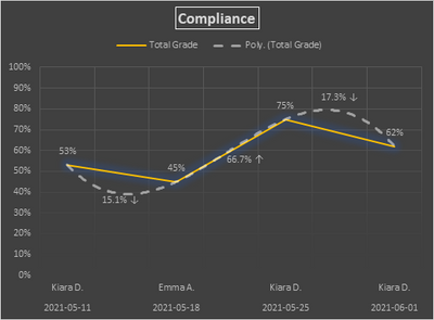
Below is an example graph I have made to show the percentage grading of audits. The visible numbers on the 'TOTAL GRADE' line are the graded numbers. I inserted a trendline called '% PERCENTAGE TRENDLINE' because I want a secondary line to show the percentage differences between the interval grading.
For example, the first two grades, 53%, and 45% have a difference decrease in the percentage of 16.3265% or 16.32% for short. I want '16.32%' ((insert downward arrow here) symbol for decrease)) to be visible on the trendline (secondary white line) in between the graded numbers of 53% and 45%. This would make seeing the total results, and their percentage differences easy to see on the same flowchart.
Any ideas? I have been looking for hours.
- Mark as New
- Bookmark
- Subscribe
- Mute
- Subscribe to RSS Feed
- Permalink
- Report Inappropriate Content
May 23 2021 06:14 AM
I don't know how you arrive at 16.32%, but here is a rather tricky way to do it. In the attached workbook, I inserted dates in between, and used these for a series that plots the average between the values, but without a line, and for the percentage increase/decrease to be used as data labels.
- Mark as New
- Bookmark
- Subscribe
- Mute
- Subscribe to RSS Feed
- Permalink
- Report Inappropriate Content
May 23 2021 07:45 AM
@Hans Vogelaar Hey Hans.
1. It won't allow me to directly insert a date into the graph. If I insert a date outside the graph and attempt to move it into the desired position, then it seemingly goes behind the graph and is invisible.
2. "For the percentage increase/decrease to be used as data labels." Are these actually inserted data labels based on one of the lines, or are you just calling them that because that's what they look like from your alternative method as inserted dates?
3. I will be adding information to this graph, and graphs like this a lot. This will also mean I may have to constantly change the sizing of the graph over time. Wouldn't it mean that inserting dates as a workaround would be impractical in this scenario? If that's the case, should I just leave them out and have them visible in another graph/table alternatively?
Sorry to hassle you, just trying to understand. Thanks in advance!
- Mark as New
- Bookmark
- Subscribe
- Mute
- Subscribe to RSS Feed
- Permalink
- Report Inappropriate Content
May 23 2021 08:40 AM
The data labels have been added to the series based on the series in D2:D8.
You don't see this series because I set that series to use 'No line'.
But this design is not practicable if you have to extend the data frequently, it'd require too much fiddling.
Let's see if someone else comes up with a better idea.

