- Home
- Microsoft 365
- Excel
- Re: How can I change the series bar chart as I would like to be?
How can I change the series bar chart as I would like to be?
- Subscribe to RSS Feed
- Mark Discussion as New
- Mark Discussion as Read
- Pin this Discussion for Current User
- Bookmark
- Subscribe
- Printer Friendly Page
- Mark as New
- Bookmark
- Subscribe
- Mute
- Subscribe to RSS Feed
- Permalink
- Report Inappropriate Content
Jul 12 2020 12:15 AM
I have spreadsheet with a series of questions on the columns and as rows numbers between 1-5.
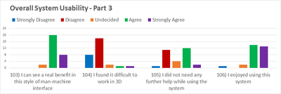
I would like to have a chart that has on the x-axis the questions, as ranges the the possible values (1-5 ) and as y-axis number of people that chose that value.
What I was able to do is to make the column bar chart and have as x-axis the questions ( great!), but as ranges I have the data time in which the answer were recorded ( :( ) and as y-axis I have the number of people( great!).
This is what I would like to have ( strongly disagree= 1, disagree =2, undecided =3, etc..)
Please help D:
- Labels:
-
Charting
-
Formulas and Functions
-
Training
- Mark as New
- Bookmark
- Subscribe
- Mute
- Subscribe to RSS Feed
- Permalink
- Report Inappropriate Content
Jul 12 2020 01:43 PM
Solution
I recommend you reshape the data to allow more easy analysis of all questions on the same axis.
When working with survey data, it helps to include a respondent ID in your analysis. So, first add a column with a unique ID for each respondent. Call it RespondentID or something like that.
Select any cell in your data and use Data>Get & Transform Data>From Table/Range to create a query on your raw data.
In the Power Query Editor, hold down Ctrl and select both RespondentID and "Informazioni cronologiche" by clicking on their column headers.
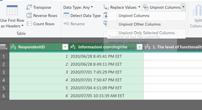
Next, use Transform>Any Column>Unpivot columns>Unpivot other columns:
You'll see that you now have one row per respondent/question/answer. You have two columns: Attribute and Value. To make it easier to understand, right-click each and rename them to Question and Response:
Now use Home>Close&Load to put the data back into the workbook.
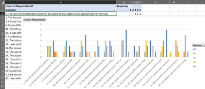
Now you can use Insert>Pivot Chart, then put Question in the Axis (Categories) area, Response in the Legend (Series) area and Count of RespondentID in the Values area.
I filtered out questions 7, 55 and 61 since they didn't follow the same data domain as the others (1-5).
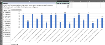
With the data in this format, it is also trivial to calculate the average score by question:
or even create groups of questions and calculate statistics on those.
The original data is of course still useful for cross-tab analysis.
Accepted Solutions
- Mark as New
- Bookmark
- Subscribe
- Mute
- Subscribe to RSS Feed
- Permalink
- Report Inappropriate Content
Jul 12 2020 01:43 PM
Solution
I recommend you reshape the data to allow more easy analysis of all questions on the same axis.
When working with survey data, it helps to include a respondent ID in your analysis. So, first add a column with a unique ID for each respondent. Call it RespondentID or something like that.
Select any cell in your data and use Data>Get & Transform Data>From Table/Range to create a query on your raw data.
In the Power Query Editor, hold down Ctrl and select both RespondentID and "Informazioni cronologiche" by clicking on their column headers.
Next, use Transform>Any Column>Unpivot columns>Unpivot other columns:
You'll see that you now have one row per respondent/question/answer. You have two columns: Attribute and Value. To make it easier to understand, right-click each and rename them to Question and Response:
Now use Home>Close&Load to put the data back into the workbook.
Now you can use Insert>Pivot Chart, then put Question in the Axis (Categories) area, Response in the Legend (Series) area and Count of RespondentID in the Values area.
I filtered out questions 7, 55 and 61 since they didn't follow the same data domain as the others (1-5).
With the data in this format, it is also trivial to calculate the average score by question:
or even create groups of questions and calculate statistics on those.
The original data is of course still useful for cross-tab analysis.


