- Subscribe to RSS Feed
- Mark Discussion as New
- Mark Discussion as Read
- Pin this Discussion for Current User
- Bookmark
- Subscribe
- Printer Friendly Page
- Mark as New
- Bookmark
- Subscribe
- Mute
- Subscribe to RSS Feed
- Permalink
- Report Inappropriate Content
Sep 07 2021 01:23 AM
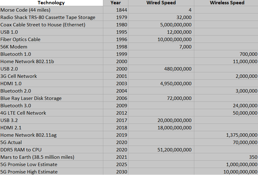
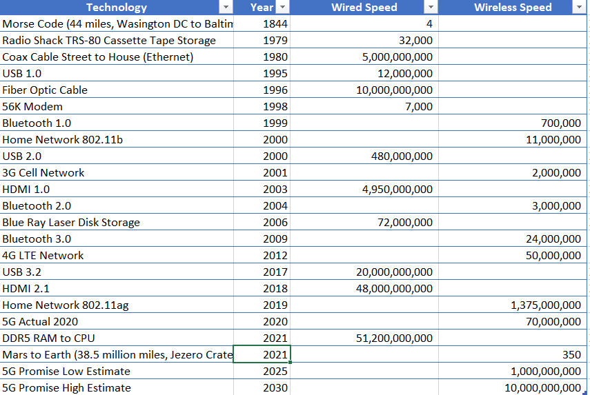
I am trying to create a 2D scatter plot. Attached is a snapshot of my data. Here is how I would like this to look:
1. Data speed on the vertical dimension.
2. Timeline on the horizontal dimension.
3. Each point has the description for that point in the plot area next to the data point.
4. Different color of data point depending on wireless or wired information.
Can Excel do this?
Up to date version of Excel on Windows 11.
- Mark as New
- Bookmark
- Subscribe
- Mute
- Subscribe to RSS Feed
- Permalink
- Report Inappropriate Content
Sep 07 2021 06:30 AM
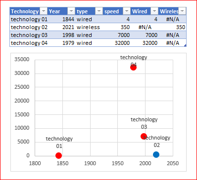
SolutionYou may add two helper columns for wired and wireless to use different colors for them. For the labels select an option to take them from cells.
- Mark as New
- Bookmark
- Subscribe
- Mute
- Subscribe to RSS Feed
- Permalink
- Report Inappropriate Content
Sep 07 2021 11:38 AM
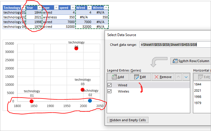
Thanks Sergei. That got me unstuck, but hit one more issue I can't figure out. The years are showing up as a data series and I want them to be the horizontal axis labels. Cn you help?
- Mark as New
- Bookmark
- Subscribe
- Mute
- Subscribe to RSS Feed
- Permalink
- Report Inappropriate Content
Sep 07 2021 02:32 PM
Perhaps I misunderstood, but years are X-axis in the sample, you may click on each of series to check. Or you mean something else?
- Mark as New
- Bookmark
- Subscribe
- Mute
- Subscribe to RSS Feed
- Permalink
- Report Inappropriate Content
Sep 07 2021 03:56 PM
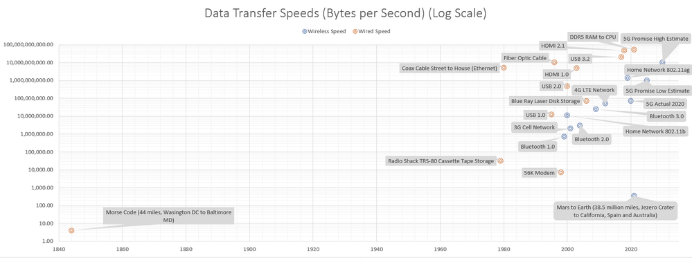
Thank you. This is so close to what I want. Can you think of a way to keep the Morse Code point near 1840 and at the same time eliminate the white space between 1860 and 1960 so all the points on the right can spread out across the chart?
- Mark as New
- Bookmark
- Subscribe
- Mute
- Subscribe to RSS Feed
- Permalink
- Report Inappropriate Content
Sep 07 2021 11:53 PM
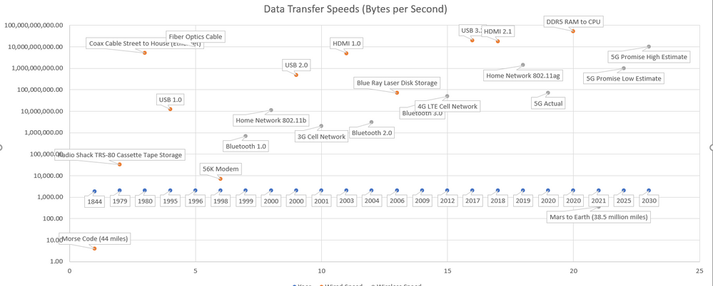
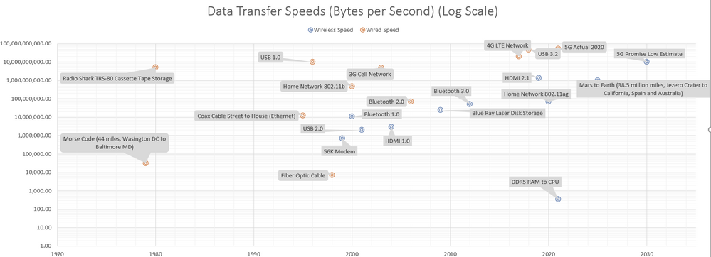
@Sergei Baklan I found that the recommended solution to my space problem was to create two charts. One with all the data and one without the 1844 outlier. As you can see, in the first chart below, the data labels are all off by one cell. I can't see how to fix this.
- Mark as New
- Bookmark
- Subscribe
- Mute
- Subscribe to RSS Feed
- Permalink
- Report Inappropriate Content
- Mark as New
- Bookmark
- Subscribe
- Mute
- Subscribe to RSS Feed
- Permalink
- Report Inappropriate Content
Accepted Solutions
- Mark as New
- Bookmark
- Subscribe
- Mute
- Subscribe to RSS Feed
- Permalink
- Report Inappropriate Content
Sep 07 2021 06:30 AM
SolutionYou may add two helper columns for wired and wireless to use different colors for them. For the labels select an option to take them from cells.

