- Home
- Microsoft 365
- Excel
- Help for beginner - Assigning text to certain values
Help for beginner - Assigning text to certain values
- Subscribe to RSS Feed
- Mark Discussion as New
- Mark Discussion as Read
- Pin this Discussion for Current User
- Bookmark
- Subscribe
- Printer Friendly Page
- Mark as New
- Bookmark
- Subscribe
- Mute
- Subscribe to RSS Feed
- Permalink
- Report Inappropriate Content
Dec 07 2022 11:36 AM
Hello, kindly ask for help with the following:
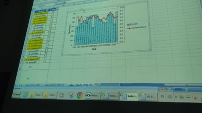
1) Could someone please explain how to recreate the following, based on the attached picture?:
A table with average precipitation per month (hor.) and year (vert.), means per month, year and overall are generated (?) on the outer edges. In addition, the averages of years that were drier on average had their own row at the bottom. Then, a column was added where the block was filled with either 'normal year' or 'dry year' with a yellow highlight. Does anyone know how to add such a column? One that has text based on whether a value is lesser or greater a certain value.
(An additional mean (srednia in the image) and I also forget what this refers to. If someone could guess what this pertains to, I would be extra grateful.)
2) A second y-axis was added with data from another excel sheet (temperature), and was wondering if someone could tell me how that was done.
3) Any recommended resources for beginners, organized in a way that makes it simpler to figure out, what one even needs to figure out. Teacher is unhelpful in this regard.
I have a test coming up where I will have to recreate certain things we did in class. There are a few I do not remember, but this worries me because I have no clue what to enter into google. Nothing relevant comes up.
A big sincere thank you to anyone who helps or has advice.
- Labels:
-
BI & Data Analysis
-
Excel
-
Training
- Mark as New
- Bookmark
- Subscribe
- Mute
- Subscribe to RSS Feed
- Permalink
- Report Inappropriate Content
Dec 07 2022 12:53 PM
SolutionThen, a column was added where the block was filled with either 'normal year' or 'dry year' with a yellow highlight. Does anyone know how to add such a column?
That would be a simple IF statement
= IF( temperature > x, "Text", "Alternative text")
The yellow would be a Conditional Format, either repeating the criterion
= temperature > x
or testing the content of the cell for the desired text.
2) A second y-axis was added with data from another excel sheet (temperature), and was wondering if someone could tell me how that was done.
That is done by changing the chart type for the temperature series to 'line', so generating a combination chart and selecting the secondary axis.
- Mark as New
- Bookmark
- Subscribe
- Mute
- Subscribe to RSS Feed
- Permalink
- Report Inappropriate Content
Dec 10 2022 09:29 AM
Accepted Solutions
- Mark as New
- Bookmark
- Subscribe
- Mute
- Subscribe to RSS Feed
- Permalink
- Report Inappropriate Content
Dec 07 2022 12:53 PM
SolutionThen, a column was added where the block was filled with either 'normal year' or 'dry year' with a yellow highlight. Does anyone know how to add such a column?
That would be a simple IF statement
= IF( temperature > x, "Text", "Alternative text")
The yellow would be a Conditional Format, either repeating the criterion
= temperature > x
or testing the content of the cell for the desired text.
2) A second y-axis was added with data from another excel sheet (temperature), and was wondering if someone could tell me how that was done.
That is done by changing the chart type for the temperature series to 'line', so generating a combination chart and selecting the secondary axis.
