- Home
- Microsoft 365
- Excel
- Re: Help! Excel 2019 Home Edition with Analysis Toolpak not creating histograms/Pareto charts. Thank
Help! Excel 2019 Home Edition with Analysis Toolpak not creating histograms/Pareto charts. Thanks!
- Subscribe to RSS Feed
- Mark Discussion as New
- Mark Discussion as Read
- Pin this Discussion for Current User
- Bookmark
- Subscribe
- Printer Friendly Page
- Mark as New
- Bookmark
- Subscribe
- Mute
- Subscribe to RSS Feed
- Permalink
- Report Inappropriate Content
Aug 22 2020 04:23 PM
Hi,
I am having a heck of a time with Excel 2019 Home Edition - Installed on my new Dell.
Here's the background information:
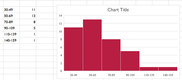
1. The histogram above is correct
a. There are six data points
b. There are six columns with the accurate data
c. histograms' columns touch one another based on the first data column in the table to the left of the histogram above
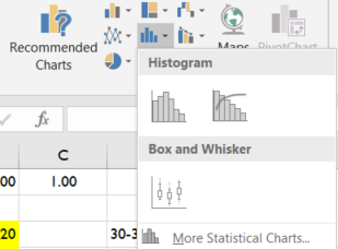
To create a histogram one goes to one of the following:
INSERT > Recommended Charts > All Charts > Histogram
- Or -
INSERT > Histogram drop down (see below)
Note: Columns touch one another in histograms and Pareto charts
Note: Columns are the heights of the values in the second chart column in Excel above
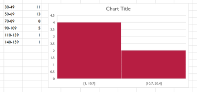
When I use Excel 2019 Home Edition (installed) and try to create a histogram using the above solution this is what I get (below)
Note: Only two columns (not six) with odd data that does not seem to reference the table to the left
Note: I have done this probably 30 times with new sheets and tables
Note: I have restarted Excel and Windows 10
Note: I have tried many different tables with data and the same thing happens. Only two columns with odd data
Note: Notice that there are only two columns (there should be six) and that the ranges are nonsensical
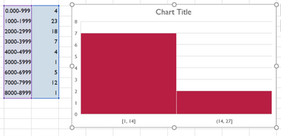
The following is another attempt to create a histogram. Note the data and number of columns:
Still not having fun in playland!
Please help!
My Stats and Psych Stats classes start on Monday
I have paid money to have this resolved and spoke with MS support to no avail.
I have tried to create my own histograms with standard column charts but these are not technically histograms.
Has anyone seen this before?
Should I reinstall Office?
Thank you so very much!
Charles
- Labels:
-
Charting
-
Excel
-
Formulas and Functions
- Mark as New
- Bookmark
- Subscribe
- Mute
- Subscribe to RSS Feed
- Permalink
- Report Inappropriate Content
Aug 22 2020 04:54 PM
@CharlesGonzalesAptos I feel bad for you and don't have the answer. I would suggest attaching your sheet and hopefully that will help someone to help you.
That all said I can make an observation that I can only hope might help. Both of the 'wrong' histograms are plotting a histogram of the second set of data. Basically not using the values of your histogram as the values but actually performing a histogram of those numbers. I'm not sure how it is picking the ranges but they are even sizes/ranges.
Also, since you already have the histogram table why not just use a bar chart to plot those values?
- Mark as New
- Bookmark
- Subscribe
- Mute
- Subscribe to RSS Feed
- Permalink
- Report Inappropriate Content
Aug 23 2020 06:17 AM
@CharlesGonzalesAptos I skipped the analysis toolpak portion and just went with a combination chart. This way, I get the benefit of showing both the data ranges AND a cumulative Pareto percent which shows that your data adds up to 100%. I use these all the time since viewers can quickly see the impact of each category. Hope it helps you pass the test.


