- Home
- Microsoft 365
- Excel
- Group dates by month and then chart
Group dates by month and then chart
- Subscribe to RSS Feed
- Mark Discussion as New
- Mark Discussion as Read
- Pin this Discussion for Current User
- Bookmark
- Subscribe
- Printer Friendly Page
- Mark as New
- Bookmark
- Subscribe
- Mute
- Subscribe to RSS Feed
- Permalink
- Report Inappropriate Content
May 01 2023 08:15 AM
I have a bunch of form entry dates exported that look something like:
4/29/2023 13:21
4/27/2023 1:55
4/20/2023 17:23
4/4/2023 14:50
3/5/2023 6:11
2/18/2023 19:34
2/2/2023 12:42
2/1/2023 8:08
12/4/2022 7:35
etc....
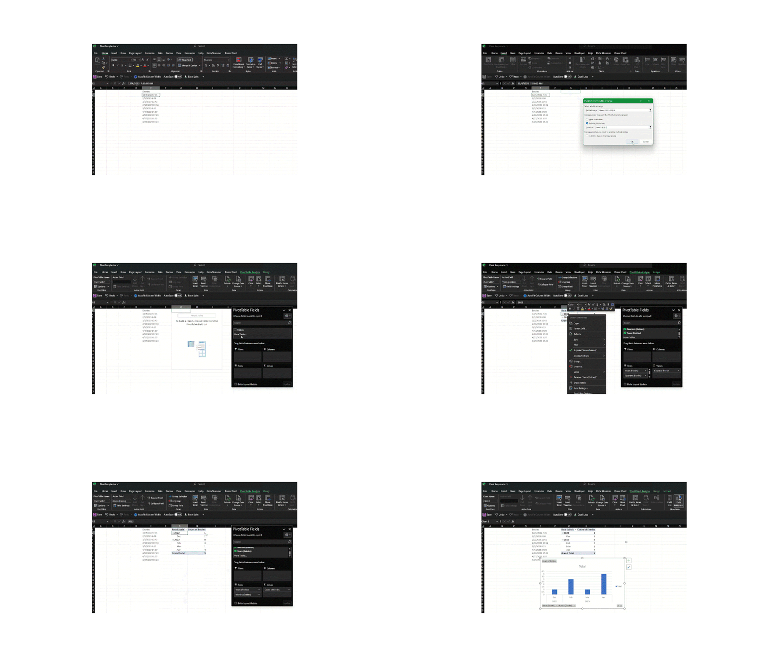
I want a bar chart to show form fills over time, but grouped by month. So eg. the bar would show April 23 with 4 entries, etc... How to do this?
- Labels:
-
Charting
-
Excel
-
Formulas and Functions
- Mark as New
- Bookmark
- Subscribe
- Mute
- Subscribe to RSS Feed
- Permalink
- Report Inappropriate Content
May 01 2023 09:09 AM
- Mark as New
- Bookmark
- Subscribe
- Mute
- Subscribe to RSS Feed
- Permalink
- Report Inappropriate Content
May 01 2023 09:24 AM
- Mark as New
- Bookmark
- Subscribe
- Mute
- Subscribe to RSS Feed
- Permalink
- Report Inappropriate Content
May 01 2023 09:31 AM
- Mark as New
- Bookmark
- Subscribe
- Mute
- Subscribe to RSS Feed
- Permalink
- Report Inappropriate Content
May 01 2023 09:47 AM
- Mark as New
- Bookmark
- Subscribe
- Mute
- Subscribe to RSS Feed
- Permalink
- Report Inappropriate Content
May 01 2023 10:34 AM - edited May 01 2023 10:36 AM
Solution- Mark as New
- Bookmark
- Subscribe
- Mute
- Subscribe to RSS Feed
- Permalink
- Report Inappropriate Content
- Mark as New
- Bookmark
- Subscribe
- Mute
- Subscribe to RSS Feed
- Permalink
- Report Inappropriate Content
Accepted Solutions
- Mark as New
- Bookmark
- Subscribe
- Mute
- Subscribe to RSS Feed
- Permalink
- Report Inappropriate Content
May 01 2023 10:34 AM - edited May 01 2023 10:36 AM
Solution
