Turn on suggestions
Auto-suggest helps you quickly narrow down your search results by suggesting possible matches as you type.
Discussion Options
- Subscribe to RSS Feed
- Mark Discussion as New
- Mark Discussion as Read
- Pin this Discussion for Current User
- Bookmark
- Subscribe
- Printer Friendly Page
- Mark as New
- Bookmark
- Subscribe
- Mute
- Subscribe to RSS Feed
- Permalink
- Report Inappropriate Content
Aug 25 2022 04:18 PM
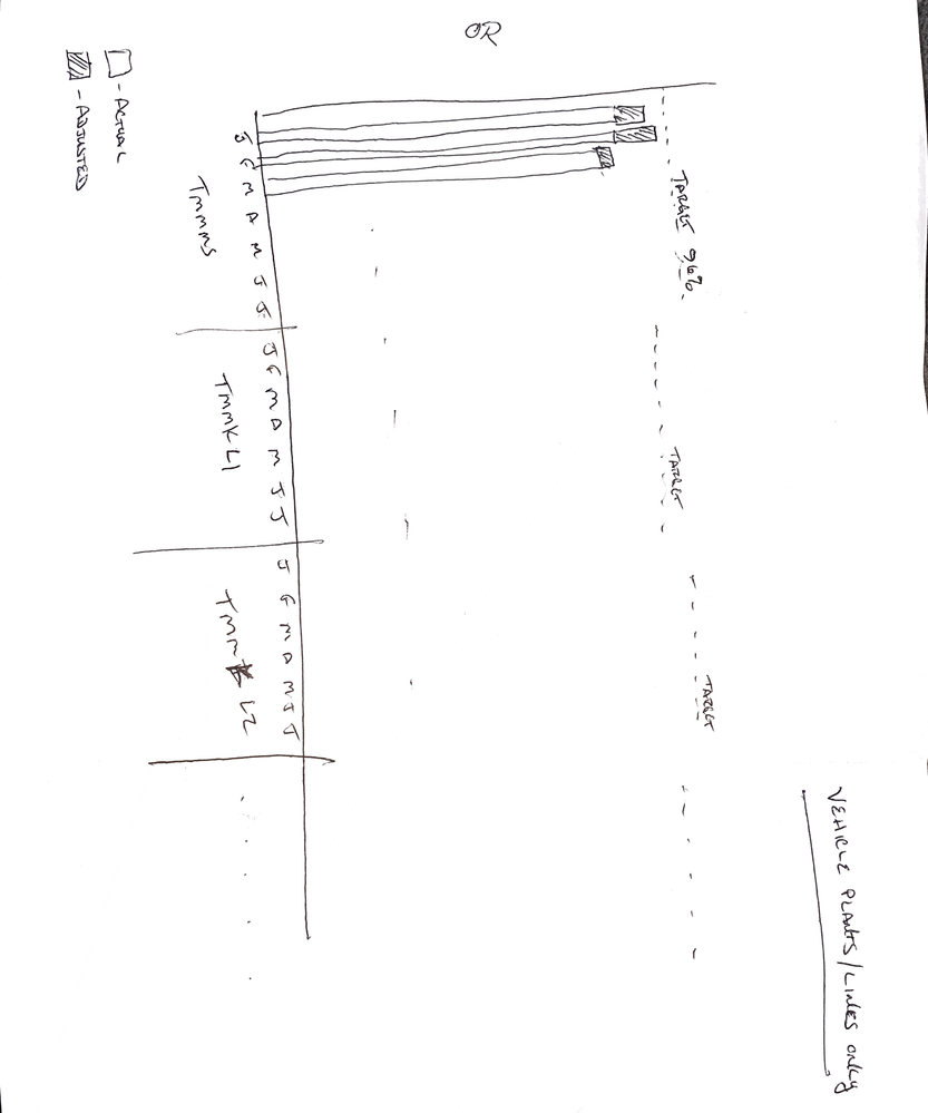
Good evening. I have a dataset and I need to create a graph like the one attached. The data I have is like this: (target will always be 96%. I need the graph to show the actual and adjustment on one line and then have the months on the x axis)
| Name | Type | Jan | Feb | March | Apr | May | June |
| TMMAL 1 | Actual | 86.0% | 82.3% | 88.7% | 92.9% | 91.6% | 91.5% |
| TMMAL 1 | Adjustment | 86.0% | 95.0% | 90.0% | 94.5% | 91.6% | 91.6% |
| TMMAL 1 | Target | 96% | 96% | 96% | 96% | 96% | 96% |
| TMMAL 2 | Actual | 93.5% | 94.7% | 95.5% | 96.2% | 94.5% | 93.7% |
| TMMAL 2 | Adjustment | 93.5% | 94.7% | 95.8% | 96.4% | 94.5% | 93.7% |
| TMMAL 2 | Target | 96% | 96% | 96% | 96% | 96% | 96% |
Labels:
- Labels:
-
Charting
-
Excel
-
Formulas and Functions
1 Reply
- Mark as New
- Bookmark
- Subscribe
- Mute
- Subscribe to RSS Feed
- Permalink
- Report Inappropriate Content
Aug 26 2022 02:59 AM
This requires a different layout of the data. See the attached sample workbook.
Note that Adjustment is now the difference between Actual and your original Adjustment.

