- Home
- Microsoft 365
- Excel
- Graph Secondary Axis align to zero of primary axis
Graph Secondary Axis align to zero of primary axis
- Subscribe to RSS Feed
- Mark Discussion as New
- Mark Discussion as Read
- Pin this Discussion for Current User
- Bookmark
- Subscribe
- Printer Friendly Page
- Mark as New
- Bookmark
- Subscribe
- Mute
- Subscribe to RSS Feed
- Permalink
- Report Inappropriate Content
Aug 28 2020 06:48 AM
Is there any way to align the zero of the secondary axis to the zero of the primary axis on a graph?
- Mark as New
- Bookmark
- Subscribe
- Mute
- Subscribe to RSS Feed
- Permalink
- Report Inappropriate Content
Aug 29 2020 12:54 AM
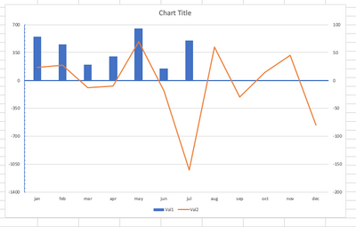
@BryNeedsToExcel Replicated the relationships in your graph to demonstrate a work around.
The automatic secondary axis boundaries go from +100% to -200% with gaps (major units) of 50%. Thus, two gaps above 0 and four gaps below zero. You need to reformat the primary axis and use the same relative boundaries. So, the maximum value = 700. Divide in two = 350. Multiply that by -4 = -1400. Now, override the primary axis bounds and set them to -1400 (minimum) and 700 (maximum) and set major units to 350. Play round with the placement of the axis labels and the format of the axis itself, and you may come up with something like this.
I am totally aware that this is not very practical in case your graphs keep changing all the time, as you would have to recalculate the axis bounds every time. But, it's a workaround for the instances you really need to align the zeros on both axis.
Attached a file for your convenience, so that you check out the settings.
- Mark as New
- Bookmark
- Subscribe
- Mute
- Subscribe to RSS Feed
- Permalink
- Report Inappropriate Content
Aug 29 2020 10:20 AM
If data is changing from time to time that's the same approach as @Riny_van_Eekelen suggested but by VBA coding.
- Mark as New
- Bookmark
- Subscribe
- Mute
- Subscribe to RSS Feed
- Permalink
- Report Inappropriate Content
Jul 28 2023 08:43 AM
@Sergei Baklan create a new line in the chart, with four cells: e.g.
b2 =0
b3 =0
c2 =-max(g3:g20)
c3 =-min(g3:g20)
Change g3:g20 to whatever the range is with the non-symmetrical data
Then add another line to your chart, x b2:b3 , y c2:c3
It will show up in the chart, and force the zero to the middle. You can then select that new data, select 'no line' and 'marker none', and if you select the legend entry, you can delete it from the list, so that it will be totally invisible, yet dynamically keep the charts centered. Do the same for a secondary axis to keep them both centered.
- Mark as New
- Bookmark
- Subscribe
- Mute
- Subscribe to RSS Feed
- Permalink
- Report Inappropriate Content
Jul 30 2023 04:25 AM
I guess it shall be bit more complex formula instead of =-MAX(range). Assume we have range with number from -200 to +10.
More important, putting zero into the middle is not always suitable. For example, we have values from -10 to 100 on primary and from 10 to 120 on secondary axis. The only we need is to have zero for both axis on the same line which is near the bottom of the chart.
