- Home
- Microsoft 365
- Excel
- Re: Graph is taking column as X-axis rather than the cell value. Does anyone know how to rectify thi
Graph is taking column as X-axis rather than the cell value. Does anyone know how to rectify this?
- Subscribe to RSS Feed
- Mark Discussion as New
- Mark Discussion as Read
- Pin this Discussion for Current User
- Bookmark
- Subscribe
- Printer Friendly Page
- Mark as New
- Bookmark
- Subscribe
- Mute
- Subscribe to RSS Feed
- Permalink
- Report Inappropriate Content
May 06 2020 04:11 PM
Hi there,
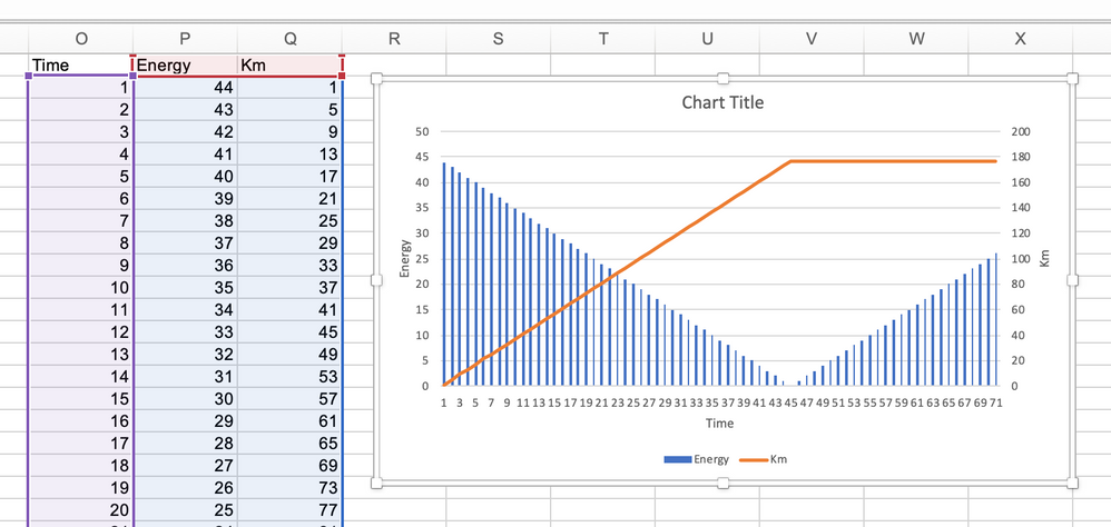
I'm attempting to create a combination graph in excel representing 3 different sets of data. On my X-axis I have distance travelled and on the Y-axis energy consumed. There is a point in my graph where distance travelled remains stagnant, but energy remaining increased due to the battery being charged, however, excel continues to increase the X-axis value. It is taking the column value as my X-axis rather than the cell value for distance travelled. Does anyone know how to fix this?
I will attach pictures for reference.
In picture one I have circled the point where 195 should stay constant, however, it increases.
In picture two I show the cell values where it stays constant.
Thank you :)
- Labels:
-
Excel
- Mark as New
- Bookmark
- Subscribe
- Mute
- Subscribe to RSS Feed
- Permalink
- Report Inappropriate Content
May 06 2020 08:10 PM - edited May 06 2020 08:11 PM
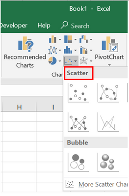
@jamaalmoosa when you want EXCEL to treat x and y values as "maths numbers" and want to plot a graph as you would do on a "graph-paper" , i.e. Y vs. X , use Scatter chart :-
- Mark as New
- Bookmark
- Subscribe
- Mute
- Subscribe to RSS Feed
- Permalink
- Report Inappropriate Content
May 06 2020 08:13 PM
- Mark as New
- Bookmark
- Subscribe
- Mute
- Subscribe to RSS Feed
- Permalink
- Report Inappropriate Content
May 06 2020 09:04 PM
Solution@jamaalmoosa I suspect that you did not link the X-axis labels to the Distance column. The labels in your picture seem to just count the number of data points. Having said that, allow me to suggest another chart that may represent your data better.
As you mention, you have three sets of data, Time, Energy and Distance. However, your chart only takes the latter two into account. Energy levels decrease (consumption) and increase (charging) over time. Distance traveled is also related to time as time progresses during both travel (consumption) and stand-still (i.e. charging).
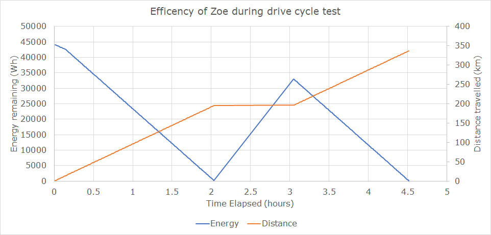
Time is the factor that combines the other two and should therefore be on the X-axis. Then you could put the Energy part on the primary Y-axis and Distance on the secondary Y-axis. The chart would then look like in the picture below. I just made up some numbers to create a shape that resembles your picture.
- Mark as New
- Bookmark
- Subscribe
- Mute
- Subscribe to RSS Feed
- Permalink
- Report Inappropriate Content
May 07 2020 06:23 AM - edited May 07 2020 06:30 AM
@Riny_van_EekelenThanks a lot for your help, much appreciated. However, I seemed to be having some trouble when attempting to put time on the X-axis, Excel just doesn't seem to be allowing this. I have attached my file for reference. I am working on sheet no. 2.:)
- Mark as New
- Bookmark
- Subscribe
- Mute
- Subscribe to RSS Feed
- Permalink
- Report Inappropriate Content
May 07 2020 08:27 AM
@jamaalmoosa Please see attached. Not entirely sure that I follow everything you try to do, but your time line jumped from 2 to 3 hours (row 195) where all previous increments were for 1/100 of one hour. Inserted the third hour in hundreds and calculated a linear charging rate, during which distance traveled remains at 194. At time 3.05, energy levels decrease again, presumable because you were driving.
- Mark as New
- Bookmark
- Subscribe
- Mute
- Subscribe to RSS Feed
- Permalink
- Report Inappropriate Content
May 07 2020 11:54 AM
@jamaalmoosa Friends, why not plotting scatter chart which is the best suited chart to treat numbers as "maths numbers" and plot graphs as on "standard mathematical graph paper" i.e. Y on X as per scale decided by numbers ?
same result is achieved without any data manipulation (interpolation), benefit over line chart is that just series are selected, and Excel just plots it without us realizing...
( and that the time was jumped by an hour is just a data fact )
Refer sheet3 of attachment
- Mark as New
- Bookmark
- Subscribe
- Mute
- Subscribe to RSS Feed
- Permalink
- Report Inappropriate Content
May 07 2020 09:34 PM
- Mark as New
- Bookmark
- Subscribe
- Mute
- Subscribe to RSS Feed
- Permalink
- Report Inappropriate Content
May 07 2020 09:37 PM
@amit_bhola Hi Amit, thank you for your solution. I was using the column due to the better visual representation but your solution is also something I was unaware of. Thank you!
Accepted Solutions
- Mark as New
- Bookmark
- Subscribe
- Mute
- Subscribe to RSS Feed
- Permalink
- Report Inappropriate Content
May 06 2020 09:04 PM
Solution@jamaalmoosa I suspect that you did not link the X-axis labels to the Distance column. The labels in your picture seem to just count the number of data points. Having said that, allow me to suggest another chart that may represent your data better.
As you mention, you have three sets of data, Time, Energy and Distance. However, your chart only takes the latter two into account. Energy levels decrease (consumption) and increase (charging) over time. Distance traveled is also related to time as time progresses during both travel (consumption) and stand-still (i.e. charging).
Time is the factor that combines the other two and should therefore be on the X-axis. Then you could put the Energy part on the primary Y-axis and Distance on the secondary Y-axis. The chart would then look like in the picture below. I just made up some numbers to create a shape that resembles your picture.


