Turn on suggestions
Auto-suggest helps you quickly narrow down your search results by suggesting possible matches as you type.
Discussion Options
- Subscribe to RSS Feed
- Mark Discussion as New
- Mark Discussion as Read
- Pin this Discussion for Current User
- Bookmark
- Subscribe
- Printer Friendly Page
- Mark as New
- Bookmark
- Subscribe
- Mute
- Subscribe to RSS Feed
- Permalink
- Report Inappropriate Content
Oct 05 2021 01:37 PM
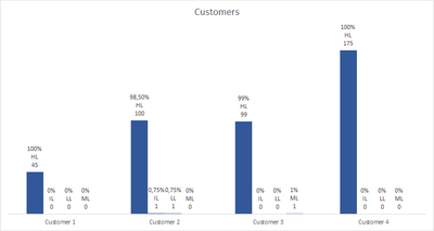
I'm trying to work on a graph that I am trying to clean up and make more pleasing to the eye. I've tried using a primary and secondary axis. Any ideas? Below is a sample of the data. I'd like to get the count and the percentage on the same graph.
| Categories | Customer 1 | Customer 2 | Customer 3 | Customer 4 |
| HL | 45 | 100 | 99 | 175 |
| IL | 0 | 1 | 0 | 0 |
| LL | 0 | 1 | 0 | 0 |
| ML | 0 | 0 | 1 | 0 |
| Categories | Customer 1 | Customer 2 | Customer 3 | Customer 4 |
| HL | 100% | 98.50% | 99% | 100% |
| IL | 0% | 0.75% | 0% | 0% |
| LL | 0% | 0.75% | 0% | 0% |
| ML | 0% | 0% | 1% | 0% |
Labels:
- Labels:
-
Excel
1 Reply
- Mark as New
- Bookmark
- Subscribe
- Mute
- Subscribe to RSS Feed
- Permalink
- Report Inappropriate Content
Oct 08 2021 05:06 AM
@MSMITH379, try the attached file with my idea.
In the label options for each series, select the range with the percentages, as in this image:
Regards,
Pedro Wave

