- Subscribe to RSS Feed
- Mark Discussion as New
- Mark Discussion as Read
- Pin this Discussion for Current User
- Bookmark
- Subscribe
- Printer Friendly Page
- Mark as New
- Bookmark
- Subscribe
- Mute
- Subscribe to RSS Feed
- Permalink
- Report Inappropriate Content
May 08 2022 03:04 AM
Hey!
Im sitting on the following problem:
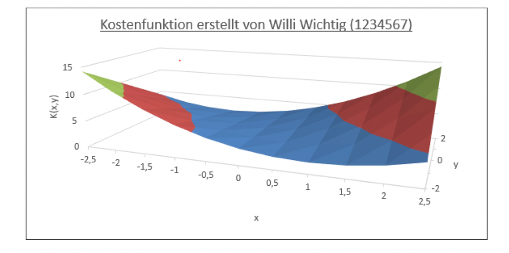
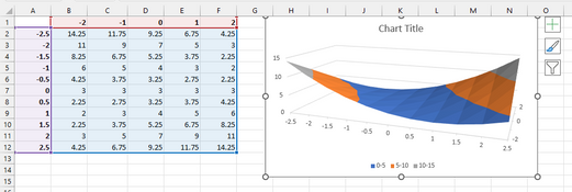
the diagram I created with the data from my table is supposed to look the same as in pic2. When selecting the data and pasting the diagram it looks like shown in pic1. Can anyone provide help with the problem?
If the sequence of the pictures is incorrect: the one with the table is my version and the one without the template.
- Mark as New
- Bookmark
- Subscribe
- Mute
- Subscribe to RSS Feed
- Permalink
- Report Inappropriate Content
May 08 2022 03:35 AM
Solution@Excel204847 Get rid of the merged cells for the row and column headers. Then select A1 to F12 and insert the surface chart. The correct axis labels will now be used automatically. If you insist on keeping the merged cells, you need to set the axis and series labels manually in the "Select Data Source" pop-up window.
- Mark as New
- Bookmark
- Subscribe
- Mute
- Subscribe to RSS Feed
- Permalink
- Report Inappropriate Content
May 08 2022 03:44 AM
To change the chart title, click on it, type the desired title, then press Enter.
To change the labels of the y-axis, either change the values in C1:G1 to the desired text values, or click Select Data on the Chart Design tab of the ribbon, then edit each of the series in turn and change their Series Name - either type in the name or point to a cell that contains the name (such as Datenreihen1),
- Mark as New
- Bookmark
- Subscribe
- Mute
- Subscribe to RSS Feed
- Permalink
- Report Inappropriate Content
May 08 2022 03:50 AM - edited May 08 2022 03:51 AM
- Mark as New
- Bookmark
- Subscribe
- Mute
- Subscribe to RSS Feed
- Permalink
- Report Inappropriate Content
May 08 2022 03:52 AM
@Excel204847 Great, but better to stay away from merged cells, when you are not forced to use them. They do more harm than good.
Accepted Solutions
- Mark as New
- Bookmark
- Subscribe
- Mute
- Subscribe to RSS Feed
- Permalink
- Report Inappropriate Content
May 08 2022 03:35 AM
Solution@Excel204847 Get rid of the merged cells for the row and column headers. Then select A1 to F12 and insert the surface chart. The correct axis labels will now be used automatically. If you insist on keeping the merged cells, you need to set the axis and series labels manually in the "Select Data Source" pop-up window.


