- Home
- Microsoft 365
- Excel
- Re: excel histogram binning for Excel for mac 2019
excel histogram binning for Excel for mac 2019
- Subscribe to RSS Feed
- Mark Discussion as New
- Mark Discussion as Read
- Pin this Discussion for Current User
- Bookmark
- Subscribe
- Printer Friendly Page
- Mark as New
- Bookmark
- Subscribe
- Mute
- Subscribe to RSS Feed
- Permalink
- Report Inappropriate Content
Mar 12 2022 11:45 AM
I cannot fill a histogram anymore -- excel uses automatic horizontal axes -- very STUPID
- Labels:
-
BI & Data Analysis
- Mark as New
- Bookmark
- Subscribe
- Mute
- Subscribe to RSS Feed
- Permalink
- Report Inappropriate Content
Mar 12 2022 08:45 PM
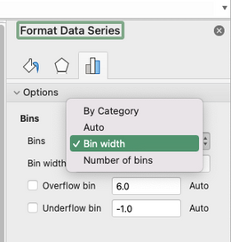
@mike-triumf Your comment is rather vague, but perhaps you haven't discovered how to over-ride the default bin settings (i.e. the horizontal axis) when creating a histogram. In Excel for the Mac, right-click on a column in the chart and select "Format Data Series...."
Now you can change the default bin settings to your liking.
- Mark as New
- Bookmark
- Subscribe
- Mute
- Subscribe to RSS Feed
- Permalink
- Report Inappropriate Content
Mar 12 2022 09:13 PM
I have 900 data points ranging from 1 to 30. I want to bin these data into these 30 bins and plot a histogram. Previous version sof MAC Excel allowed one to run the frequency command to fill the bins and then make a reason able frequency distribution plot. The frequency function no longer produces any output so I cannot make a reasonable histogram of my data. This worked 1 year ago -- but now it fails.
Your suggestion of right click did not help me to rebin the data. The histogram still has 900 entries -- it plots the horizontal axis as the entry number with the y axis as the data value ( the one I want to histogram ).
- Mark as New
- Bookmark
- Subscribe
- Mute
- Subscribe to RSS Feed
- Permalink
- Report Inappropriate Content
Mar 12 2022 09:53 PM
@mike-triumf Not sure I follow and don't really remember the old Mac versions. But in the most recent one (also in the PC version, by the way), there is a chart type called "Histogram" that does some automatic "binning", but it can be over-ridden as described earlier.
Perhaps you are creating a histogram by inserting a regular column chart displaying the frequency of each of the numbers from 1-30. The attached file contains examples of both.
If all of this makes no sense, perhaps you can upload a screenshot or share a file, clarifying what you are faced with.
