- Home
- Microsoft 365
- Excel
- Re: excel graphs - combination? white line?
excel graphs - combination? white line?
- Subscribe to RSS Feed
- Mark Discussion as New
- Mark Discussion as Read
- Pin this Discussion for Current User
- Bookmark
- Subscribe
- Printer Friendly Page
- Mark as New
- Bookmark
- Subscribe
- Mute
- Subscribe to RSS Feed
- Permalink
- Report Inappropriate Content
Apr 30 2021 02:41 PM
Hi, I just saw a report that had a graph in it. What was different was the vertical numbers were 1,2,3,4,5,20,21,22 between 5 and 20 there was a white space gap line all the way across than it continued with 20,21, etc. This looked like they were able to truncate the graph and restart it to emphasis a gap in the vertical numbers. I have not found how to do this. Can anyone tell me how to do this?
Thanks
- Labels:
-
Excel
- Mark as New
- Bookmark
- Subscribe
- Mute
- Subscribe to RSS Feed
- Permalink
- Report Inappropriate Content
May 01 2021 01:37 AM - edited May 01 2021 02:00 AM
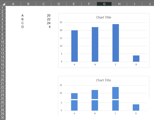
@micro9901 I'm not aware of any feature in Excel that can do this. But if you have photo editing program you can copy the graph into it and create whatever you want from it. In the attached picture the graph at the top comes out of Excel, and the one below is "edited" (not very pretty I must admit).
- Mark as New
- Bookmark
- Subscribe
- Mute
- Subscribe to RSS Feed
- Permalink
- Report Inappropriate Content
May 01 2021 09:02 AM
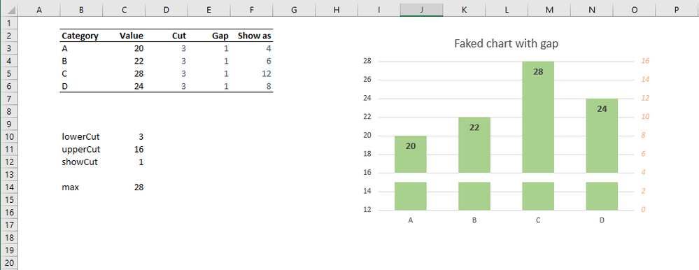
You could 'fake it' with a stacked column chart which is actually plotted against a hidden secondary axis whilst showing the values using labels and an offset primary axis.
Show as:= Values - cut
- Mark as New
- Bookmark
- Subscribe
- Mute
- Subscribe to RSS Feed
- Permalink
- Report Inappropriate Content
May 01 2021 09:44 AM
Here How to break chart axis in Excel? (extendoffice.com) is step by step instruction and here Broken Y Axis in an Excel Chart - Peltier Tech is why breaking an axis is a bad idea with alternatives.

