- Subscribe to RSS Feed
- Mark Discussion as New
- Mark Discussion as Read
- Pin this Discussion for Current User
- Bookmark
- Subscribe
- Printer Friendly Page
- Mark as New
- Bookmark
- Subscribe
- Mute
- Subscribe to RSS Feed
- Permalink
- Report Inappropriate Content
Apr 02 2020 11:15 AM
Good afternoon.
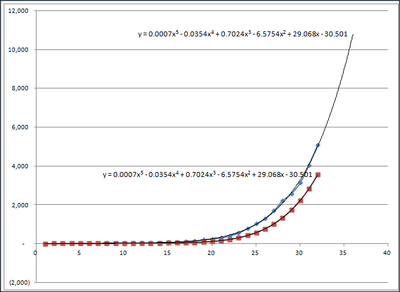
I'm using excel 2007 to graph some data, put in a trendline, show the equation and then use that equation to generate projected results to compare against the original data.
Here is the result. The blue curve is the actual data with trendline and resulting equation. The red curve is the calculated data from the blue trendline equation along with its own trendline and equation. The curves are obviously very different, as are the trendlines, but the resulting equations are identical. Impossible.
What gives?
- Labels:
-
Excel
- Mark as New
- Bookmark
- Subscribe
- Mute
- Subscribe to RSS Feed
- Permalink
- Report Inappropriate Content
Apr 03 2020 07:42 AM
- Mark as New
- Bookmark
- Subscribe
- Mute
- Subscribe to RSS Feed
- Permalink
- Report Inappropriate Content
Apr 03 2020 08:16 AM
@Jan Karel Pieterse Thank you, Jan! Yes, I increased the number of decimals to 5 and the curves matched up.
