- Home
- Microsoft 365
- Excel
- Re: Excel graph question (number & date)
Excel graph question (number & date)
- Subscribe to RSS Feed
- Mark Discussion as New
- Mark Discussion as Read
- Pin this Discussion for Current User
- Bookmark
- Subscribe
- Printer Friendly Page
- Mark as New
- Bookmark
- Subscribe
- Mute
- Subscribe to RSS Feed
- Permalink
- Report Inappropriate Content
Jul 09 2020 01:12 AM
Hi all,
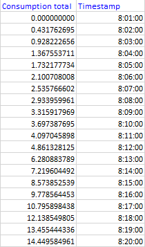
I feel quite silly for not being able to figure this out. We queried some data using a plugin in Excel, to display resource consumption in our factories. In this example we're looking at the water consumption as measured by sensors across a 20 minute period:
The consumption total column is formatted as "number, 9 decimals" and the Timestamp column has been formatted as "Time, hh:mm:ss" but tried custom as well.
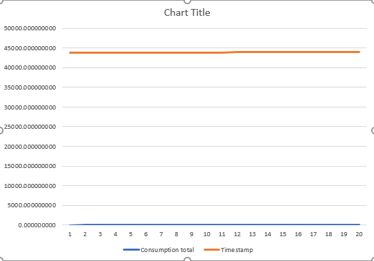
Over this period I'd like to make a super simple Excel graph, a line going up showing you when we used what amounts of water. However, the timestamp gets converted into a number which results in this:
How can I best display the consumption of water without seeing the timestamp as a line? I want the timestamps simply on the horizontal axis. Sorry for asking something so basic!
- Labels:
-
Excel
- Mark as New
- Bookmark
- Subscribe
- Mute
- Subscribe to RSS Feed
- Permalink
- Report Inappropriate Content
Jul 09 2020 01:53 AM - edited Jul 09 2020 03:08 AM
Solution@DLans Try it this way (see attached).
You should only chart the consumption with the timestamps on the X-axis as labels.
- Mark as New
- Bookmark
- Subscribe
- Mute
- Subscribe to RSS Feed
- Permalink
- Report Inappropriate Content
Jul 09 2020 03:21 AM
@Riny_van_Eekelen That was as simple as I feared it would be, thank you!
- Mark as New
- Bookmark
- Subscribe
- Mute
- Subscribe to RSS Feed
- Permalink
- Report Inappropriate Content
Accepted Solutions
- Mark as New
- Bookmark
- Subscribe
- Mute
- Subscribe to RSS Feed
- Permalink
- Report Inappropriate Content
Jul 09 2020 01:53 AM - edited Jul 09 2020 03:08 AM
Solution@DLans Try it this way (see attached).
You should only chart the consumption with the timestamps on the X-axis as labels.

