- Home
- Microsoft 365
- Excel
- Dynamic LINE CHART for data with expanding SERIES AND DATES
Dynamic LINE CHART for data with expanding SERIES AND DATES
- Subscribe to RSS Feed
- Mark Discussion as New
- Mark Discussion as Read
- Pin this Discussion for Current User
- Bookmark
- Subscribe
- Printer Friendly Page
- Mark as New
- Bookmark
- Subscribe
- Mute
- Subscribe to RSS Feed
- Permalink
- Report Inappropriate Content
Oct 09 2021 08:04 PM - edited Oct 09 2021 08:05 PM
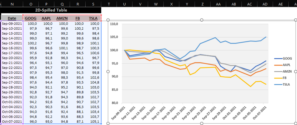
Below is a sample of 5 tech stocks quotes for the last 30 days that I pulled via STOCKHISTORY function.
From the above data I need to create a TREND (LINE) CHART that starts with 100 so I can compare price performance across stocks under the same baseline.
The problem I have is: the above sample covers 5 stocks over 21 market days, but on my real world that stock list may grow/shrink depending on an user's watchlist, and same thing goes with the dates span, which may grow/shrink as per the user's choice (i.e.: 1 week, 1 month, 3 months, 1 year, 5 years, etc.).
So we're talking about a 2-dimensional dynamic data array, and we all know that if I plot the chart just by highlighting the table and picking the chart type, Excel will just assume that static data array I had selected.
Which means every time this data grows either horizontally (additional series) and/or vertically (larger dates span) the chart will just miss out on those new items. And in case the opposite happens the chart will just show empty series and/or an empty space on the horizontal axis.
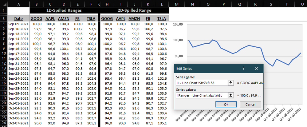
I already know the work around that prevents that from happening as far as DATES go, by setting up formula names for each data column spilled-range formula and putting them in place of each respective static data array for each series (since Excel chart STILL WON'T WORK WITH HASH REFERENCES - GO FIGURE!!!), as shown on the screenshots sequence that follows:
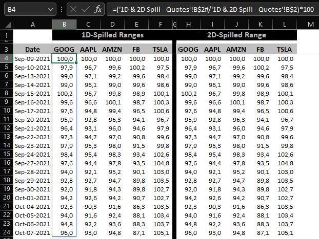
1D spilled range formula on row 4 for every column:
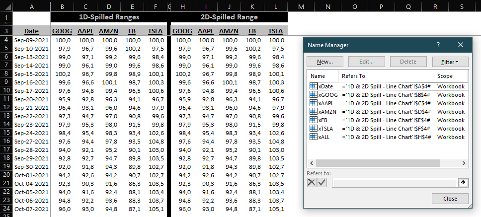
Formula names created for the dates series and each stock trend data series:
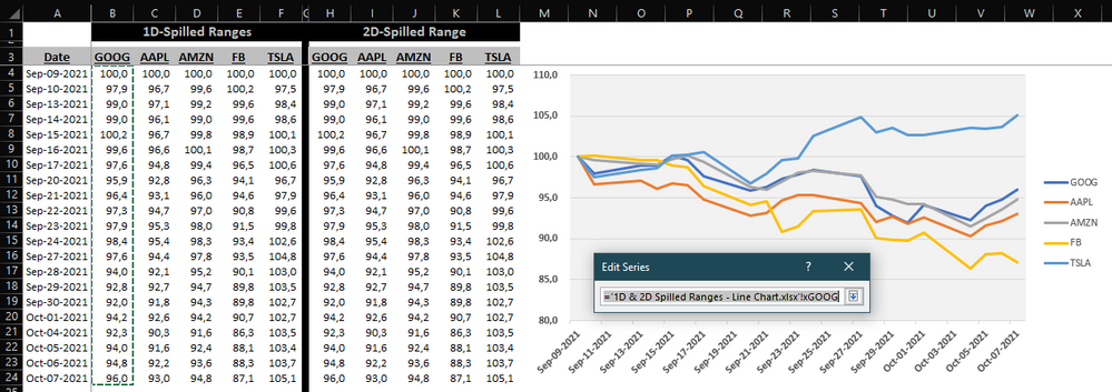
Chart series getting plotted via named formula:
The above approach does work great, but only takes care of growing/shrinking date spans though.
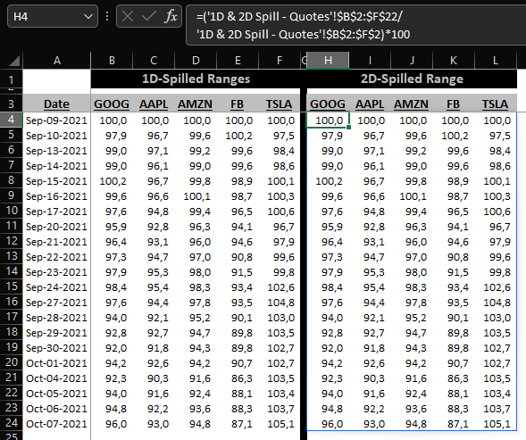
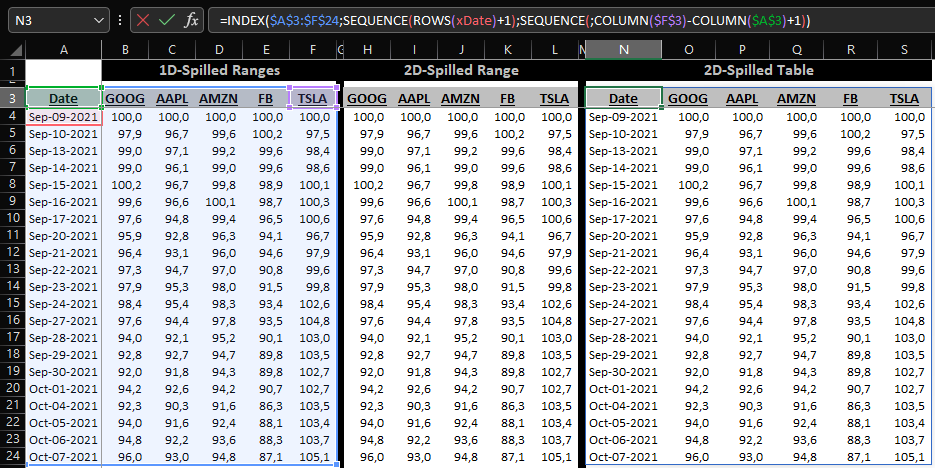
So I went ahead and created a 2D spilled range formula array as you may have already noticed at the above screenshots located on the right trend data set and named it "xALL".
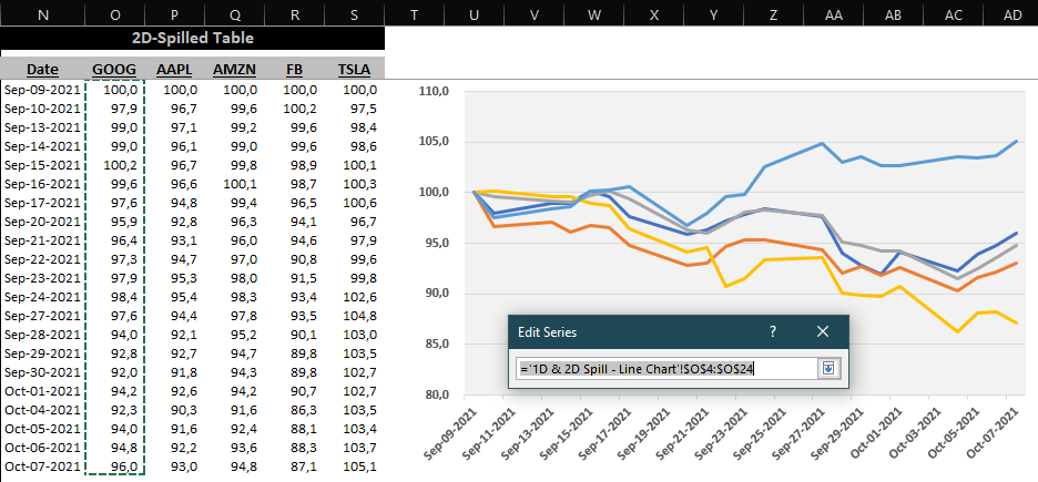
And then I tried to tweak the chart I had created using the 1D approach, got rid of all data series except one, and then switched its formula name to the 2D xALL named formula:
But as I was expecting, line charts work only with single rows/columns, so I keep getting this error message:
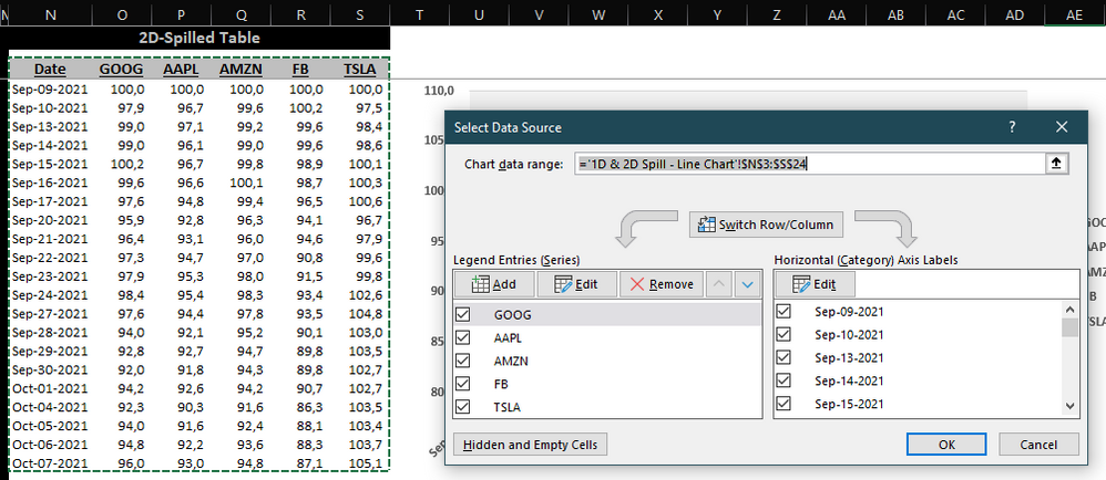
And then I thought: why not consolidate the entire tabular set (headers + date column + data series columns) with one single 2D spilled range via INDEX (named "xyALL"), highlight it, insert the line chart, and then replace the whole data set with this new named formula?
Initially the plan seemed to work fine...
But then when I checked whether Excel had converted that dynamic span into a static array, low and behold, after all Excel's smart but not THAT smart!
And every time I go to the 'Chart data range' box and try to replace the static array "$N$3:$N$24" with the dynamic named formula "xyALL" Excel will just convert it back to the static range:
And when I try to edit the SERIES references directly on the formula bar by replacing with the named formulas, I get the same expected "I can only take single row/column" error:
So, now I'm stuck in neutral... Is there actually a way to do that? Would a pivot table/pivot chart approach do the trick here? I'm not that well versed with pivot tables and I guess that would require some advanced knowledge I currently don't have in case it can be done via such path.
Thanks in advance for any help on this one!
Leonardo
- Labels:
-
Charting
-
Excel
-
Formulas and Functions

