- Home
- Microsoft 365
- Excel
- Custom labels aren't applying properly when copy/pasting filtered charts between applications
Custom labels aren't applying properly when copy/pasting filtered charts between applications
- Subscribe to RSS Feed
- Mark Discussion as New
- Mark Discussion as Read
- Pin this Discussion for Current User
- Bookmark
- Subscribe
- Printer Friendly Page
- Mark as New
- Bookmark
- Subscribe
- Mute
- Subscribe to RSS Feed
- Permalink
- Report Inappropriate Content
Mar 06 2023 09:35 AM - edited Mar 07 2023 06:07 AM
Edit: I believe this is a bug in Excel [Version 2208 (Build 15601.20538 Click-to-Run)]. See my second reply below.
When attempting to embed paste a copied chart from Excel 2016 to another application (Outlook, PowerPoint, etc.) that has been filtered in some way (to remove rows from the chart), custom labels apply from the start of the set of custom labels, regardless of what data is included.
Replication steps:
- Create a chart of any type. This is happening mostly on column and line charts for me. Add data labels. Customize those data labels with custom entries.
- In my instance, I have a column of values, and a formatted set of those values in a subsequent column. The data is in line by rows. The formatted data is what's being used as custom records.
- Filter that chart to limit the number of rows being included, specifically excluding at least the first line of data.
- In my instance, I have data that is organized by month. I have selected a middle range of data from that dataset.
- Copy this chart and attempt to paste into PPT or Outlook. The chart's data will be correct, but the labels will show from the first custom data label, regardless of what rows have been filtered.
I confirmed this happening in several Office products. When pasting a chart as an embed, if I edit the data within PPT/Outlook/whatever, it still looks right, but I noticed that the chart appears to only embed the specific fields that are being not filtered out, rather than everything in the chart. I think this is related to that.
Example:
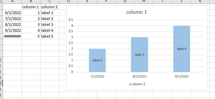
In Excel, I made the following chart. I attached the custom labels to each row's data. I filtered it to remove the first and last columns. Note that columns 2-4 have labels with the appropriate value in them.
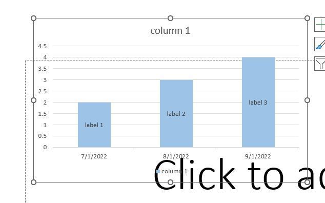
When I paste this chart into PPT via embed and use destination formatting (K), the below chart is pasted. Note that the entire chart is the same, but the labels show the first three entries in the custom label column, instead of the correct entries.
- Labels:
-
Excel
- Mark as New
- Bookmark
- Subscribe
- Mute
- Subscribe to RSS Feed
- Permalink
- Report Inappropriate Content
Mar 06 2023 10:02 AM
My use case is that I paste embedded, update the sizing as needed, then copy that embedded chart, delete, paste as picture. This pastes it without a border (unlike if you just paste as picture initially) and ensures proper sizing. This does not work with the above defect.
- Mark as New
- Bookmark
- Subscribe
- Mute
- Subscribe to RSS Feed
- Permalink
- Report Inappropriate Content
Mar 07 2023 06:02 AM

