- Subscribe to RSS Feed
- Mark Discussion as New
- Mark Discussion as Read
- Pin this Discussion for Current User
- Bookmark
- Subscribe
- Printer Friendly Page
- Mark as New
- Bookmark
- Subscribe
- Mute
- Subscribe to RSS Feed
- Permalink
- Report Inappropriate Content
Jan 15 2021 08:07 AM
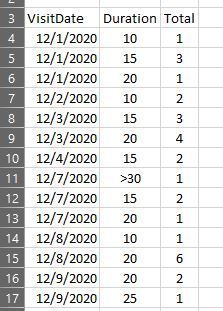
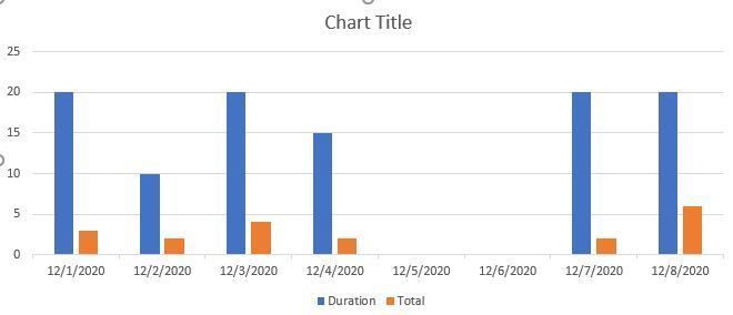
I'm pretty new to Excel and need to build a clustered chart for appointment resource data. Below is a snip of the data in the layout I have to work with. Each appointment type is provided from 5 minutes all the way to greater than 30 minutes. There should be a bar for each duration on each date it was used. Can someone please show me how to display this so each appointment duration appears as its own bar representing the daily total over each date it was used? The first screen shot shows the data set I have to work with. The second is the resulting chart I get. I can't seem to get the data to display correctly.
Just for clarity, 12/1/2020 shows 5 appointments... a single 10-minute appointment, 3 15-minute appts., and a single 20-minute appt. The Total column represents how many of that duration on that date. Thanks in advance.
- Mark as New
- Bookmark
- Subscribe
- Mute
- Subscribe to RSS Feed
- Permalink
- Report Inappropriate Content
Jan 15 2021 08:54 AM
Click anywhere on the chart to select it.
Activate the Design tab of the ribbon, under 'Chart Tools'.
In the Data group, click 'Select Data'.
Under 'Legend Entries (Series)', select the Duration series and click Remove.
Under 'Horizontal (Category) Axis Labels', click Edit.
You will see something like Sheet1!$A$4:$A$25 (the latter number depends on your actual data).
Change the second A to B: Sheet1!$A$4:$B$25.
Click OK, then click OK again.

