- Subscribe to RSS Feed
- Mark Discussion as New
- Mark Discussion as Read
- Pin this Discussion for Current User
- Bookmark
- Subscribe
- Printer Friendly Page
- Mark as New
- Bookmark
- Subscribe
- Mute
- Subscribe to RSS Feed
- Permalink
- Report Inappropriate Content
Aug 31 2022 04:49 AM
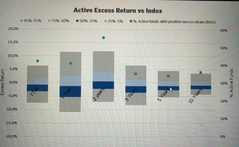
I want to make a box and whiskers plot that looks like the picture i am going to attach to this message. I want the data to be shown on the left handside of the diagram and the percentage or number of data that belongs to each quartile on the right handside of the diagram handside.
I want my data to be visualised like this.
So far I have calculated:
Min(=QUARTILE.INC(array; 0)
Q1 (=QUARTILE.INC(array; 1)
Q2 (=QUARTILE.INC(array; 2)
Q3(=QUARTILE.INC(array; 3)
Max (=QUARTILE.INC(array; 4)
Then in order to make a stacked column plot I calculate the followings:
Min
Q1-Min
Q2-Q1
Q3-Q2
Max-Q3
I have two problems:
1. when I add the Mean value, it is placed at the bottom of the stacked column but I want it to be placed in the middle
2. I want the percentage to be shown on the right handside of the diagram but I do not understand how to corporate the percentage to the data points I have already calculated
I really apprectiate if I get answer to these questions. Thanks
- Labels:
-
Excel
-
Formulas and Functions
