Turn on suggestions
Auto-suggest helps you quickly narrow down your search results by suggesting possible matches as you type.
Discussion Options
- Subscribe to RSS Feed
- Mark Discussion as New
- Mark Discussion as Read
- Pin this Discussion for Current User
- Bookmark
- Subscribe
- Printer Friendly Page
- Mark as New
- Bookmark
- Subscribe
- Mute
- Subscribe to RSS Feed
- Permalink
- Report Inappropriate Content
Jul 18 2022 12:07 PM
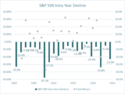
I am trying to line up this data and create a combo clustered chart with a scatter plot.
Notice how the scatter plot does not exactly line up with the clustered column chart.
| S&P 500 Intra Year Declines | Total Return | |
| 2002 | -33.0% | -22.10% |
| 2003 | -13.8% | 28.67% |
| 2004 | -7.4% | 10.88% |
| 2005 | -7.0% | 4.91% |
| 2006 | -7.5% | 13.91% |
| 2007 | -9.9% | 5.68% |
| 2008 | -47.7% | -37.00% |
| 2009 | -27.2% | 26.45% |
| 2010 | -15.6% | 15.06% |
| 2011 | -18.6% | 2.11% |
| 2012 | -9.6% | 14.22% |
| 2013 | -5.6% | 32.37% |
| 2014 | -7.3% | 13.67% |
| 2015 | -12.0% | 1.37% |
| 2016 | -10.3% | 11.95% |
| 2017 | -2.6% | 20.79% |
| 2018 | -19.4% | -5.19% |
| 2019 | -6.6% | 31.47% |
| 2020 | -33.8% | 18.39% |
| 2021 | -5.1% | 28.68% |
| 2022 | -23.0% | -19.97% |
Wondering if there is a possible way to simply line up the dots
Labels:
- Labels:
-
Charting
-
Excel
-
Formulas and Functions
2 Replies
- Mark as New
- Bookmark
- Subscribe
- Mute
- Subscribe to RSS Feed
- Permalink
- Report Inappropriate Content
Jul 18 2022 12:38 PM
I'd use a line chart with no lines, only markers. See the attached sample workbook.
- Mark as New
- Bookmark
- Subscribe
- Mute
- Subscribe to RSS Feed
- Permalink
- Report Inappropriate Content
Jul 18 2022 12:54 PM
A line chart combines with the columns better than the scatter in that both normally plot point mid-bay rather than on the grid points. Otherwise the column chart can be changed to plot on the grid points.

