- Home
- Microsoft 365
- Excel
- Clustered stacked Column Chart in Power Query/Pivot Table
Clustered stacked Column Chart in Power Query/Pivot Table
- Subscribe to RSS Feed
- Mark Discussion as New
- Mark Discussion as Read
- Pin this Discussion for Current User
- Bookmark
- Subscribe
- Printer Friendly Page
- Mark as New
- Bookmark
- Subscribe
- Mute
- Subscribe to RSS Feed
- Permalink
- Report Inappropriate Content
Jun 06 2023 07:41 AM
Hi all,
I am currently creating an excel table to automatically analyze data from a shared mailbox. In theory I can display all data I want but I need several charts for it. Ideally, I would want to display all information in one chart though.
So what I currently have is the following:
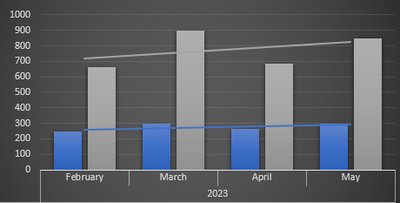
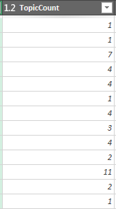
The bars plot the Topic Count - i.e. in the Query I have a column which counts all mails within a conversation. So sth like this:
The blue bar now shows the "count" of this column while the grey bar shows the "sum" --> i.e. blue bar shows number of individual conversations and grey number of total mails within a conversation.
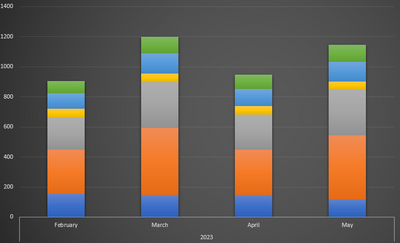
This is where it gets complicated: All mails in this mailbox are sorted in three different categories so the bars above are actually split into three sub parts.
So while I can create the same chart like above for each category I thought it would make sense to have a clustered stacked column chart in which you can see the bar like above but also the different categories.
When I do a clustered bar chart in Excel though it obviously just stacks both the sums +counts on top of each other and not as separate bars for each month:
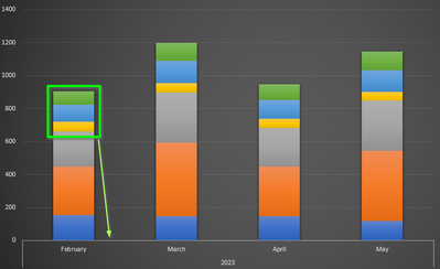
So what I would be looking for is to have the first three parts of the graph as a second bar, i.e. a clustered stacked column chart:
It sounds rather easy but it's bothering me now for some hours. Is there any way I can easily implement this into the pivot chart or maybe in the query?
I am specifically not looking into options to copy things around every time and rearrange tables etc. It has to be sth to just hit the "refresh data" button once a month. If there is no way to do that it's ok - I just wanted to ask the hove mind if there is sth I am missing.
Thanks so much and cheers
- Labels:
-
BI & Data Analysis
-
Excel
-
Power BI


