- Subscribe to RSS Feed
- Mark Discussion as New
- Mark Discussion as Read
- Pin this Discussion for Current User
- Bookmark
- Subscribe
- Printer Friendly Page
- Mark as New
- Bookmark
- Subscribe
- Mute
- Subscribe to RSS Feed
- Permalink
- Report Inappropriate Content
Jun 22 2021 08:23 PM - edited Jun 22 2021 08:26 PM
Hi,
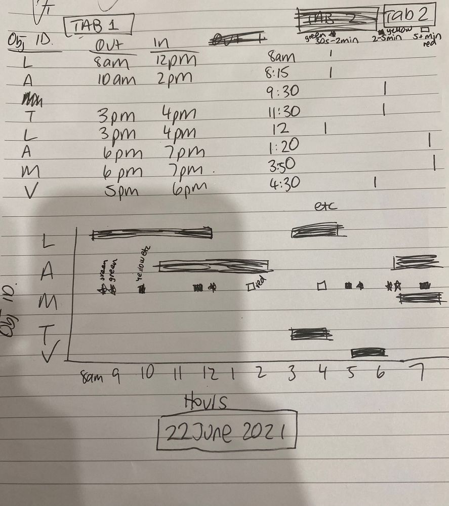
Not sure how to approach this challenge, I'm sure it can be done but I'm not sure how. We are needing to create a daily log of four peoples movements (bar chart) with records of noise (overlayed scatter) - we are having issues with a neighbour and so need to demonstrate that our dogs are not barking incessantly when we leave. I've looked at pivot options but think it needs to use a VLOOKUP setup so if need be we can just type in a date and export a graph that shows bar/scatter data for that particular day.
The picture is what I'd like to be able to achieve for each day. I've set up the records on two separate tabs for movements and barking instances.
Ideally the bar graph will just give one line for the same object ID even if there are multiple values on the same date. The scatter markings should also show different colours to denote the categories.
I've attached as far as I've got but the next steps are well above my skills in terms of creating the graphs and what I think requires a VLOOKUP so I'd be so grateful for any help. Thank you in advance!
Lyndall
- Labels:
-
Charting
-
Formulas and Functions
- Mark as New
- Bookmark
- Subscribe
- Mute
- Subscribe to RSS Feed
- Permalink
- Report Inappropriate Content
Jun 23 2021 11:51 AM - edited Jun 23 2021 11:56 AM
@lyndallmac , with some manual work, a chart like below can be made in which the solid markers denote out, blank markers denote in and colorful markers denote barking scale.
If a sufficiently big area is selected for charting, then i believe this should be flexible for new data appended over new rows.
Steps are mentioned in the attached excel file.
It's not the perfect way i guess, but one is able to do with no much skills other than just plotting scatters, copy pasting charts over one another, and formatting the markers.
and yes, for x-axis , add date and time first and then plot the charts.
y axis 2-3-4-5 can be overwritten with L-A-T-M text boxes.
Blank cells are automatically and undesirably plotted by excel as 0 , so the indexing for L is started from 2 onwards.
This enables to hide the y=0 line which has the undesired blank=0 markers by setting the y axis start as 1.
- Mark as New
- Bookmark
- Subscribe
- Mute
- Subscribe to RSS Feed
- Permalink
- Report Inappropriate Content
Sep 15 2021 07:33 AM
Hi @lyndallmac
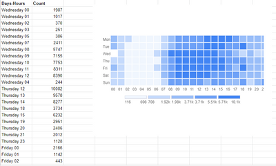
I attached the image might it help you.
You can create for Microsoft Excel & Office 365.
And if you are comfortable with Google Sheets, you can find here.
Thanks


