- Subscribe to RSS Feed
- Mark Discussion as New
- Mark Discussion as Read
- Pin this Discussion for Current User
- Bookmark
- Subscribe
- Printer Friendly Page
- Mark as New
- Bookmark
- Subscribe
- Mute
- Subscribe to RSS Feed
- Permalink
- Report Inappropriate Content
Jul 27 2022 06:51 AM
Good morning -
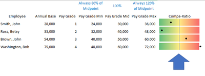
I am having difficulty creating a bar graph in a worksheet cell. I am wishing to chart the compa-ratio for each individual based on their grade midpoint. I would like the graph to show the three color gradient as shown, mark the midpoint amount and then plot where the employee falls within the range.
Below is an example. The area under Compa-Ratio is a text box view to show what I am looking for.
Any assistance would be greatly appreciated.
- Labels:
-
Excel
- Mark as New
- Bookmark
- Subscribe
- Mute
- Subscribe to RSS Feed
- Permalink
- Report Inappropriate Content
Jul 28 2022 10:58 AM - edited Jul 28 2022 11:05 AM
@CraftingBuddy I'm not sure if there is a better way but here I tried a couple of tricks:
on the left part of this image is an attempt using Conditional Formatting. It isn't exactly what you want but it IS in cell. I personally would get rid of the gradient that I added and just use the bar graph portion. On the right side of the image is a horizontal bar graph where I added the gradient with 75% transparancy (so you see the cell borders behind it) and removed the horizontal bars lines & fills but added the data points with a custom formatting to only show an asterisks (*). I feel this is visually closer to what you want but it is NOT in-cell but rather sitting on top of the cells and carefully scaled accordingly. The file is attached for you to play with. The 'values' are all based on column F (but 'hidden' using that conditional formatting)
EDIT: I realized I forgot to 'reverse category order' on the graph and while I was at it I added in column H a copy of the values in column F so it is easier to see them.

