- Home
- Microsoft 365
- Excel
- Added new column to table and chart shows wrong numbers
Added new column to table and chart shows wrong numbers
- Subscribe to RSS Feed
- Mark Discussion as New
- Mark Discussion as Read
- Pin this Discussion for Current User
- Bookmark
- Subscribe
- Printer Friendly Page
- Mark as New
- Bookmark
- Subscribe
- Mute
- Subscribe to RSS Feed
- Permalink
- Report Inappropriate Content
Sep 02 2021 12:44 PM
In the attached file, I added a new column "E" and the chart shows wrong numbers for that chart. The mouse pointer shows the right numbers, but the line chart reflects incorrect numbers. (The purple line). What explains this? Thanks.
- Labels:
-
Excel
- Mark as New
- Bookmark
- Subscribe
- Mute
- Subscribe to RSS Feed
- Permalink
- Report Inappropriate Content
Sep 02 2021 12:53 PM - edited Sep 02 2021 12:53 PM
That's weird - I don't see why it behaves this way. I'd delete the chart, select the table and create a new line chart.
- Mark as New
- Bookmark
- Subscribe
- Mute
- Subscribe to RSS Feed
- Permalink
- Report Inappropriate Content
Sep 02 2021 01:48 PM
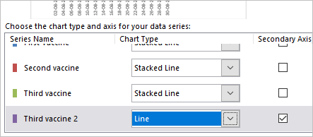
SolutionYou selected Stacked Line chart, it means each next line shows sum of all values in previous and current series. I don't know what actually you'd like to show. As variant you may shift on Line chart and show values for each series independently. Or keep staked lines for previous columns, use new one with secondary axis as non-stacked line. De[ends on what you'd like to have.
- Mark as New
- Bookmark
- Subscribe
- Mute
- Subscribe to RSS Feed
- Permalink
- Report Inappropriate Content
Sep 02 2021 01:52 PM
Ah, of course... <slaps forehead>
- Mark as New
- Bookmark
- Subscribe
- Mute
- Subscribe to RSS Feed
- Permalink
- Report Inappropriate Content
- Mark as New
- Bookmark
- Subscribe
- Mute
- Subscribe to RSS Feed
- Permalink
- Report Inappropriate Content
Sep 03 2021 06:40 AM
@PhilipLibman , you are welcome
Accepted Solutions
- Mark as New
- Bookmark
- Subscribe
- Mute
- Subscribe to RSS Feed
- Permalink
- Report Inappropriate Content
Sep 02 2021 01:48 PM
SolutionYou selected Stacked Line chart, it means each next line shows sum of all values in previous and current series. I don't know what actually you'd like to show. As variant you may shift on Line chart and show values for each series independently. Or keep staked lines for previous columns, use new one with secondary axis as non-stacked line. De[ends on what you'd like to have.
