- Home
- Microsoft 365
- Excel
- Add a secondary axis on a donut chart in Mac Excel 2019
Add a secondary axis on a donut chart in Mac Excel 2019
- Subscribe to RSS Feed
- Mark Discussion as New
- Mark Discussion as Read
- Pin this Discussion for Current User
- Bookmark
- Subscribe
- Printer Friendly Page
- Mark as New
- Bookmark
- Subscribe
- Mute
- Subscribe to RSS Feed
- Permalink
- Report Inappropriate Content
Jun 13 2020 12:03 PM
Hi everyone! Do you know how to add a secondary axis on a donut chart in Mac Excel 2019? Thanks!
- Labels:
-
Excel
-
Excel on Mac
- Mark as New
- Bookmark
- Subscribe
- Mute
- Subscribe to RSS Feed
- Permalink
- Report Inappropriate Content
Jun 13 2020 10:14 PM
@liang17 Not specific to Excel on Mac! A Donut chart has no axis. Not a primary one, so you can't add a secondary one. What are you trying to achieve? Can you visualise the chart you want to create?
- Mark as New
- Bookmark
- Subscribe
- Mute
- Subscribe to RSS Feed
- Permalink
- Report Inappropriate Content
Jun 14 2020 12:21 PM
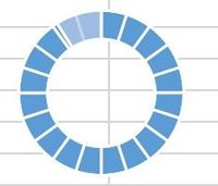
@Riny_van_Eekelen Thanks for the reply. I was following an online excel course and trying to create a donut chart attached below. It contains two series, the first donut is a whole sliced donut as the background. The second donut contains two portions. The gradient portion is added to the first donut as the secondary axis that I was trying to create.
- Mark as New
- Bookmark
- Subscribe
- Mute
- Subscribe to RSS Feed
- Permalink
- Report Inappropriate Content
Jun 14 2020 10:31 PM
@liang17 From looking at the picture I conclude that this is no more than a regular donut chart with one series, where the last three slices were given a contrasting colour. Now, I did find references on-line of people talking about primary and secondary axis in donut charts. But, it's probably better to refer to them as inner and outer ring. It is suggested to first create a column chart and select one series to be on the secondary axis. Then, change the chart types for both series to a donut. This didn't work out very well for me on a Mac, though.
The attached file contain an example of the first chart type mentioned above, plus one consisting of two rings, each representing one series. For the latter, select both series, insert chart, pie and change type to donut. Then adjust the colours of the inner (primary) and outer (secondary) to your liking.
In case I have completely missed the point, I would invite others to jump in and correct me.
- Mark as New
- Bookmark
- Subscribe
- Mute
- Subscribe to RSS Feed
- Permalink
- Report Inappropriate Content
May 02 2021 10:18 PM - edited May 02 2021 10:20 PM
Find an improvised chart, allows you to handle more than one data range. Read & follow the instruction on Sheet.
This works with all version of Excel.
