- Home
- Microsoft Edge Insider
- Discussions
- Re: What's new in Edge insider Canary Version 79.0.284
What's new in Edge insider Canary Version 79.0.284
- Subscribe to RSS Feed
- Mark Discussion as New
- Mark Discussion as Read
- Pin this Discussion for Current User
- Bookmark
- Subscribe
- Printer Friendly Page
- Mark as New
- Bookmark
- Subscribe
- Mute
- Subscribe to RSS Feed
- Permalink
- Report Inappropriate Content
Sep 24 2019 08:51 AM - edited Sep 26 2019 01:54 PM
The Global Media Controls key Icon is changed.
Before:
After (Now):
More info about this: this changed happened around 1 weeks ago in Google Chrome Canary, now Microsoft Edge insider got the new change too.
in case you're wondering how to get the Global Media Controls button on your Edge Insider Canary, you can do so by enabling this flag in: edge://flags/
Global Media Controls
Enables the Global Media Controls UI in the toolbar. – Mac, Windows
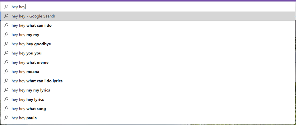
Another appearance change: notice the color in the omnibox search suggestions.
Before: it was gray
After (Now): it's pitch black, just like in the classic Edge.
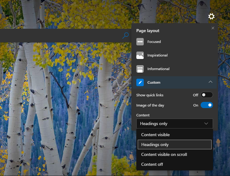
New Tab Page Customization
- Labels:
-
appearance
-
canary
-
Changes
-
Global Media Controls
- Mark as New
- Bookmark
- Subscribe
- Mute
- Subscribe to RSS Feed
- Permalink
- Report Inappropriate Content
Sep 24 2019 08:57 AM
Oh wow it is in regard to the appearance. Pretty neat.
Why those that are reading this post I encourage to try out Edge Canary. There's a lot of neat features that pop up which aren't (yet) in Developer version and especially not yet in Beta version.
- Mark as New
- Bookmark
- Subscribe
- Mute
- Subscribe to RSS Feed
- Permalink
- Report Inappropriate Content
Sep 24 2019 09:01 AM
- Mark as New
- Bookmark
- Subscribe
- Mute
- Subscribe to RSS Feed
- Permalink
- Report Inappropriate Content
Sep 24 2019 10:35 AM
- Mark as New
- Bookmark
- Subscribe
- Mute
- Subscribe to RSS Feed
- Permalink
- Report Inappropriate Content
Sep 24 2019 11:19 AM
Sure, if they change anything noticeable I'll be posting about it
- Mark as New
- Bookmark
- Subscribe
- Mute
- Subscribe to RSS Feed
- Permalink
- Report Inappropriate Content
Sep 24 2019 01:03 PM
@HotCakeX another thing: the address bar is darker now on the light mode, which looks VERY weird. I hope it's a bug.
- Mark as New
- Bookmark
- Subscribe
- Mute
- Subscribe to RSS Feed
- Permalink
- Report Inappropriate Content
Sep 24 2019 01:10 PM
Enables the Global Media Controls UI in the toolbar. – Mac, Windows
#global-media-controls
Note: This button is an "auto-hide/auto-show button. In other words it will only show when you are on a website that has media to be played and auto-hide when you are not. It will not show all the time unless you are on a media site...
At least that is the way it has been working for me
Version 79.0.284.0 (Official build) canary (64-bit)
Dennis5mile
- Mark as New
- Bookmark
- Subscribe
- Mute
- Subscribe to RSS Feed
- Permalink
- Report Inappropriate Content
Sep 24 2019 01:35 PM
- Mark as New
- Bookmark
- Subscribe
- Mute
- Subscribe to RSS Feed
- Permalink
- Report Inappropriate Content
Sep 24 2019 01:38 PM
@YgorCortes wrote:@HotCakeX another thing: the address bar is darker now on the light mode, which looks VERY weird. I hope it's a bug.
Hi,
this is how it looks like on my Edge insider canary Version 79.0.284.0
if it's different for you, please post a screenshot to see the difference, thanks
- Mark as New
- Bookmark
- Subscribe
- Mute
- Subscribe to RSS Feed
- Permalink
- Report Inappropriate Content
Sep 24 2019 01:42 PM - edited Sep 24 2019 01:44 PM
Yeah, I only mentioned it for those that did not know this. The new folks that are just now checking out the new Edge... ;)
Dennis5mile
- Mark as New
- Bookmark
- Subscribe
- Mute
- Subscribe to RSS Feed
- Permalink
- Report Inappropriate Content
Sep 26 2019 12:09 PM
@HotCakeXHere's how it looks on mine
- Mark as New
- Bookmark
- Subscribe
- Mute
- Subscribe to RSS Feed
- Permalink
- Report Inappropriate Content
Sep 26 2019 12:14 PM
- Mark as New
- Bookmark
- Subscribe
- Mute
- Subscribe to RSS Feed
- Permalink
- Report Inappropriate Content
Sep 26 2019 01:51 PM - edited Sep 26 2019 01:57 PM
@HotCakeX That's not the only change in the Global media controls, there are two other changes which I mention here:
Some nice changes made to the "Global Media Controls" in Edge insider Canary.
And this is another novelty in the Canary version (79.0.286.0):
Microsoft improves the Aura tooltips in Edge insider Canary.
- Mark as New
- Bookmark
- Subscribe
- Mute
- Subscribe to RSS Feed
- Permalink
- Report Inappropriate Content
Sep 26 2019 01:56 PM
- Mark as New
- Bookmark
- Subscribe
- Mute
- Subscribe to RSS Feed
- Permalink
- Report Inappropriate Content
Sep 26 2019 05:04 PM - edited Sep 26 2019 05:04 PM
@HotCakeX You're awesome, thanks for sharing! :)
- Mark as New
- Bookmark
- Subscribe
- Mute
- Subscribe to RSS Feed
- Permalink
- Report Inappropriate Content
- Mark as New
- Bookmark
- Subscribe
- Mute
- Subscribe to RSS Feed
- Permalink
- Report Inappropriate Content
Sep 30 2019 11:49 AM - edited Sep 30 2019 11:50 AM
"Another appearance change: notice the color in the omnibox search suggestions.
Before: it was gray
After (Now): it's pitch black, just like in the classic Edge."
Fortunately, in the build released today in Canary (79.0.290.0), Microsoft has reversed this change, this was a change made in Chromium itself, it was not a change "planned" or on purpose in the new Edge, the omnibox returns to have the same nice color of before.
- Mark as New
- Bookmark
- Subscribe
- Mute
- Subscribe to RSS Feed
- Permalink
- Report Inappropriate Content
Sep 30 2019 12:27 PM
I prefer that to this shady gray..
- Mark as New
- Bookmark
- Subscribe
- Mute
- Subscribe to RSS Feed
- Permalink
- Report Inappropriate Content
Sep 30 2019 12:56 PM
@HotCakeXI am very happy that they have restored the gray color, I never liked pitch black, for example, I would like the Settings app (Windows 10) to have the same gray color of the Store, I think most people prefer gray over pitch black, that's why Microsoft recently changed the color of the aura tooltips.
- Mark as New
- Bookmark
- Subscribe
- Mute
- Subscribe to RSS Feed
- Permalink
- Report Inappropriate Content
Sep 30 2019 01:14 PM
but between me and you, we 2 have obviously different tastes and that's respectable, Microsoft just needs to provide us with options to satisfy our personalization needs :)


