- Subscribe to RSS Feed
- Mark Discussion as New
- Mark Discussion as Read
- Pin this Discussion for Current User
- Bookmark
- Subscribe
- Printer Friendly Page
- Mark as New
- Bookmark
- Subscribe
- Mute
- Subscribe to RSS Feed
- Permalink
- Report Inappropriate Content
Aug 05 2020 09:42 AM
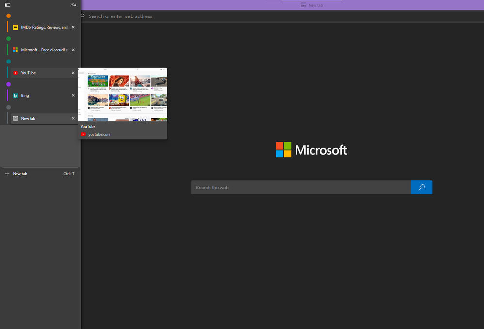
managed to get it on Edge Version 86.0.598.0 (Official build) canary (64-bit)
They are a little premature and basic, still need to evolve a lot.
but for now the tab previews work, tab grouping and colors work and the main button for switching between horizontal/vertical view works.
there is a big gap here which I don't understand why it's there. probably a placeholder for an upcoming feature.
overall I like it and looking forward to a more evolved experience from vertical tabs soon.
- Mark as New
- Bookmark
- Subscribe
- Mute
- Subscribe to RSS Feed
- Permalink
- Report Inappropriate Content
- Mark as New
- Bookmark
- Subscribe
- Mute
- Subscribe to RSS Feed
- Permalink
- Report Inappropriate Content
Oct 24 2020 04:21 PM
@HotCakeX Do you thing, they will improve it (but move up the address bar to reclaim space not used anymore by the tab ? (because i love the vertical but i found very ugly the empty bar at the top :\ )
- Mark as New
- Bookmark
- Subscribe
- Mute
- Subscribe to RSS Feed
- Permalink
- Report Inappropriate Content
Oct 25 2020 12:04 AM
I hope they do something like that, because it'll make sense and saves space.
when people use vertical tabs on the left, it takes up some space, so instead they need to free up some space at the top to compensate for that
- Mark as New
- Bookmark
- Subscribe
- Mute
- Subscribe to RSS Feed
- Permalink
- Report Inappropriate Content
Oct 25 2020 09:08 AM
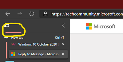
@HotCakeX Yep, I just got it, and it does look nice. The only glitch I'm seeing at the moment is with tab groups. I've noticed that when I have more than one tab group, when the bottom one is collapsed, the title/header of the top group is hidden.
- « Previous
- Next »


