- Home
- Microsoft Edge Insider
- Discussions
- Re: Ugly outline in dropdown menus
Ugly outline in dropdown menus
- Subscribe to RSS Feed
- Mark Discussion as New
- Mark Discussion as Read
- Pin this Discussion for Current User
- Bookmark
- Subscribe
- Printer Friendly Page
- Mark as New
- Bookmark
- Subscribe
- Mute
- Subscribe to RSS Feed
- Permalink
- Report Inappropriate Content
Feb 09 2021 04:08 AM
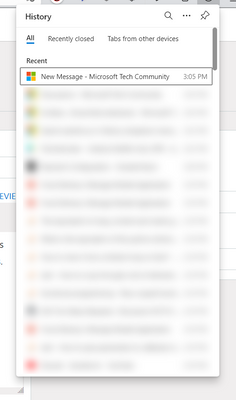
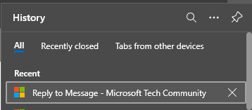
The first element in History/Favorites/Downloads menus is always outlined when I open the menu - it's ugly and there's no need in this because I did not used keyboard for navigation between the elements.
- Mark as New
- Bookmark
- Subscribe
- Mute
- Subscribe to RSS Feed
- Permalink
- Report Inappropriate Content
Feb 09 2021 06:43 AM
doesn't look that bad..
you might not use keyboard but you can press enter immediately after opening history panel to go to the first entry
it's also there for assistive technologies. I remember developers mentioning similar thing in this forum.
- Mark as New
- Bookmark
- Subscribe
- Mute
- Subscribe to RSS Feed
- Permalink
- Report Inappropriate Content
Feb 09 2021 09:06 AM
If I open the old history dropdown, there will not be outlines until I use the keyboard for the first time.
I think there's no need in instant outlines (applies to all websites) until I use keyboard or if I don't have assistive technologies enabled.
- Mark as New
- Bookmark
- Subscribe
- Mute
- Subscribe to RSS Feed
- Permalink
- Report Inappropriate Content
Feb 09 2021 10:04 AM
the same outline exists for favorites and downloads flyouts,
Collections don't have it which makes it inconsistent,
this is useful even if user is not having any assistive technology, like if you just use keyboard shortcuts and you don't have to press down arrow twice.
maybe instead of an outline if it was a mild highlight over the selected item, it would look better
- Mark as New
- Bookmark
- Subscribe
- Mute
- Subscribe to RSS Feed
- Permalink
- Report Inappropriate Content
Feb 10 2021 02:51 AM

