- Home
- Microsoft Edge Insider
- Discussions
- Re: there's an ugly white line between the search box and suggestions when Edge is in dark theme
there's an ugly white line between the search box and suggestions when Edge is in dark theme
- Subscribe to RSS Feed
- Mark Discussion as New
- Mark Discussion as Read
- Pin this Discussion for Current User
- Bookmark
- Subscribe
- Printer Friendly Page
- Mark as New
- Bookmark
- Subscribe
- Mute
- Subscribe to RSS Feed
- Permalink
- Report Inappropriate Content
Oct 21 2019 11:49 AM
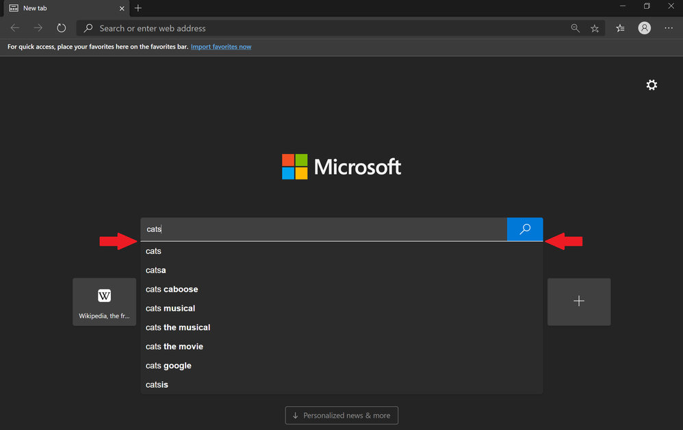
see red arrows in attached screenshot, please fix!
- Mark as New
- Bookmark
- Subscribe
- Mute
- Subscribe to RSS Feed
- Permalink
- Report Inappropriate Content
Oct 21 2019 01:50 PM - edited Oct 21 2019 01:52 PM
Hi,
I think that search box could use a better design too,
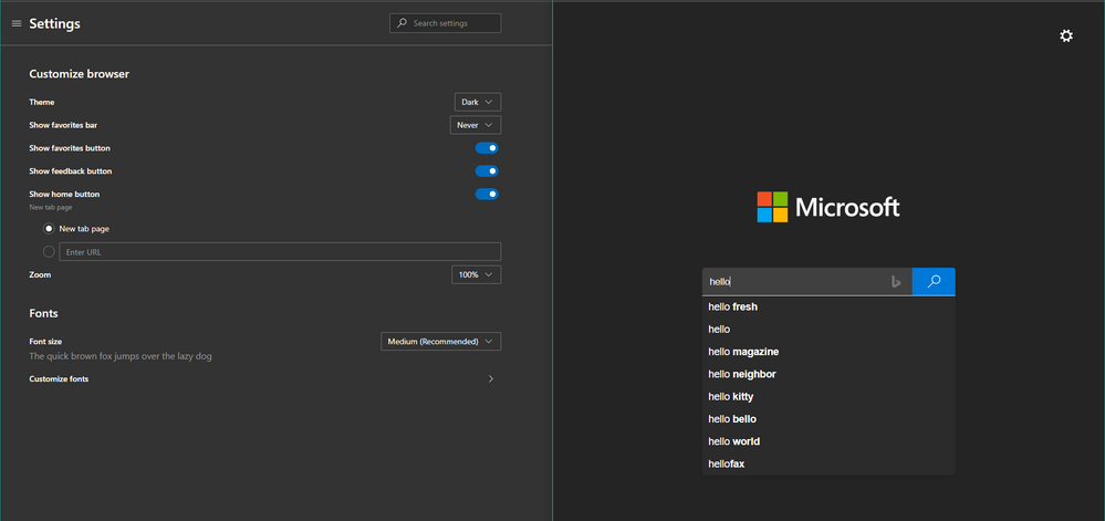
for example this is how it looks like in Dark theme
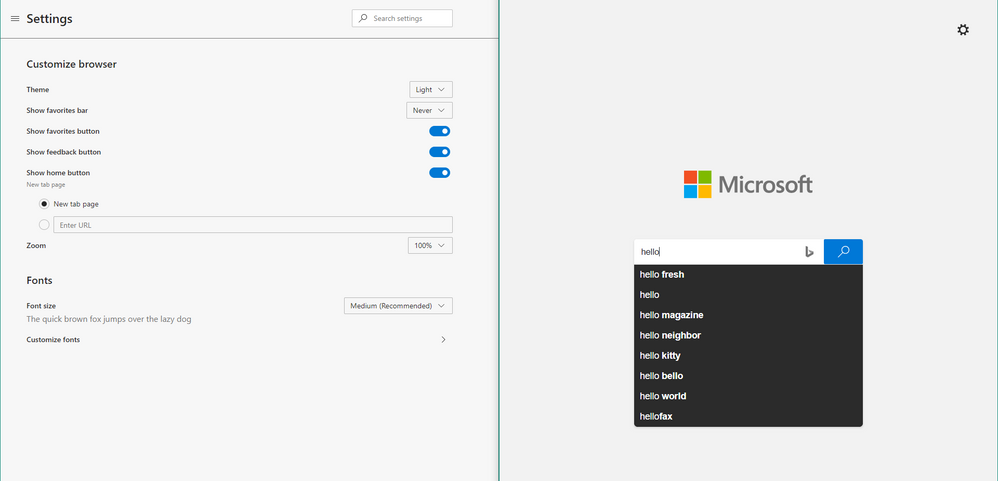
And how it looks like in Light theme
so in addition to fixing that thin white line that you mentioned, I think they should also fix the drop down menu background as well in Light theme, because it is black with white text.
it should be the opposite, white background with black text.
right now in both Dark and Light theme, they look the same.
Edge Insider Version 79.0.308.0 (Official build) canary (64-bit)
- Mark as New
- Bookmark
- Subscribe
- Mute
- Subscribe to RSS Feed
- Permalink
- Report Inappropriate Content
Jan 23 2020 03:12 PM
@HotCakeX Are you still seeing the dark search suggestions in the light theme? If so, please let us know.
Fawkes (they/them)
Project & Community Manager - Microsoft Edge
- Mark as New
- Bookmark
- Subscribe
- Mute
- Subscribe to RSS Feed
- Permalink
- Report Inappropriate Content
Jan 23 2020 04:11 PM
Hi@Deleted
no it's fixed now in Version 81.0.402.0 (Official build) canary (64-bit)
- Mark as New
- Bookmark
- Subscribe
- Mute
- Subscribe to RSS Feed
- Permalink
- Report Inappropriate Content
Jan 24 2020 09:55 AM - edited Jan 24 2020 10:08 AM
@HotCakeX Great! I'm glad to hear it. :)
Fawkes (they/them)
Project & Community Manager - Microsoft Edge


