- Home
- Microsoft Edge Insider
- Discussions
- Suggestions to Extensions fly-out
Suggestions to Extensions fly-out
- Subscribe to RSS Feed
- Mark Discussion as New
- Mark Discussion as Read
- Pin this Discussion for Current User
- Bookmark
- Subscribe
- Printer Friendly Page
Feb 17 2021 06:37 AM
- Mark as New
- Bookmark
- Subscribe
- Mute
- Subscribe to RSS Feed
- Permalink
- Report Inappropriate Content
Feb 17 2021 06:37 AM
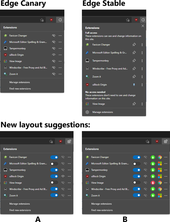
I decided to play around with the fly-out menu design of the extensions a little.
I even changed the icon that represents the extensions.
In example A I changed the image of the eye that represents a hidden extension to a darker shade, so that there is a greater contrast between the "hidden" eyes and the "visible" eyes.
Still in example A, I put turn on/off buttons so that it is possible to activate or deactivate an extension directly from there.
Example B is more confusing (hehe). Here I also placed icons that indicate whether the extension has access to the site or not. (Maybe the Stop icon is not the best icon for that...)
And I also added icons that indicate the source of that extension (Microsoft, Google), and by clicking on these icons you would go directly to the respective store and extension
- Mark as New
- Bookmark
- Subscribe
- Mute
- Subscribe to RSS Feed
- Permalink
- Report Inappropriate Content
