- Home
- Microsoft Edge Insider
- Discussions
- Suggestion: New Tab page new Quick Links on ver 86.0.590.0 suggestion
Suggestion: New Tab page new Quick Links on ver 86.0.590.0 suggestion
- Subscribe to RSS Feed
- Mark Discussion as New
- Mark Discussion as Read
- Pin this Discussion for Current User
- Bookmark
- Subscribe
- Printer Friendly Page
- Mark as New
- Bookmark
- Subscribe
- Mute
- Subscribe to RSS Feed
- Permalink
- Report Inappropriate Content
Jul 28 2020 08:31 AM - edited Jul 29 2020 07:36 PM
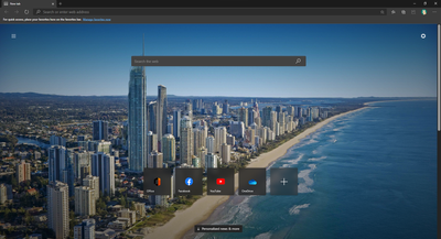
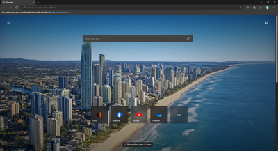
I noticed that New Tab page Quick Links design is changed on version 86.0.590.0 and I would like to share my feedback that this is bad in terms of visibility and even to aesthetics. The previous design that had a solid square were better in terms of visibility and feels more akin to Live Tiles (even though its not live).
This is the new Quick Links in New Tab page currently in version 86.0.590.0 Dev channel
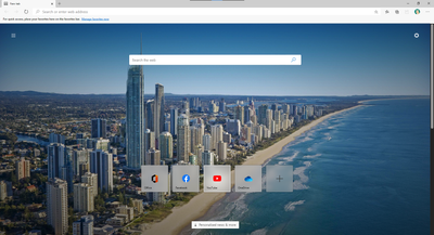
I suggest to to improve it by bringing back the tile but make it Fluent with Acrylic effect (translucent). And make it complete square with same Live Tile layout for consistency from the Start menu in Windows 10. This is not just aesthetics, but for usability standpoint, it is more clear and visible against any background picture.
Suggestions:
Dark theme Quick Links
Dark theme on hover with Reveal Highlight effect
Light theme Quick Links
Light theme on hover with Reveal Highlight effect
- Mark as New
- Bookmark
- Subscribe
- Mute
- Subscribe to RSS Feed
- Permalink
- Report Inappropriate Content
Jul 28 2020 10:36 AM - edited Jul 28 2020 10:39 AM
You made a really good work. I hope that Microsoft will keep it in mind , despite their plans of no add nothing of "Fluent Design" on the new Edge.
- Mark as New
- Bookmark
- Subscribe
- Mute
- Subscribe to RSS Feed
- Permalink
- Report Inappropriate Content
Jul 28 2020 11:00 AM
It is a very nice suggestion. Can you please also send this suggestion (great if already sent) through the in-app feedback tool (Alt+Shift+I) in Microsoft Edge and also other users who like this suggestion in order to get this suggestion a +1 to make it a part of Microsoft Edge in the future.
- Mark as New
- Bookmark
- Subscribe
- Mute
- Subscribe to RSS Feed
- Permalink
- Report Inappropriate Content
Jul 29 2020 12:07 AM
- Mark as New
- Bookmark
- Subscribe
- Mute
- Subscribe to RSS Feed
- Permalink
- Report Inappropriate Content
Jul 29 2020 12:10 AM
The original squared Quick Links were better in terms of visibility, easily to tell how big the touch target, and it stands out from the background image. Also better consistent (not perfect) to Windows 10 aesthetics.


