- Home
- Microsoft Edge Insider
- Discussions
- 回复: Should add more margin(or padding) to all extensions info of Extension Pop-up Menu
Some issues of Extension Toolbar Menu
- Subscribe to RSS Feed
- Mark Discussion as New
- Mark Discussion as Read
- Pin this Discussion for Current User
- Bookmark
- Subscribe
- Printer Friendly Page
- Mark as New
- Bookmark
- Subscribe
- Mute
- Subscribe to RSS Feed
- Permalink
- Report Inappropriate Content
Sep 28 2019 05:58 PM - edited Sep 28 2019 06:13 PM
Because I install many extensions to my Edge Canary, putting all extension icons to three dots menu isn't a good idea, I add a flag " --enable-features=ExtensionsToolbarMenu" to enable flag called "Extensions Toolbar Menu", and now I think something could make it better.
My Edge startup command: "C:\Users\thinkpad\AppData\Local\Microsoft\Edge SxS\Application\msedge.exe" --enable-features=ExtensionsToolbarMenu
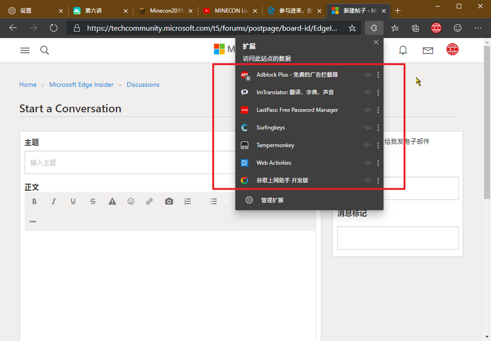
After enabled it, I found that the area of Extension icons and titles have less margin(or padding), this is not uniform with the style of this window. So my suggestion is could add more margin(or padding) to it to make it look better.
Now it is: (screenshot)
And last I hope Edge DevTeam could make it as the default Extension Menu display, instead of putting all of them to three dots menu, Thanks!
(SOME UPDATES, SORRY....)
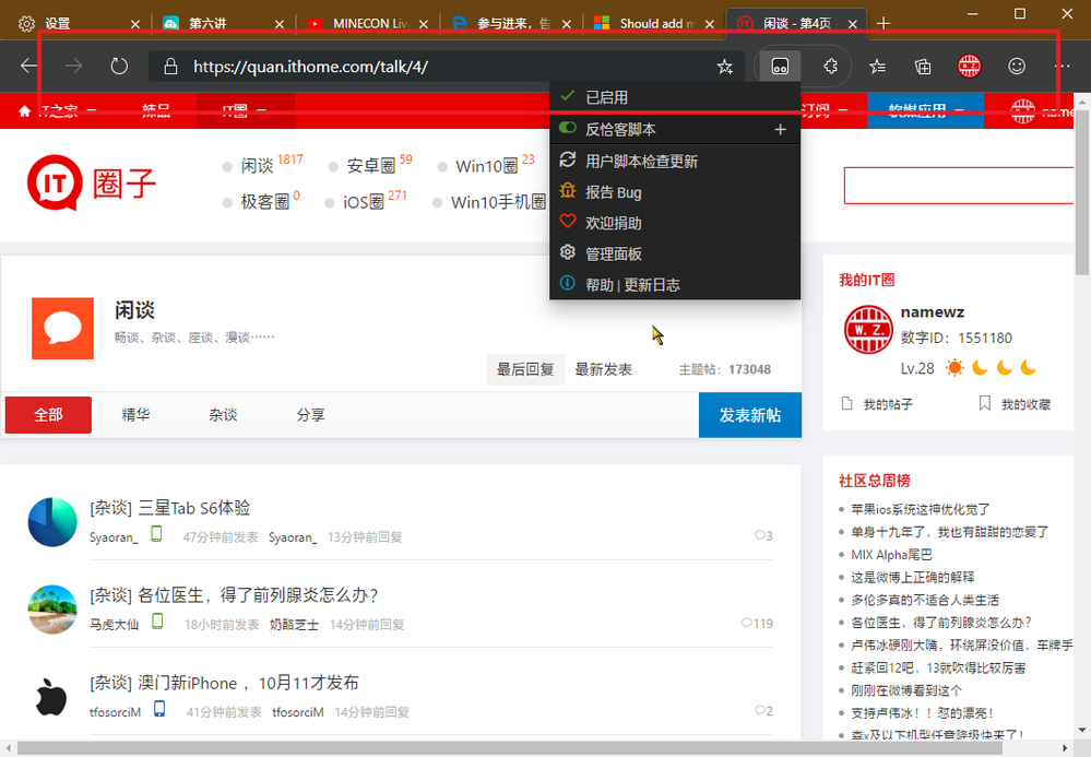
I found a new bug of Extension Toolbar Menu, after I clicked an extension icon and displayed extension popup window, the height of whole address bar is a bit bigger than before.
Like this:
(Sorry for my poor English, and thank to all members of Edge Team):beaming_face_with_smiling_eyes:![]()
- Mark as New
- Bookmark
- Subscribe
- Mute
- Subscribe to RSS Feed
- Permalink
- Report Inappropriate Content
Sep 28 2019 06:02 PM
I'm using Edge Canary 79.0.287.0 with Windows 10 build 18362.10022(Slow Ring).

