- Home
- Microsoft Edge Insider
- Discussions
- Re: Some bugs with the latest versions (Canary)
Some bugs and suggestions with the latest versions (Canary)
- Subscribe to RSS Feed
- Mark Discussion as New
- Mark Discussion as Read
- Pin this Discussion for Current User
- Bookmark
- Subscribe
- Printer Friendly Page
- Mark as New
- Bookmark
- Subscribe
- Mute
- Subscribe to RSS Feed
- Permalink
- Report Inappropriate Content
Nov 21 2019 02:07 PM - edited Mar 18 2020 10:56 AM
Hello
1 - Since the .340 version, when I click on the button Restart (changes of an option in edge://flags/)the browser closes but does not reopen (the Edge process is still running in the task manager)
2 - Possible to re-put the option to disable the immersive reader (as it was before) in edge://flags/ (or in edge://policy/ )
Easy to set up and everyone is happy ![]()
3 - If "Browsing history" in edge://settings/clearBrowsingDataOnClose is enable, it causes the bug to have about:blank page when we open Edge before having the requested web page (shortcut, start page, clickable link, etc ...)
If the browser is already open, and I open a web page from a shortcut, clickable link from software, etc... I have the requested page directly in new tab (no about:blank)
4 - Always display bugs in text frames or clickable buttons of some sites
Thanks for your great work
- Mark as New
- Bookmark
- Subscribe
- Mute
- Subscribe to RSS Feed
- Permalink
- Report Inappropriate Content
Mar 09 2020 01:12 AM
@Deleted
Problem #3 is "almost" resolved
I no longer have the about:blank page with the option activated
But at times, when I click on a shortcut, the window opens and closes by itself
- Mark as New
- Bookmark
- Subscribe
- Mute
- Subscribe to RSS Feed
- Permalink
- Report Inappropriate Content
Apr 08 2020 09:51 AM - edited Apr 08 2020 09:52 AM
@Deleted
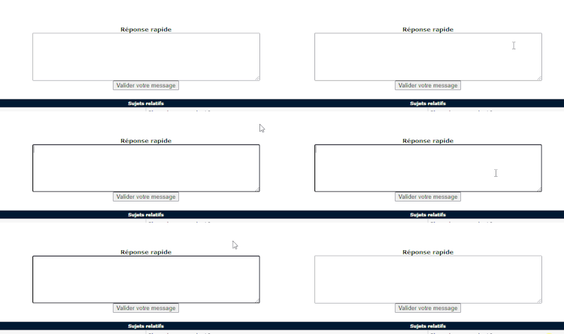
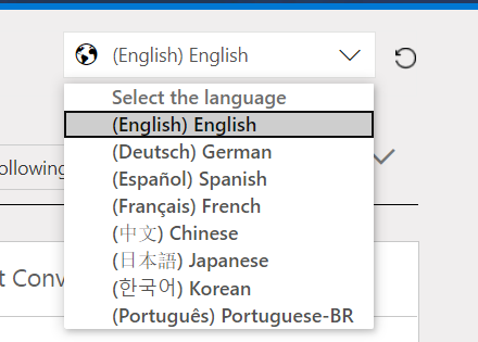
For bug 4, I add a screen of this forum where we see the text frames or clickable buttons bug
The black outline when I scroll the cursor
Thanks
- Mark as New
- Bookmark
- Subscribe
- Mute
- Subscribe to RSS Feed
- Permalink
- Report Inappropriate Content
Apr 08 2020 09:13 PM
- Mark as New
- Bookmark
- Subscribe
- Mute
- Subscribe to RSS Feed
- Permalink
- Report Inappropriate Content
Apr 08 2020 11:22 PM
@Deleted
You're welcome ;)
I forgot to specify that I did not have a black "coutour" before the appearance of this "bug" with old version of Edge (and it is not present with Chrome for example)
- Mark as New
- Bookmark
- Subscribe
- Mute
- Subscribe to RSS Feed
- Permalink
- Report Inappropriate Content
Apr 09 2020 12:01 AM
@Deleted
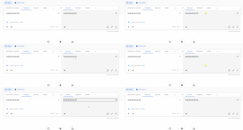
here it how it looks like on Firefox
and now on Edge Version 83.0.478.1 (Official build) canary (64-bit)
- Mark as New
- Bookmark
- Subscribe
- Mute
- Subscribe to RSS Feed
- Permalink
- Report Inappropriate Content
Apr 09 2020 09:25 AM
@Deleted
I can confirm that the black bar around the language selector is not part of the intended design, yet. I can also see this in the dogfood build.
Why yet?
Because as we continue our accessibility journey items that are accessed by using the keyboard (i.e. Tab and arrow keys) should have a visual focus indicator around them. We have been using a broken dash for this else where in the community and not a solid line. We have not added this to the language selector yet.
Allen
- Mark as New
- Bookmark
- Subscribe
- Mute
- Subscribe to RSS Feed
- Permalink
- Report Inappropriate Content
Apr 14 2020 11:32 AM
- Mark as New
- Bookmark
- Subscribe
- Mute
- Subscribe to RSS Feed
- Permalink
- Report Inappropriate Content
Apr 14 2020 11:37 AM
umm no I don't remember seeing that in other places, i don't have a website to test it on atm
- Mark as New
- Bookmark
- Subscribe
- Mute
- Subscribe to RSS Feed
- Permalink
- Report Inappropriate Content
Apr 14 2020 12:54 PM - edited Apr 14 2020 12:56 PM
SolutionWith regards to the black bar on focusable elements this change is by design and was tested with end users. From an aesthetics perspective the change was roughly a 50/50 split for/against but it was more preferred by users that have a need for higher contrast colors. Because of our focus on accessibility we decided that it broke the tie. We go over this change in our blog post about the updated form controls. This change has landed in Chromium itself and will be visible in Chrome started in version 83.
And Firefox is also considering aligning with our adjustment too due to the accessibility benefits.
Thanks as always for the feedback and please keep it coming.
- Mark as New
- Bookmark
- Subscribe
- Mute
- Subscribe to RSS Feed
- Permalink
- Report Inappropriate Content
Apr 14 2020 11:55 PM - edited Apr 15 2020 12:11 AM
Thanks for your reply
So this "problem / bug" is actually wanted ?
Because it's more like a bug than anything else, to have this black "box" (very bold) on any clickable button, link, etc. on web pages
As it was before, there was also a "difference" but much more "clean/pretty" (much better "integrated" into web pages)
It is the "black" and "too bold" which does not go at all
That of Google Chrome is good, very little difference on the text and the clickable button
And according to your blog , there should be no difference (or very little) on the clickable buttons and text, for example
Currently, there is this black framed almost everywhere
Thanks
- Mark as New
- Bookmark
- Subscribe
- Mute
- Subscribe to RSS Feed
- Permalink
- Report Inappropriate Content
Apr 15 2020 02:53 AM - edited Apr 15 2020 03:21 AM
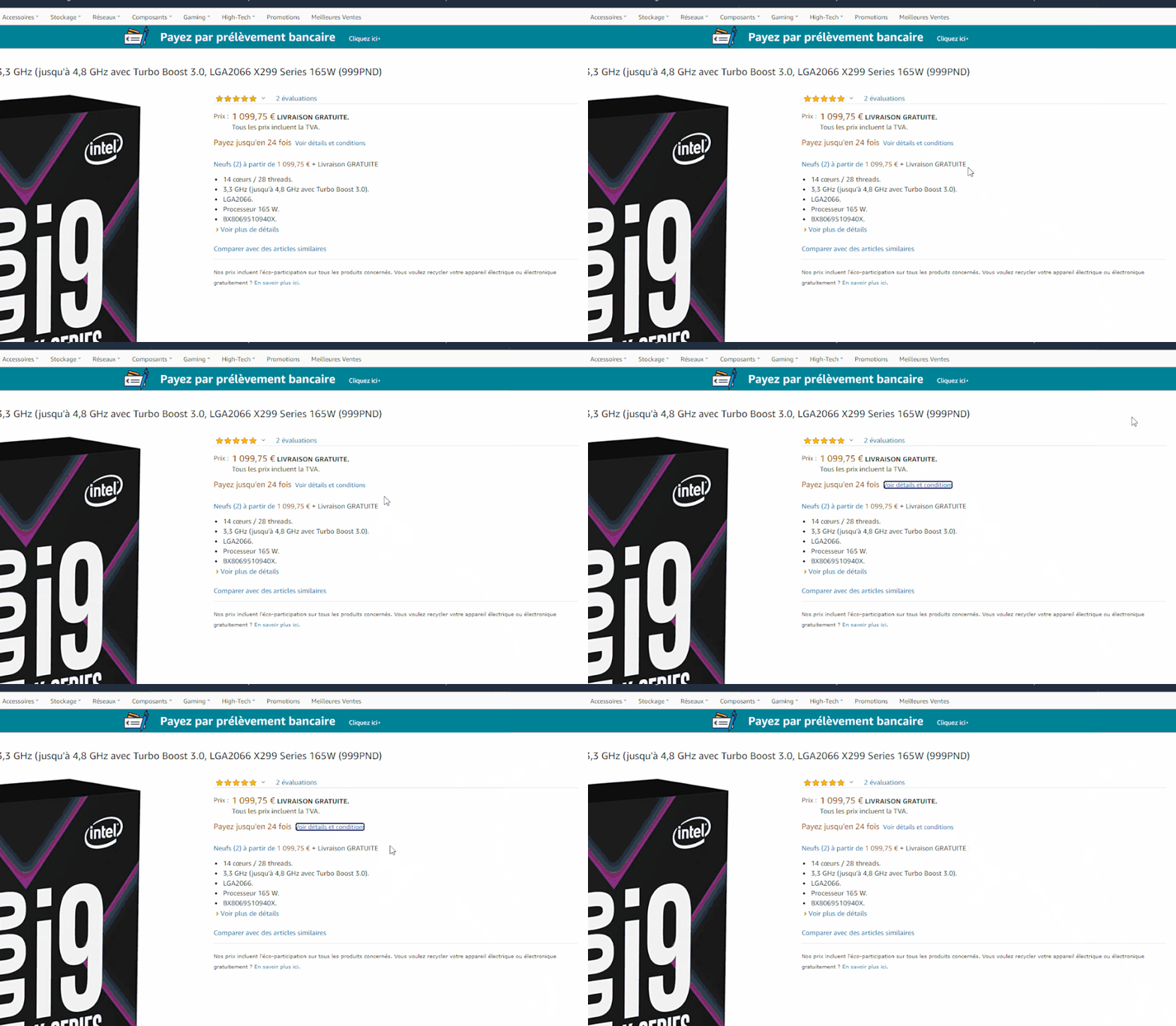
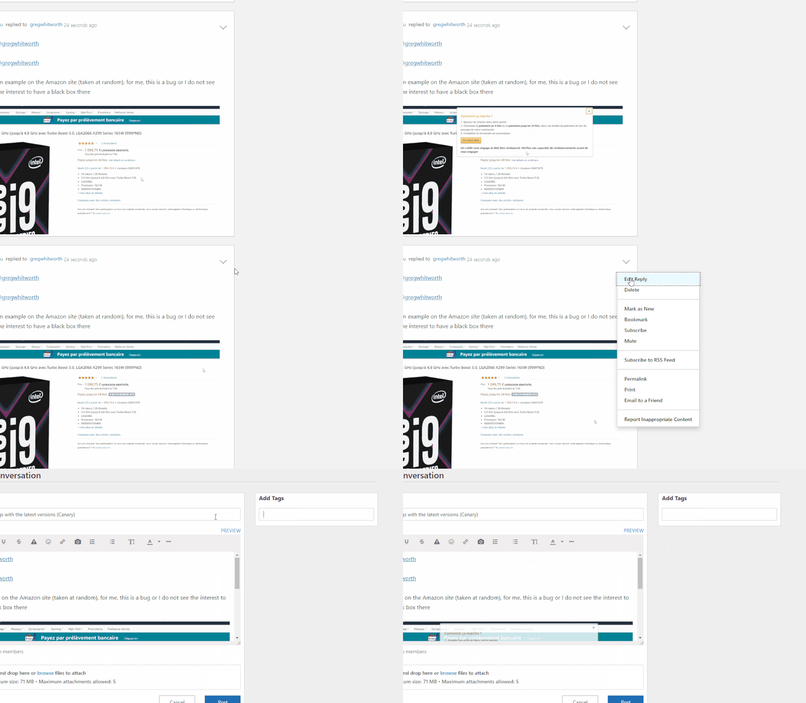
An example on the Amazon site (taken at random), for me, this is a bug or I do not see the interest to have a black box there
Or this black box (dotted) when we click on a menu option (also appears when we click on a clickable link in this forum (topic title, etc ...))
Once we click, we know we have clicked ![]()
Thanks
- Mark as New
- Bookmark
- Subscribe
- Mute
- Subscribe to RSS Feed
- Permalink
- Report Inappropriate Content
Apr 15 2020 08:36 AM
- Mark as New
- Bookmark
- Subscribe
- Mute
- Subscribe to RSS Feed
- Permalink
- Report Inappropriate Content
Apr 15 2020 08:47 AM - edited Apr 15 2020 09:04 AM
Thanks for your reply,
I will test with Chrome 83 to see if there is the same behavior
For the dotted lines and the black box after having hovered over (or clicked on) the "links", see the side of the active links and hovered over (hover and active I believe)
For the black framed, I find that it is really too black / bold
But I don't understand why Edge doesn't behave like the information in the blog
If I look at the informations, I don't have the same behavior in Edge
On the blog, there is no black box in the drop-down list for example
There is also no black and bold box in the text field
And it does not come from forums or sites (with their CSS), it was not there before it was changed in Edge
- Mark as New
- Bookmark
- Subscribe
- Mute
- Subscribe to RSS Feed
- Permalink
- Report Inappropriate Content
Apr 16 2020 01:17 PM - edited Apr 17 2020 12:48 AM
I tested the last Chrome 84 Dev (and browsed a few forums), indeed there is the same feature (some are better in Chrome, they made a mixture of the old and new design, kept the blue part for example)
But there are chances that it does not stay like that in Chrome, many have the same opinions as me from what I read (partly from some of the points listed above)
It's too black and bold, not going at all, with the rest of the browser design
A more sober "color" (gray?) would look much better it would seem
And remove the black "outline" (dotted or not) once we clicked on the button
I'll see what Google does with Chrome, and what it does with Edge
If Edge could look like Windows, which is very good on that side (drop down menu design, in blue without outline, etc ...)
Gray outline when we click on a button to type text
This kind of gray outline would be better, more sober and more adapted to the current design, I think (and then it is already present in the frames of Edge)
Just our opinions
Thanks
- Mark as New
- Bookmark
- Subscribe
- Mute
- Subscribe to RSS Feed
- Permalink
- Report Inappropriate Content
Apr 28 2020 06:29 PM - edited Apr 28 2020 06:31 PM
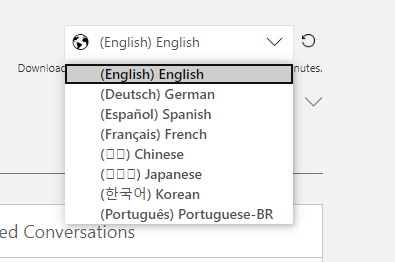
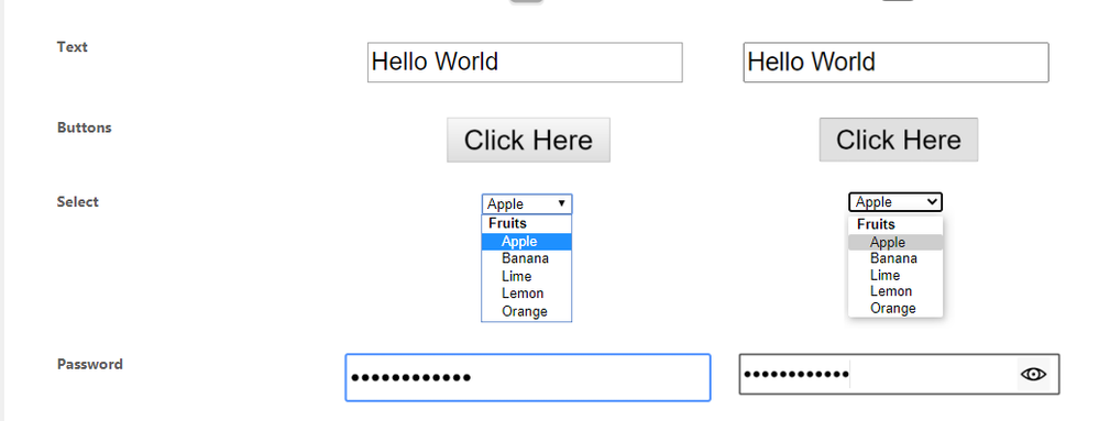
Chrome to perfect the design "copied" on Edge
Edge Canary 84 :
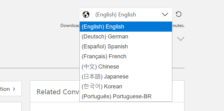
Chrome Canary 84 :
On Chrome, the blue outline is much better, the design is smoother
Maybe i'll use chrome canary until edge is the same design
- Mark as New
- Bookmark
- Subscribe
- Mute
- Subscribe to RSS Feed
- Permalink
- Report Inappropriate Content
Apr 29 2020 08:41 AM
@tistou Thanks for the response, and I'll continue to track feedback.
To your specific example however - this is due to them over-riding within their UI the focus styles created by the platform as can be seen in their stylesheet here:
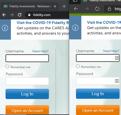
This does not impact web rendered content as can be seen here on Fidelity.com
Chrome Canary 84 (Left) / Edge Canary 84 (Right)
If we continue to get feedback from users that they do not like the overall aesthetics we'll go back to doing some user research. Out of curiosity, if I offered you a toggle to adjust that, would you use that? I prefer - as noted in the blog and above, to have the default err on the side of being accessible. But I also understand people, even in the study, have a difference of opinion on aesthetics. We spent a lot of time across companies going over this and which direction was the best one. Let me know about the setting (btw, I'm merely brainstorming at the moment and that is only one possible solution - happy to hear others if you got 'em). Thanks for the continued feedback.
- Mark as New
- Bookmark
- Subscribe
- Mute
- Subscribe to RSS Feed
- Permalink
- Report Inappropriate Content
Apr 29 2020 08:52 AM - edited Apr 29 2020 08:58 AM
Thanks for your reply and thanks for the details,
Indeed I prefer the design of Chrome for these interfaces (much less aggressive than the black of Edge)
@gregwhitworth wrote:Out of curiosity, if I offered you a toggle to adjust that, would you use that?
Yes of course, I would be delighted to test
I have indicated to users of French forums to give feedback on this design
Thanks
- Mark as New
- Bookmark
- Subscribe
- Mute
- Subscribe to RSS Feed
- Permalink
- Report Inappropriate Content
Apr 29 2020 09:00 AM
@tistou I've opened the following bug to track feedback on this: https://bugs.chromium.org/p/chromium/issues/detail?id=1076478
Please star that issue as that helps us keep track (at a Chromium level) the demand for investigating the issue. I'll note that the toggle is only one such solution and it may not be the way we try and solve this, if we try and solve it. I want to try and manage your expectations though, as we have to prioritize our time on the highest priority items based on feedback. And even getting a seemingly simple toggle in requires user testing, design reviews, developer time and considerations of other approaches.
At any rate, I want to ensure that you know that we do value the feedback (not just Edge but the entire Chromium v-team on controls) and will take it into account during prioritization.
- Mark as New
- Bookmark
- Subscribe
- Mute
- Subscribe to RSS Feed
- Permalink
- Report Inappropriate Content
Apr 29 2020 09:06 AM
Ok, thank so much for the initiative
I fully understand that you could not respond favorably to all user requests
- « Previous
- Next »
